Block printing
Carving, inking, pulling. Textures, letters, portraits, posters, totes.
This is a relief-printing practice that runs across textures, letterforms, portraits, posters, and wearables. I work in linoleum, plywood, laser-cut basswood, and hand-cut letter blocks, with Speedball ink and a baren, at the kitchen counter or the studio table.
What follows is the body of work, roughly grouped: the blocks themselves (linoleum textures and a deep tray of laser-cut wood letterforms), the bulldog and the Rushmore portrait series, oversized letters carved at sheet-scale, a typographic Sondheim quote, an event poster, daily-print exercises, finished printed objects, and a series of multi-block abstract compositions at the end. The point is the practice: carve, ink, pull, look at it, and carve again.
The blocks
Before the print, the carving.
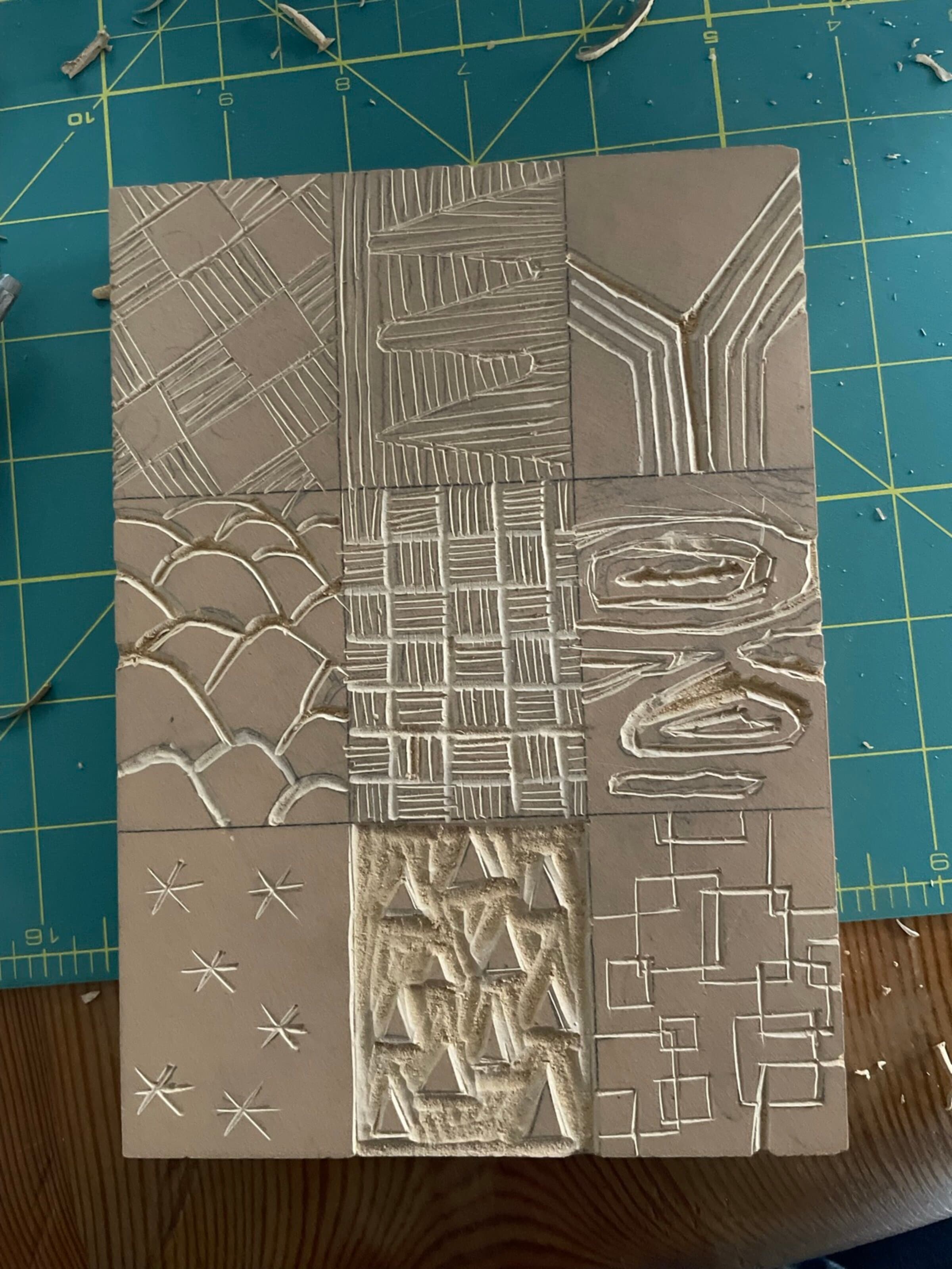
These are two carved blocks of textures, hand-cut into linoleum: the first uninked and fresh off the bench, the second inked in dark blue and ready to pull. Both share the same nine-square grid and the same hand, with hatching at different angles, an OK lettering rough, woven plaid, dragon scales, geometric brick, snowflakes, and irregular shards.
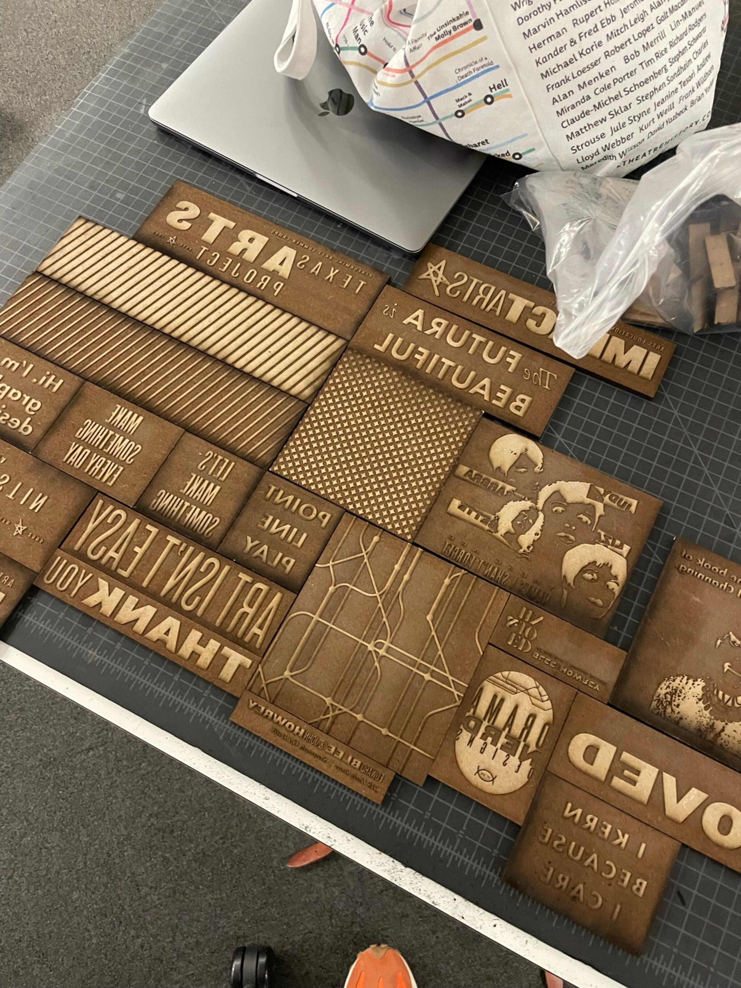
The bigger collection is a tray of laser-cut basswood blocks. Each block is its own composition: a phrase (ART ISN'T EASY, MAKE SOMETHING, THANK YOU, NEVER, FUTURA IS BEAUTIFUL, TEXAS), a pattern (stripes, halftone dots, a subway-map wireframe), or a face. They fit in a custom wood tray, mirrored and ready to ink. The blocks shown in this section all came out of this tray.
The textures, pulled
Same blocks. Many sheets.
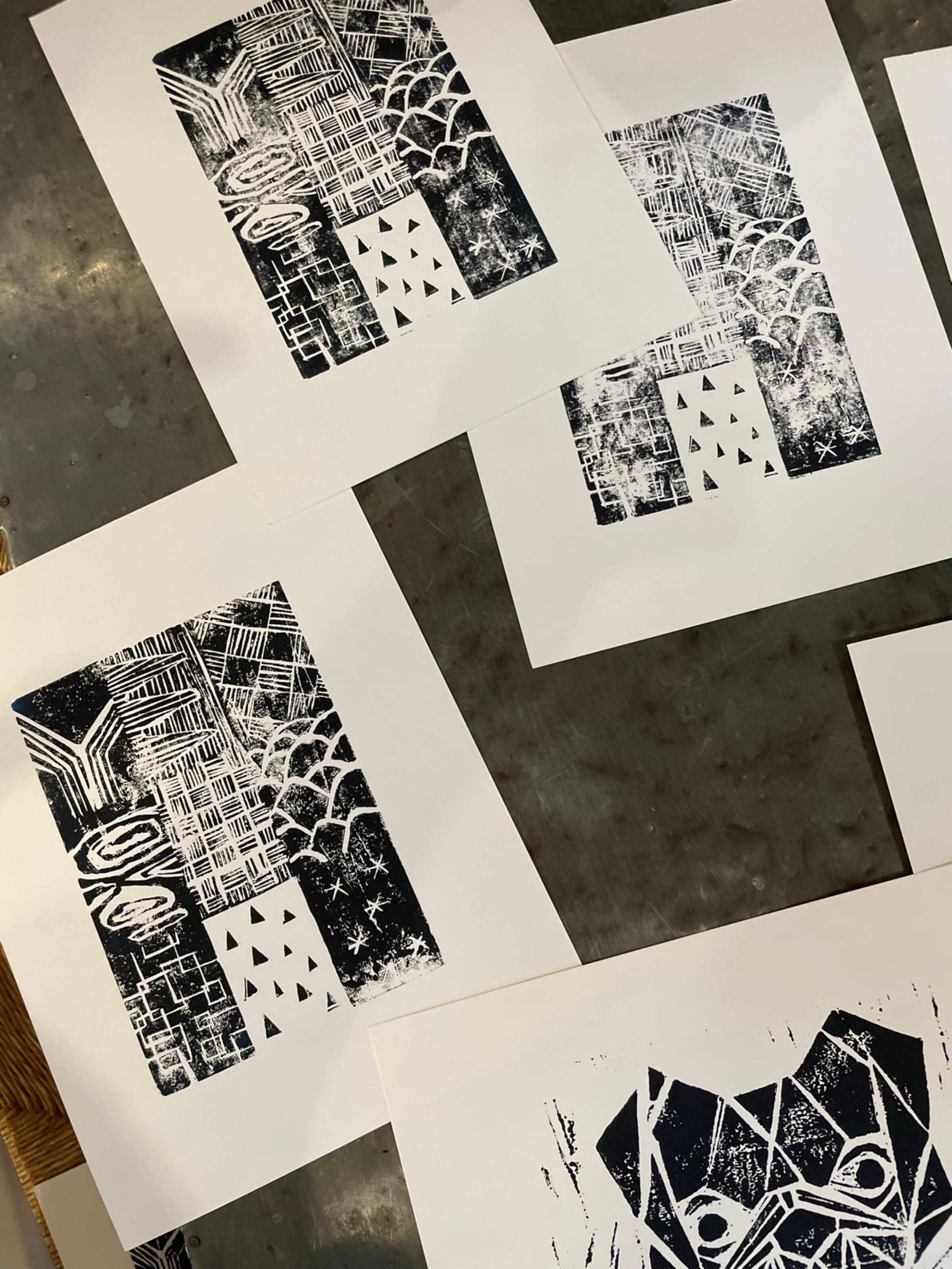
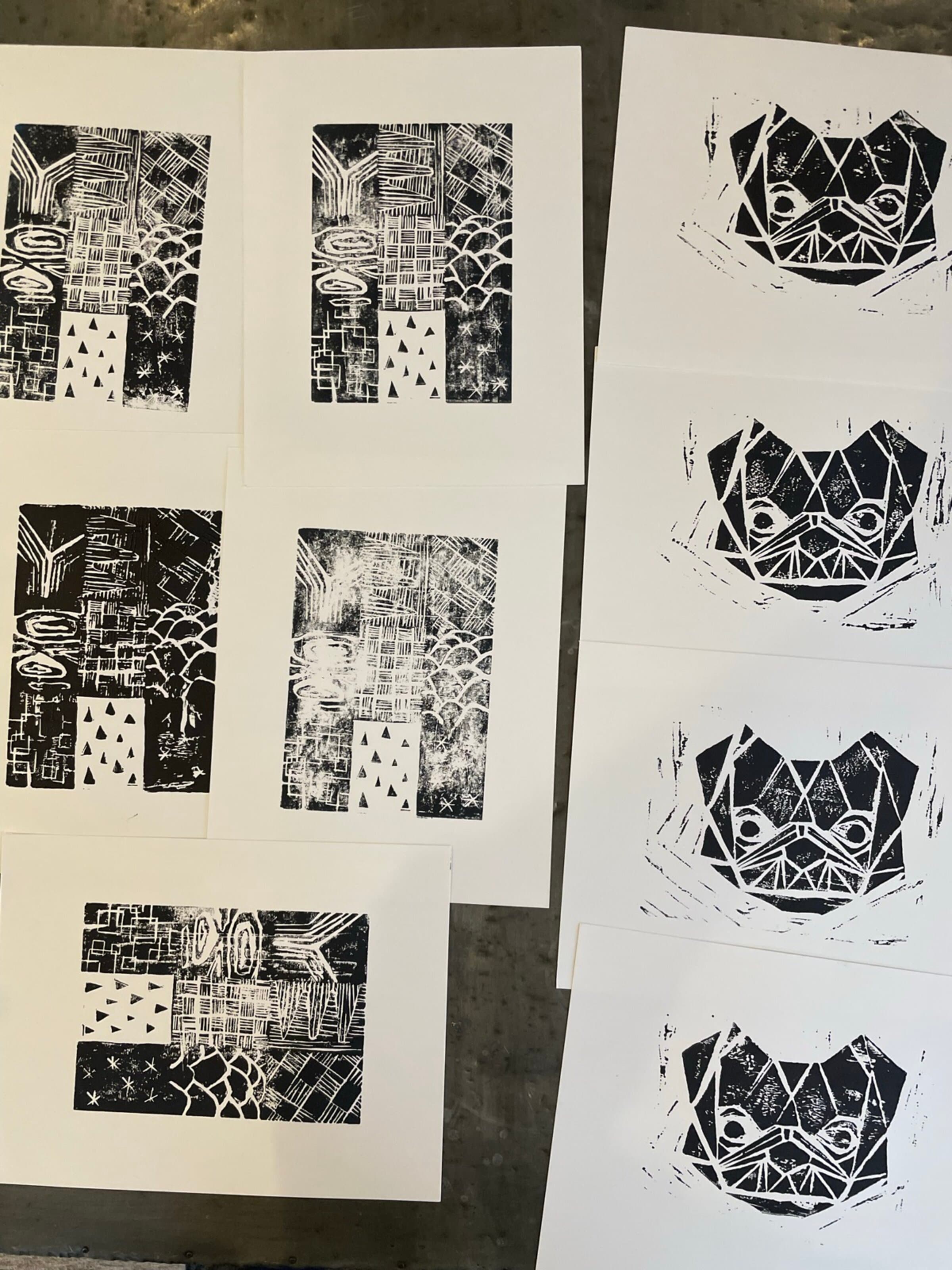
I stamped the same texture grid onto sheet after sheet, letting the ink load decrease each time. The carved bulldog block from the next section made an appearance on these sheets too, its black halftone face crashing into the same composition. The photos below show studio flat-lays of multiple pulls in a row.
The bulldog
One face. Many ink loads.
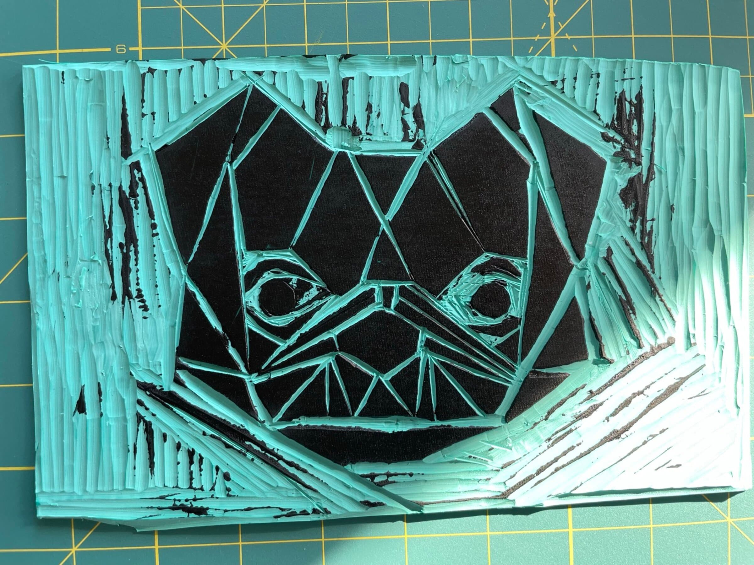
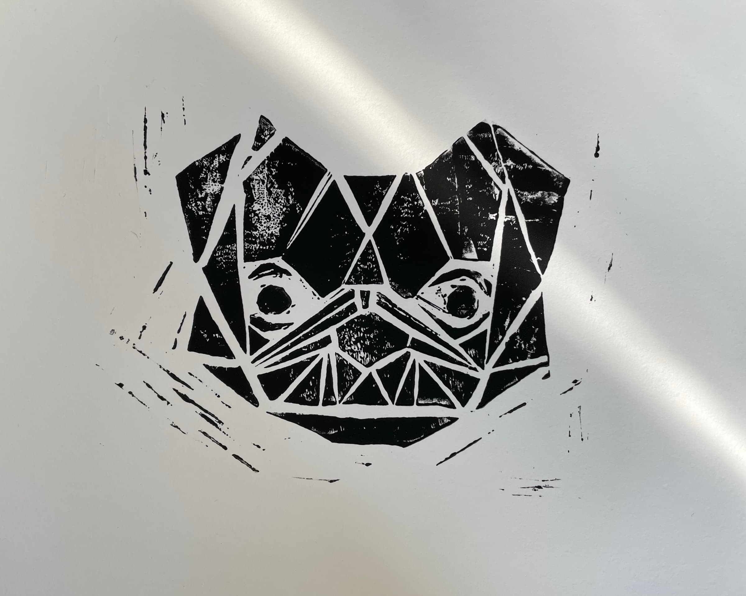
This is a stylized French Bulldog face cut into linoleum as a faceted-geometric study, so the planes catch the ink and the shadows fall into the carved-out grooves. The photos below show the inked block itself in teal-on-black before pulling, and a clean pull of the same block in deep black on cream paper.
The Rushmore series
One block. Twelve pulls.
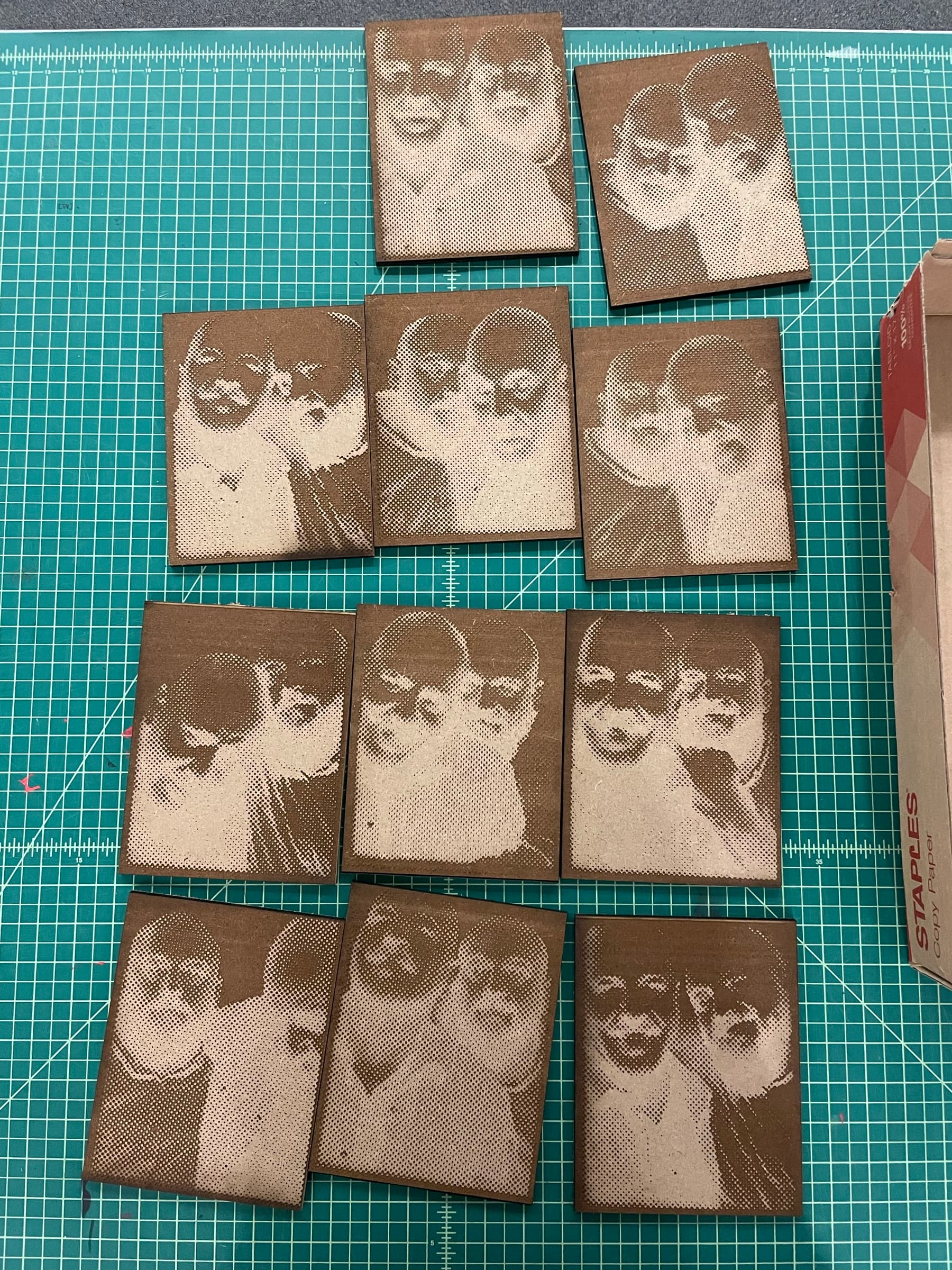
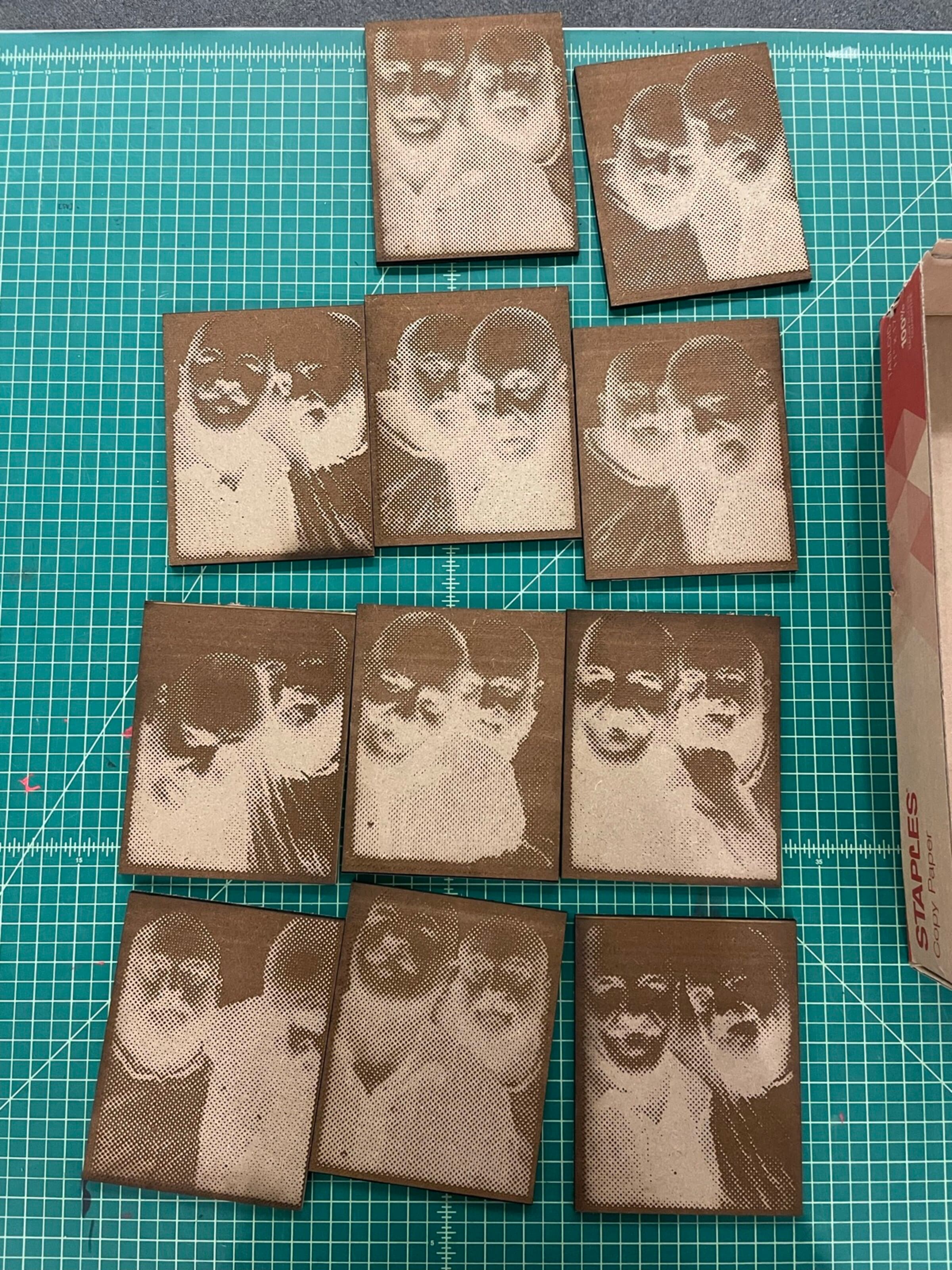
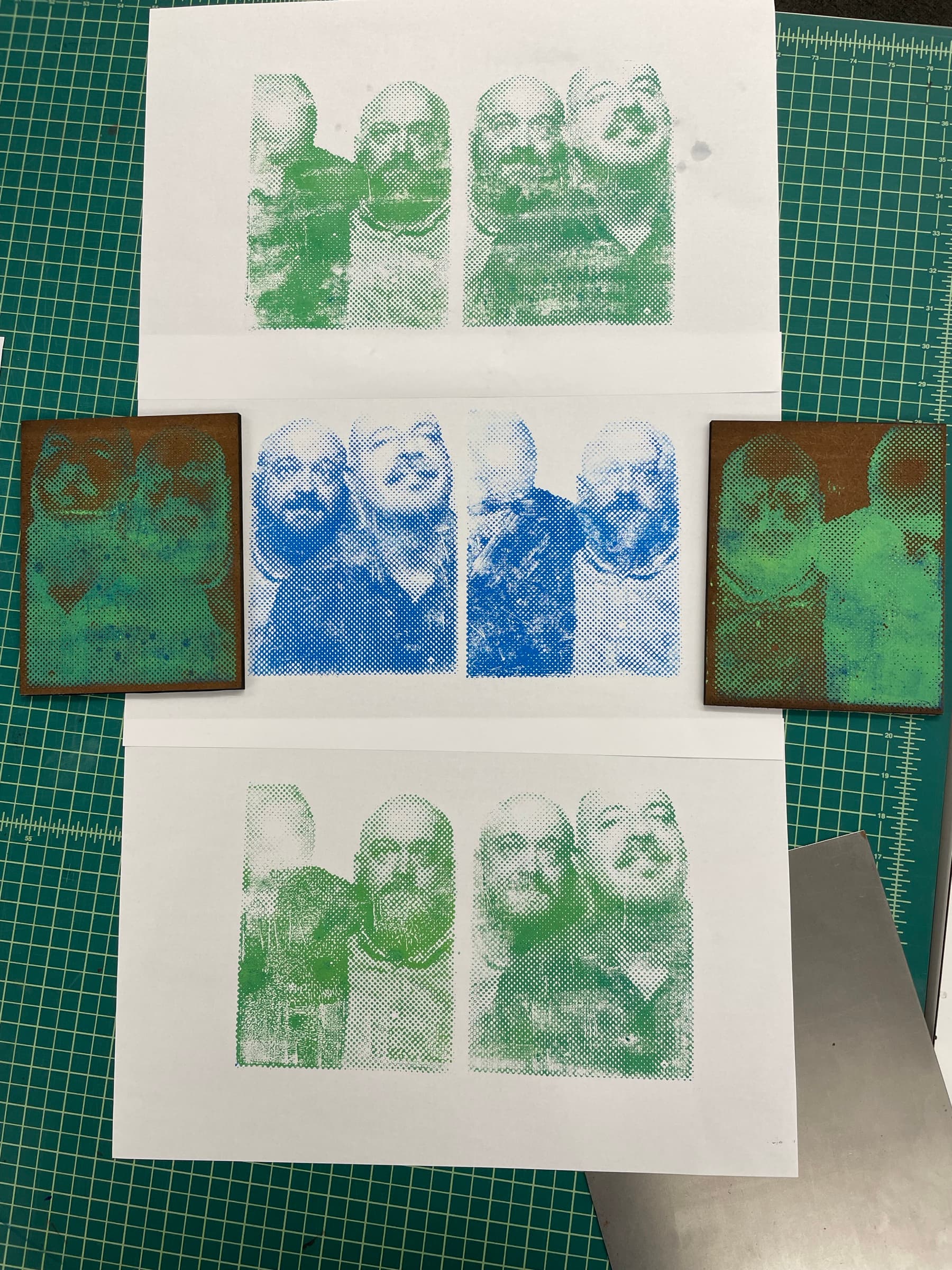
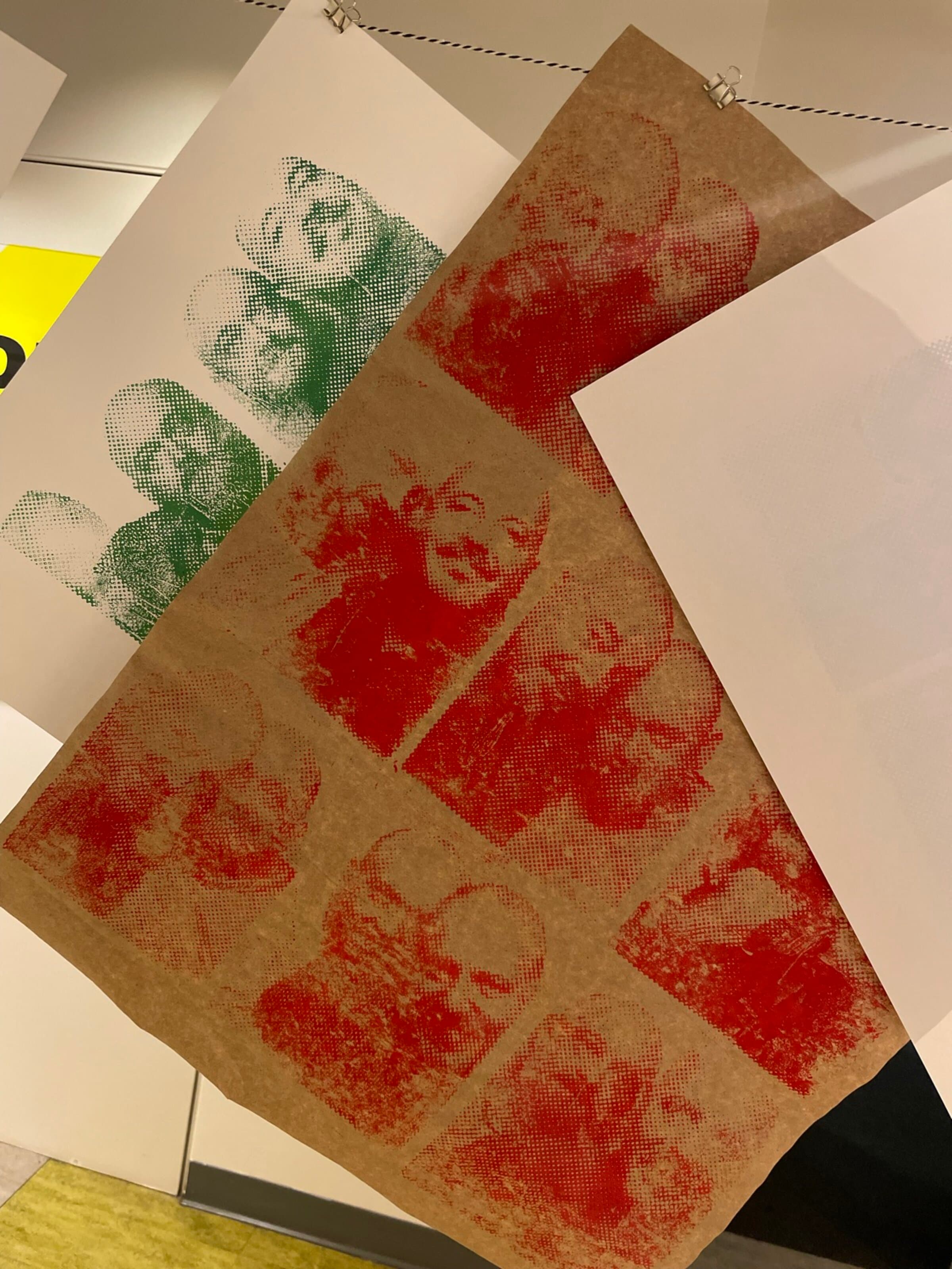
These are twelve identical small wood blocks, each laser-engraved with the same multi-figure portrait composition. The photos below show the blocks laid out in a tight grid, then the prints: the same composition pulled across green, cobalt, a green-and-yellow split, and sepia and brown ink loads. Every pull comes out a slightly different version of the same carved face.
Letters at scale
A wood plank, a giant letter.
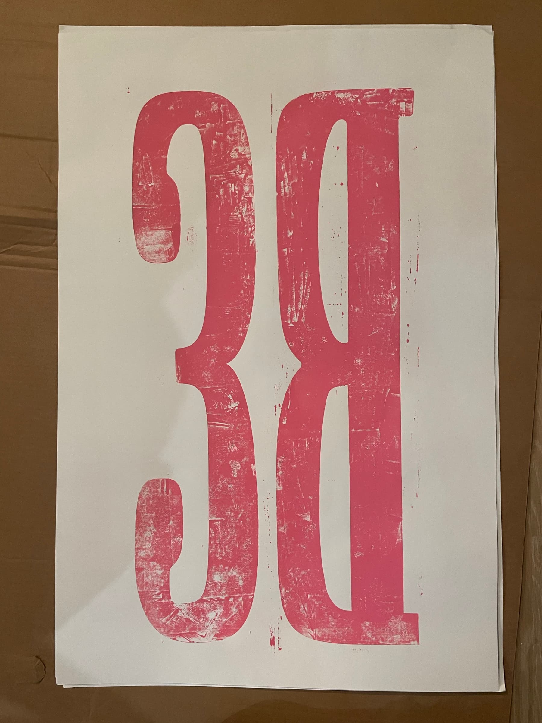
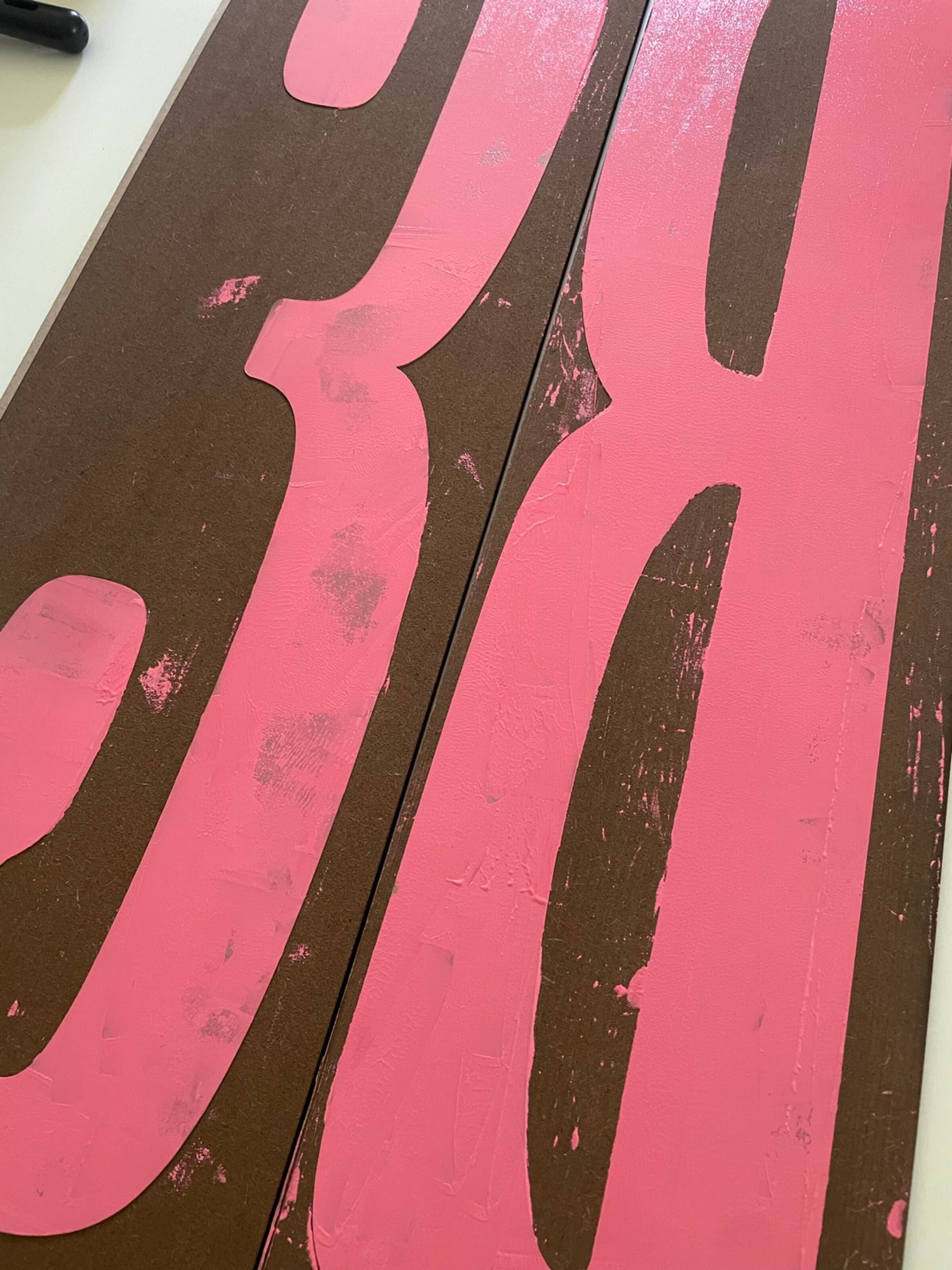
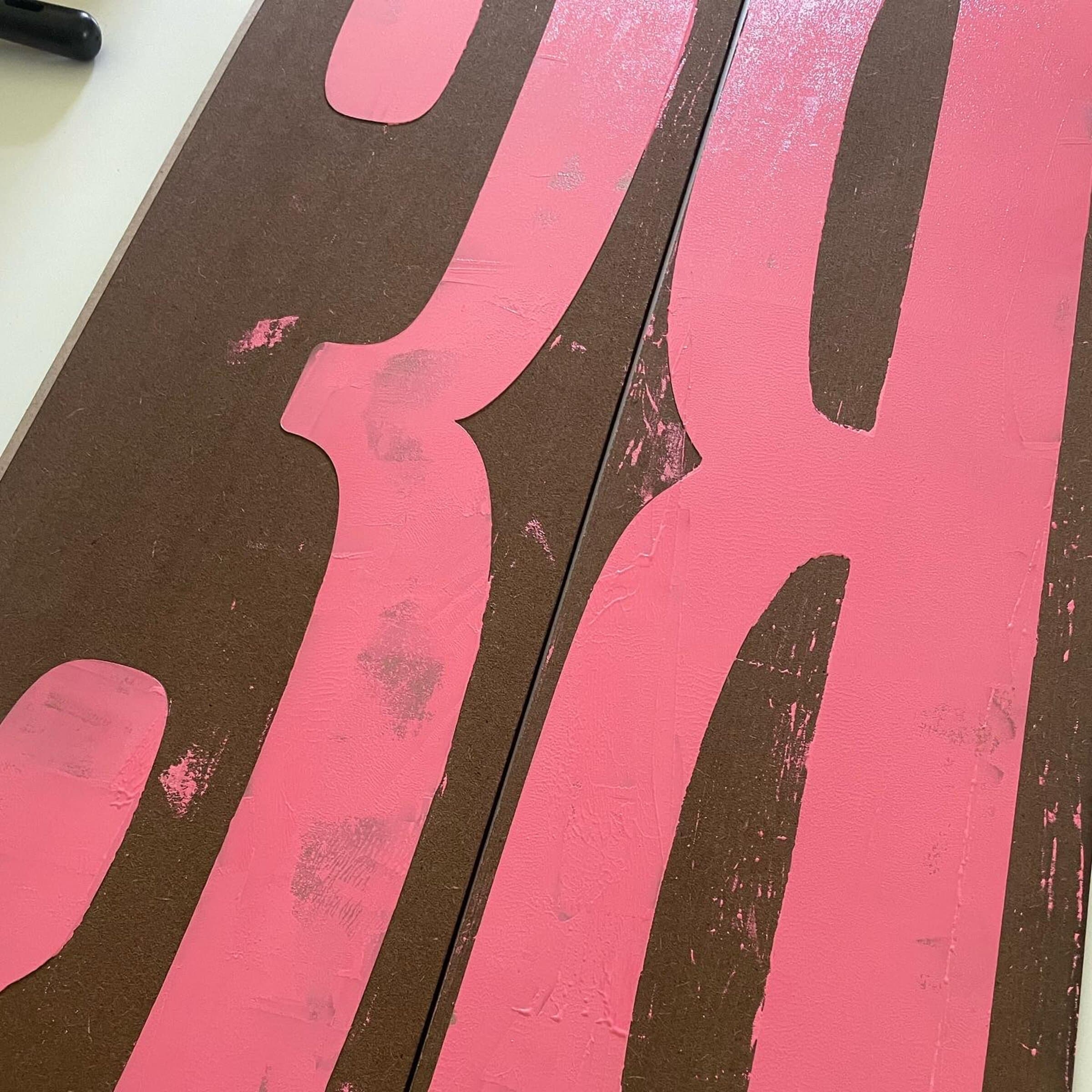
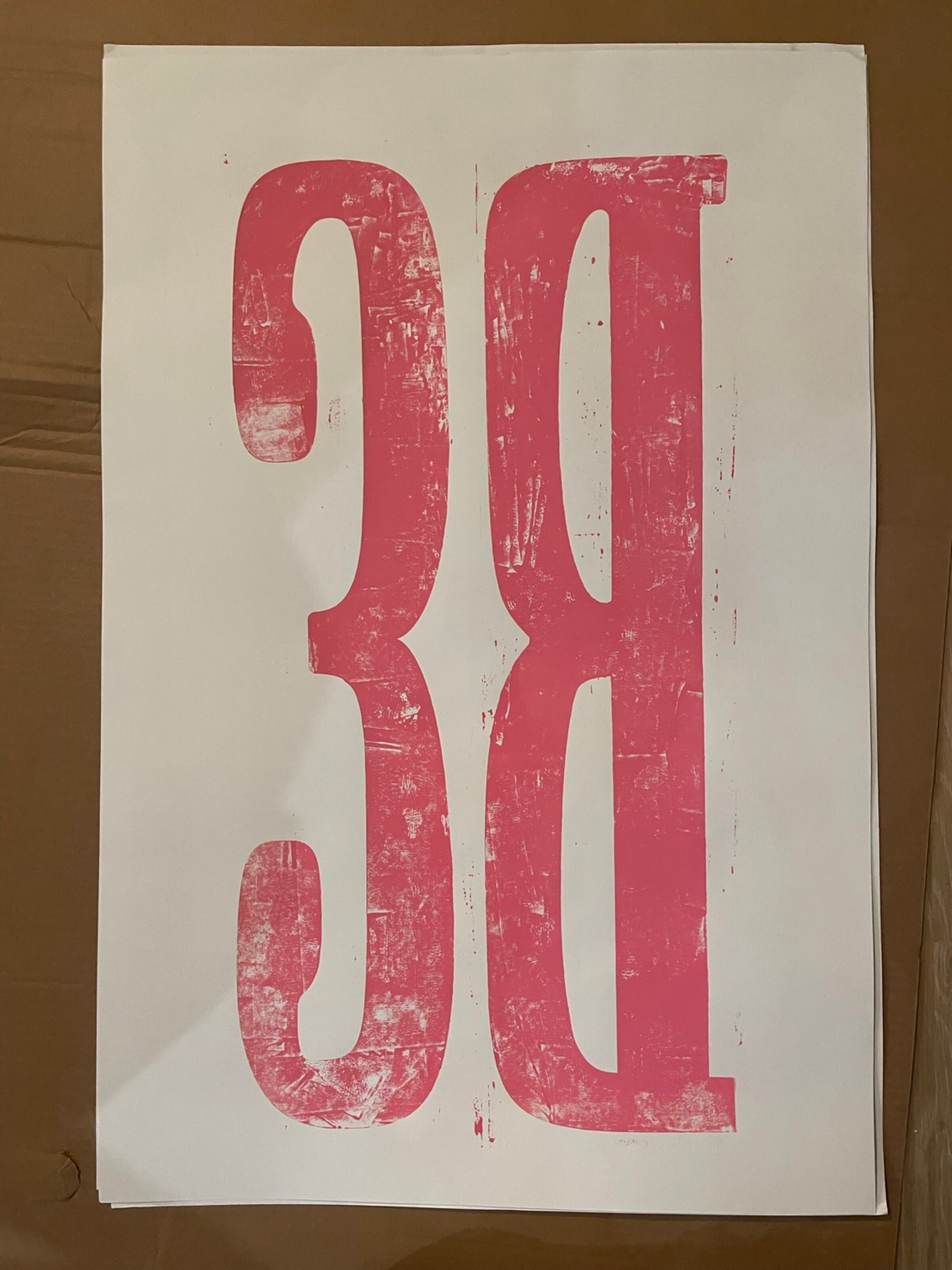
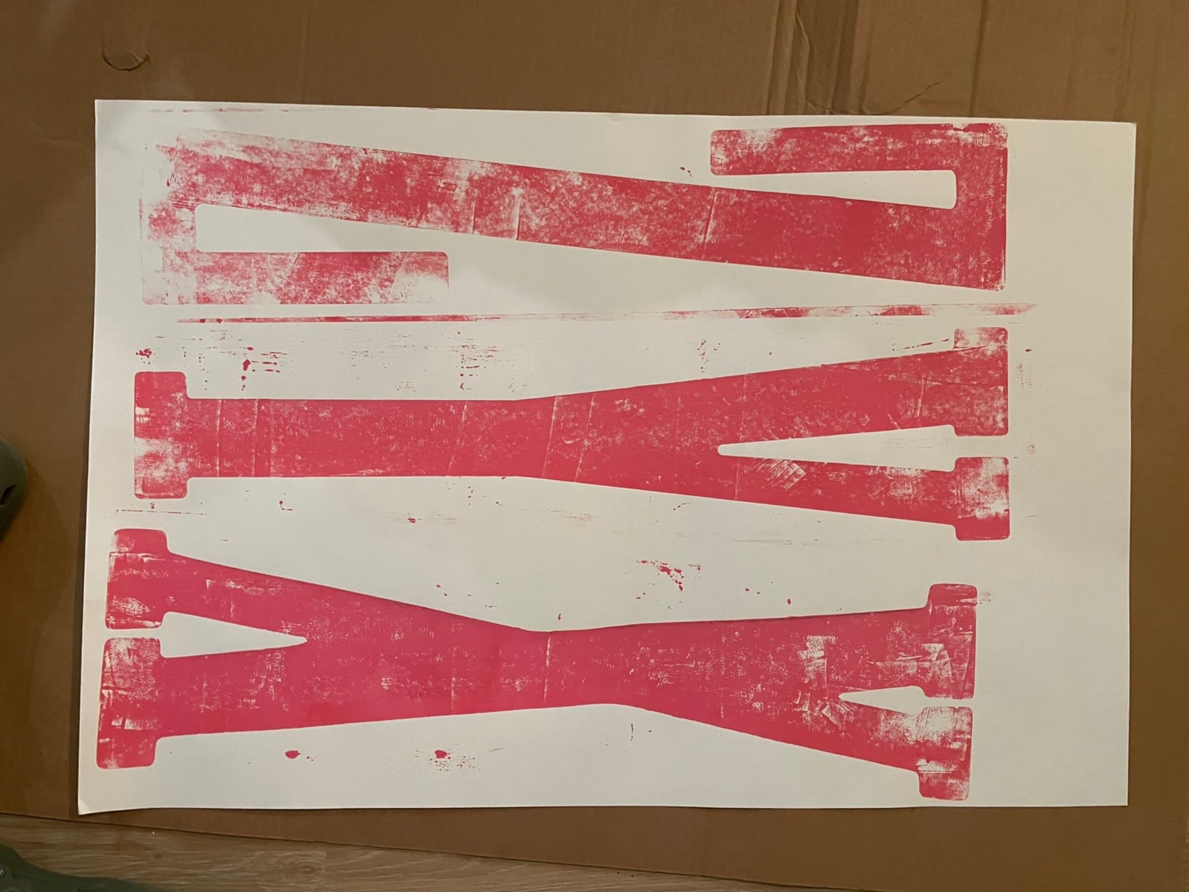
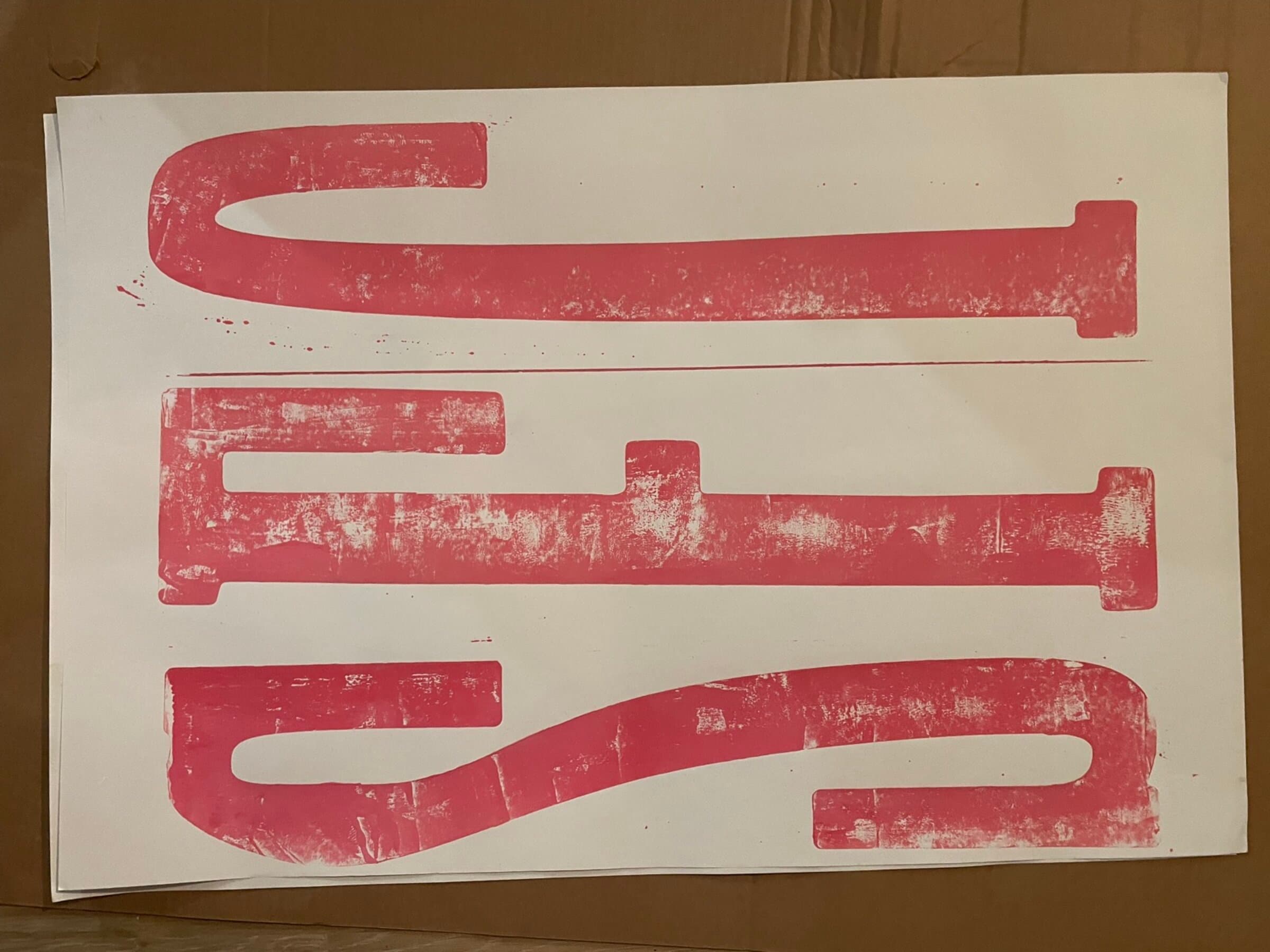
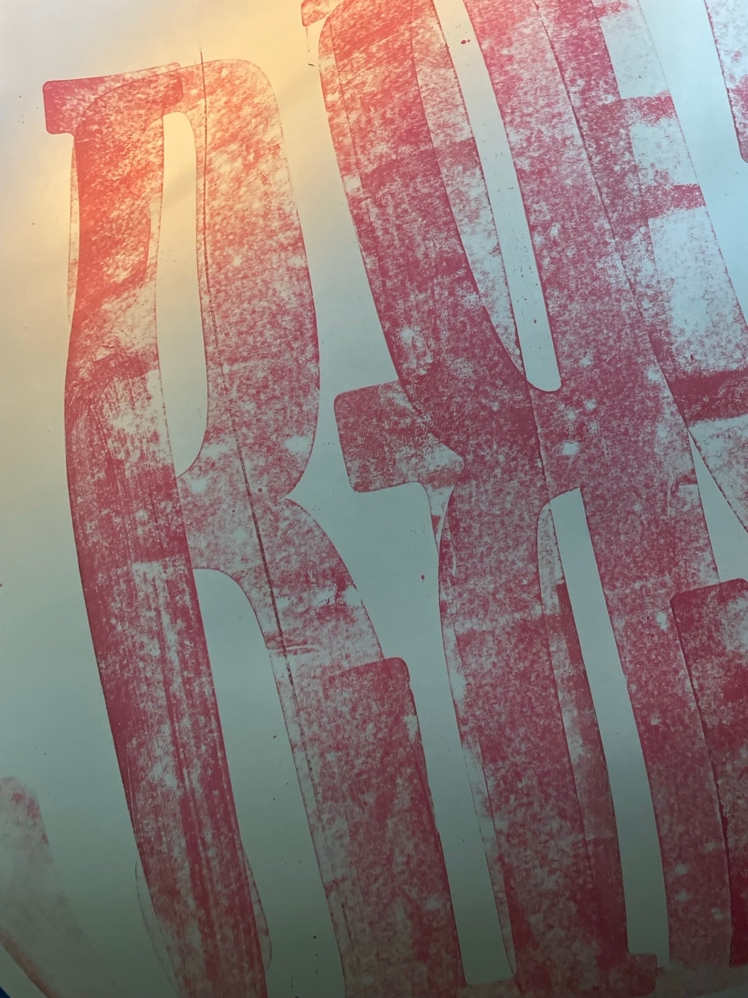
These are the biggest blocks of the practice. Each letter is its own carved wood plank, sized to read across a room. I ink them with hot pink and pull them by hand onto large sheets, where the impression takes the full body weight of someone leaning on it. The photos below show the inked planks themselves, then the BS pull on white, then a video of one of the pulls happening live.
A Sondheim quote
Design, composition, tension, balance.
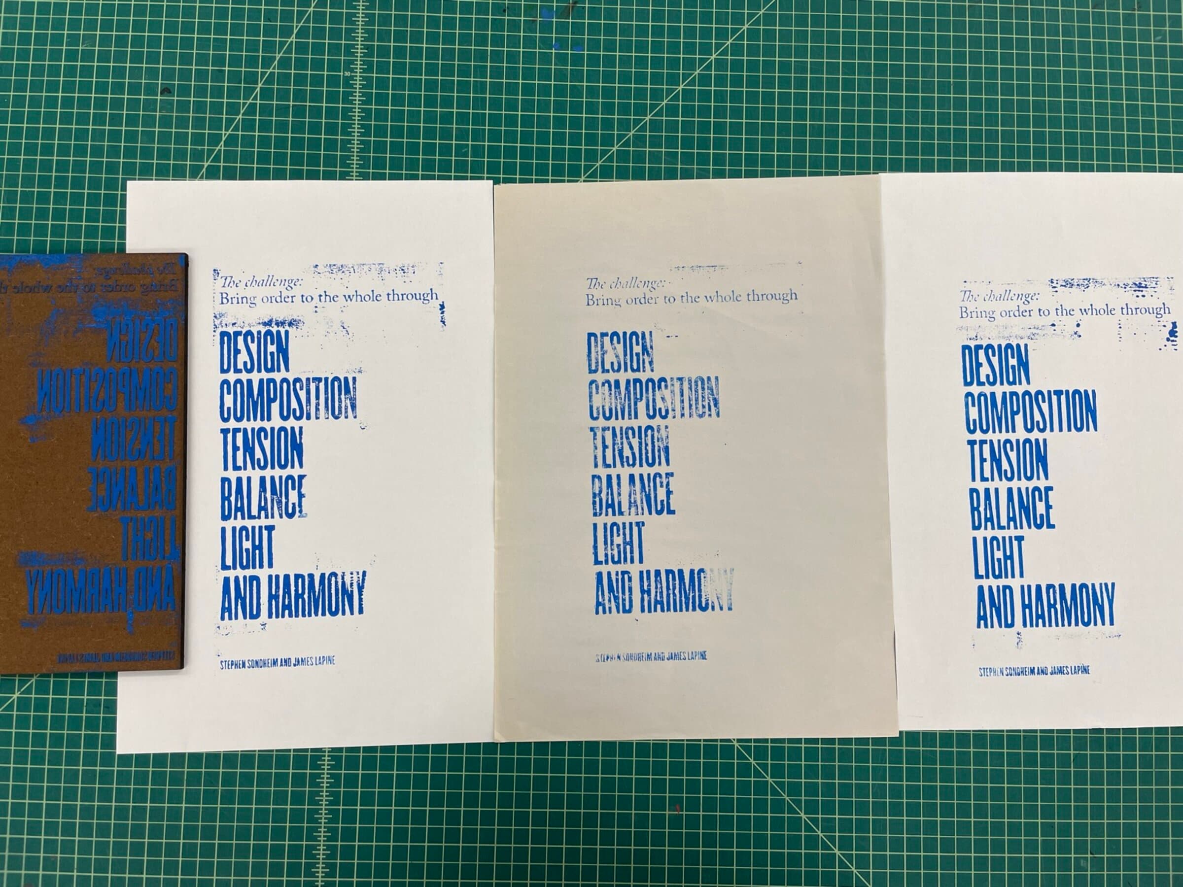
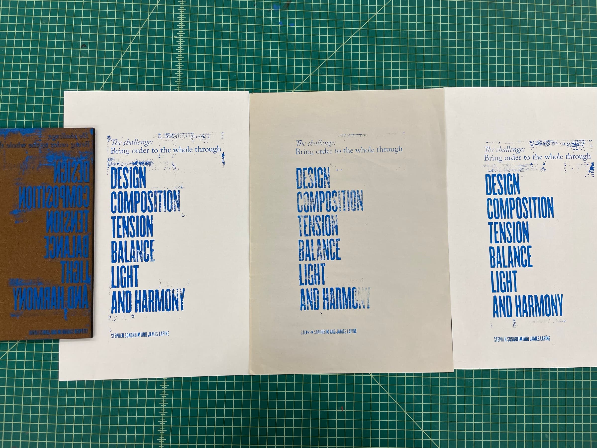
A laser-cut basswood block of a Stephen Sondheim and James Lapine quote from Sunday in the Park with George: “The challenge: bring order to the whole through DESIGN, COMPOSITION, TENSION, BALANCE, LIGHT AND HARMONY.” Pulled in cobalt blue across three sheets in a row, the inked block itself sitting alongside the pulls, mirrored and unread.
An event poster
Block Printing! FRI APR 22.
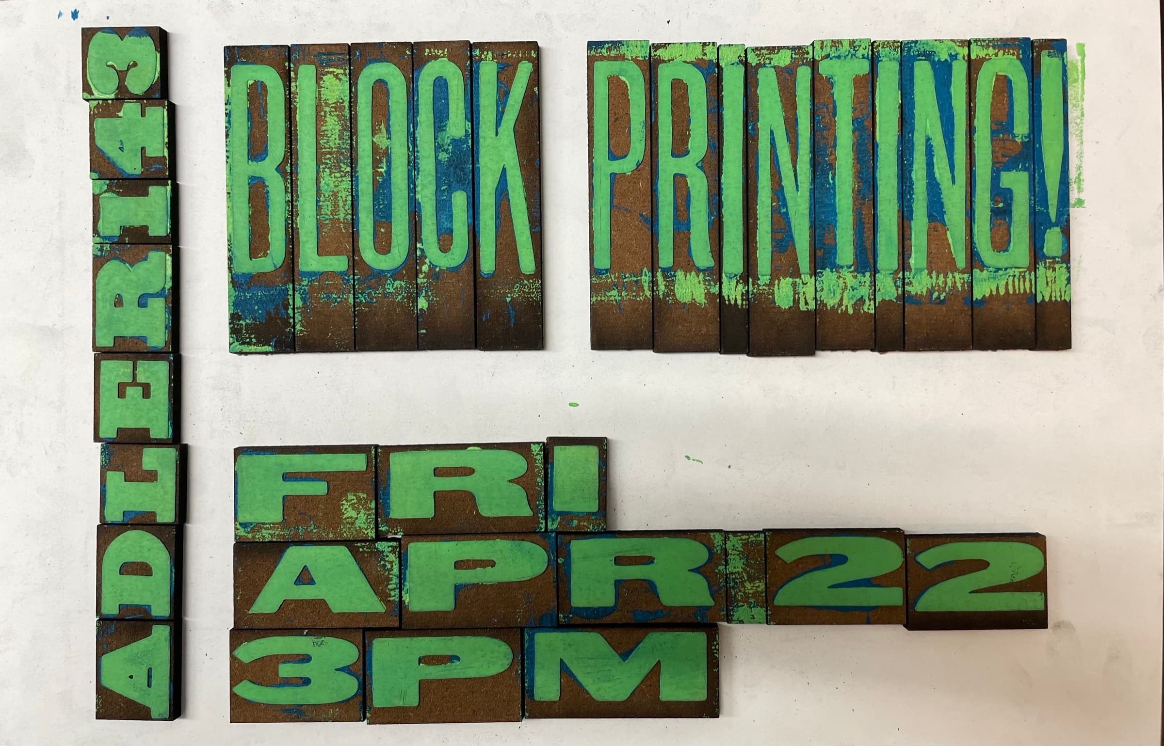
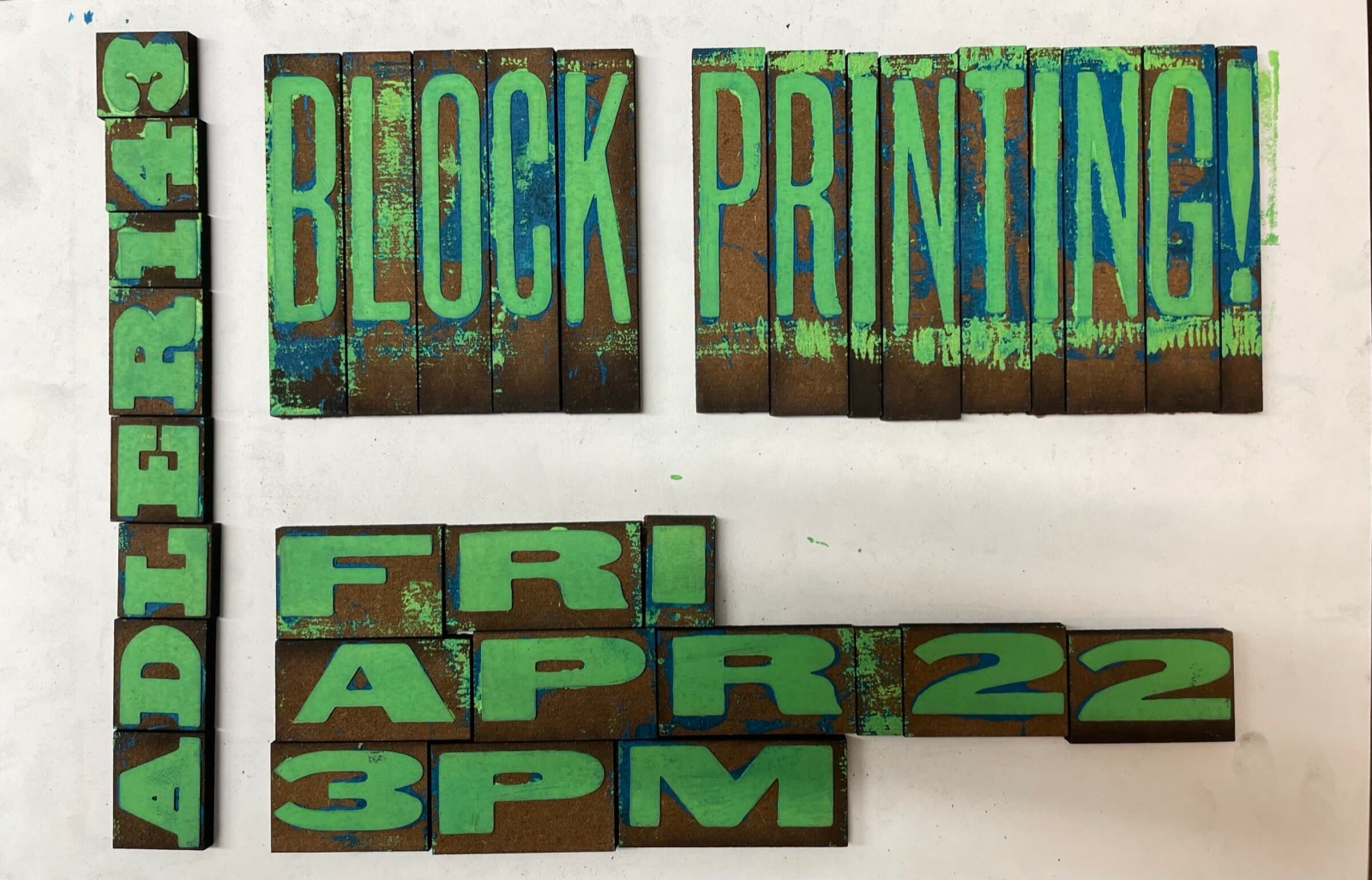
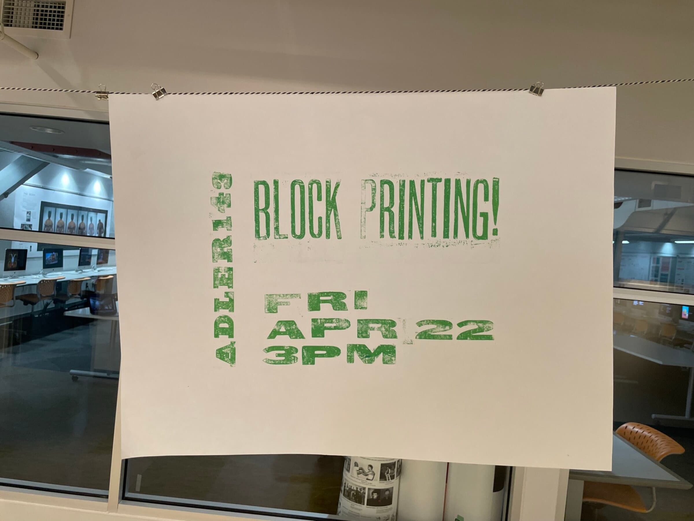
I set the hand-carved letter blocks into a real piece of wayfinding: a poster for a block-printing class on Friday April 22 at 3pm, built on the wood-grain blocks themselves and pulled in green ink. The photos below show the inked blocks before the pull, the printed poster on white, and the same poster hung in the studio that taught the class.
Daily prints
Make something every day.
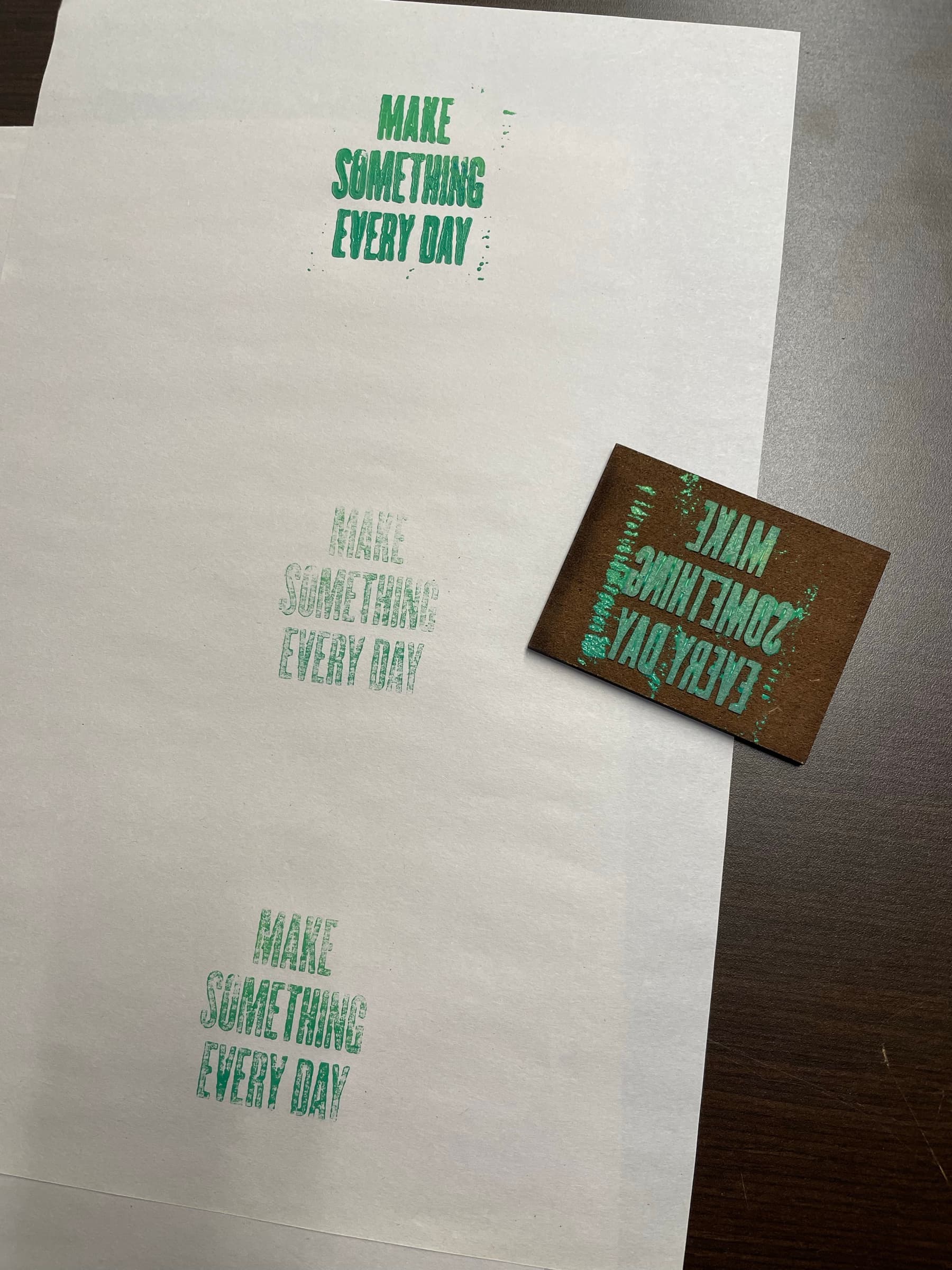
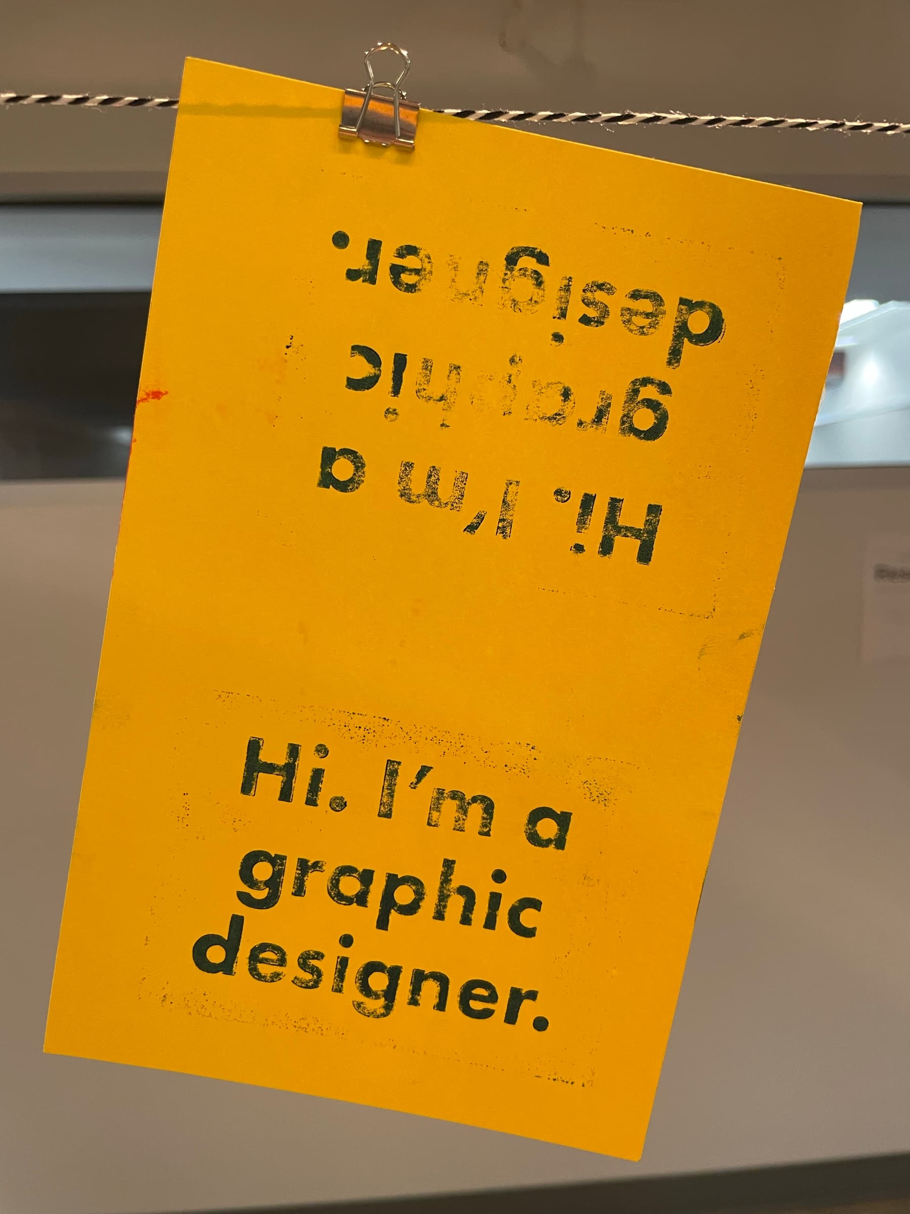
This is a small block carved with the words MAKE SOMETHING EVERY DAY, pulled three times across a sheet at decreasing ink loads. The block sits beside the prints to show its source. It's half manifesto, half ink-load study. Beside it sits the calling card I print for myself, on yellow stock in green ink: “Hi, I'm a graphic designer.”
A pattern at scale
One block. Stamped twenty times.
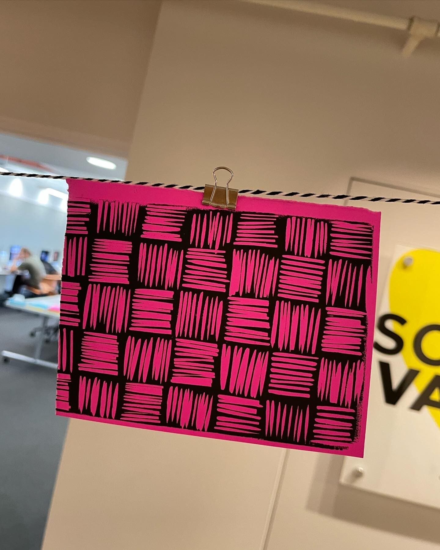
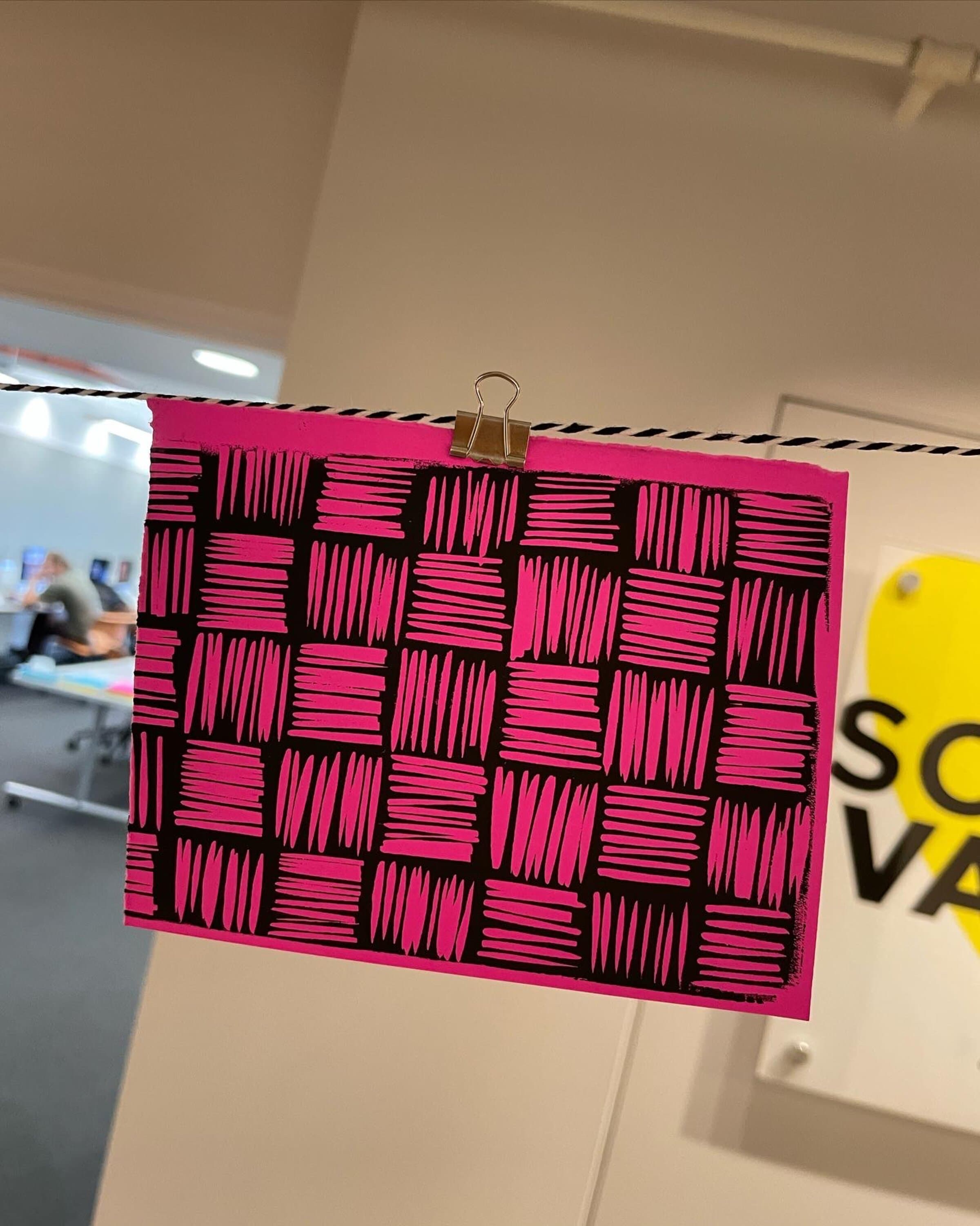
I stamped a single small carved block of cross-hatched bars twenty-some times in tight registration on hot-magenta paper, alternating direction each row. One small object multiplies into a wall-scale woven texture this way. The photos below show the same print clipped to a clothesline in two different studio settings.
On a tote
Art isn't easy.
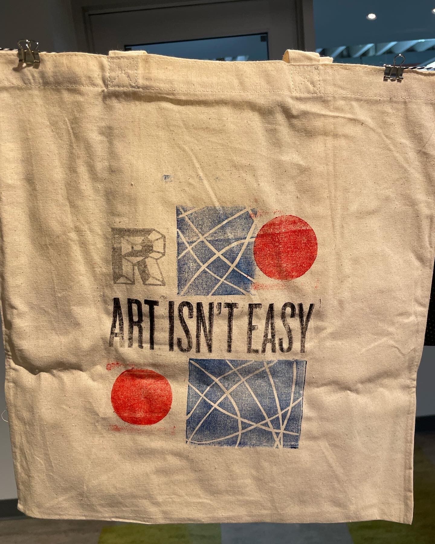
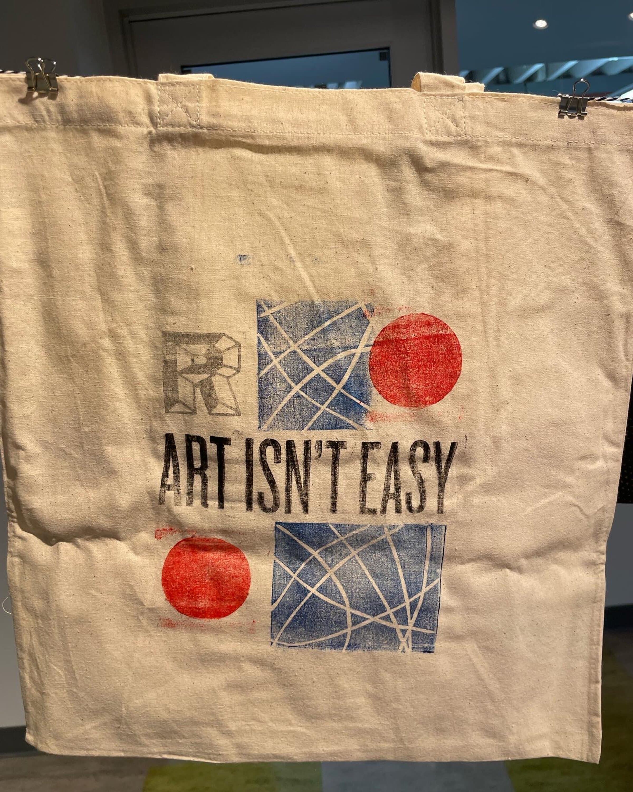
I pulled the same letter blocks onto canvas here, in two compositions of the same phrase, ART ISN'T EASY: one with two indigo bramble-line blocks framing the type and two scarlet sun-disc blocks at the corners, another rearranging the same elements with an R block and the bramble blocks shifted into a stack. It's a wearable version of the practice, one that travels with whoever carries it.
Color studies
Three or four blocks at a time.
These are the studies that made the rest of the work possible. Each composition uses a different combination of the same blocks: concentric rectangles, radial bursts, organic loops, parallel ridges, dot fields. The order of impression decides which marks read as foreground and which dissolve into the ground. The video below shows one of the multi-block prints being assembled live, followed by the full series of finished pulls.
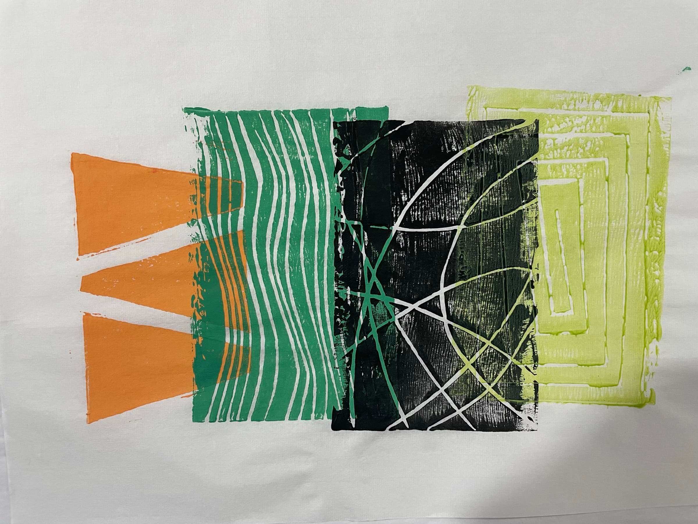
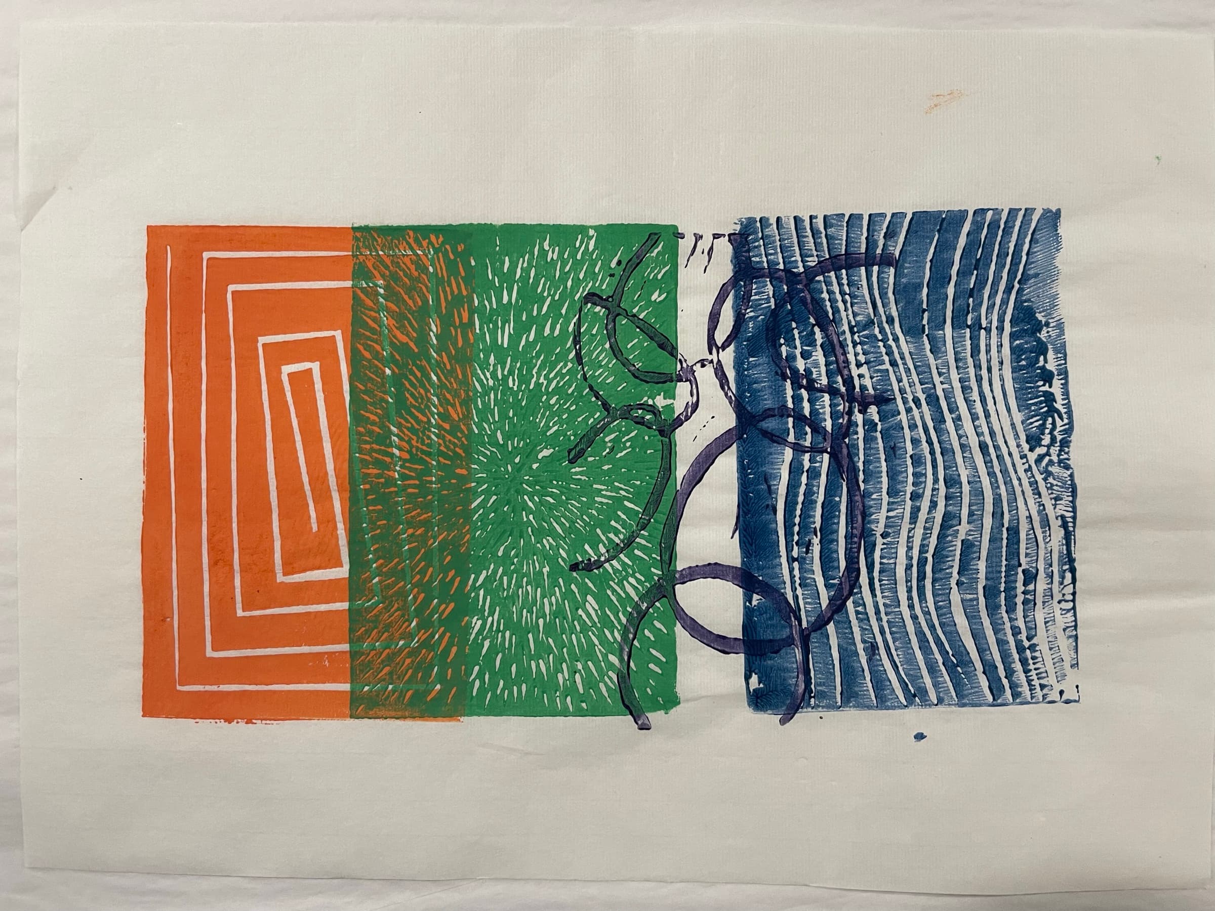
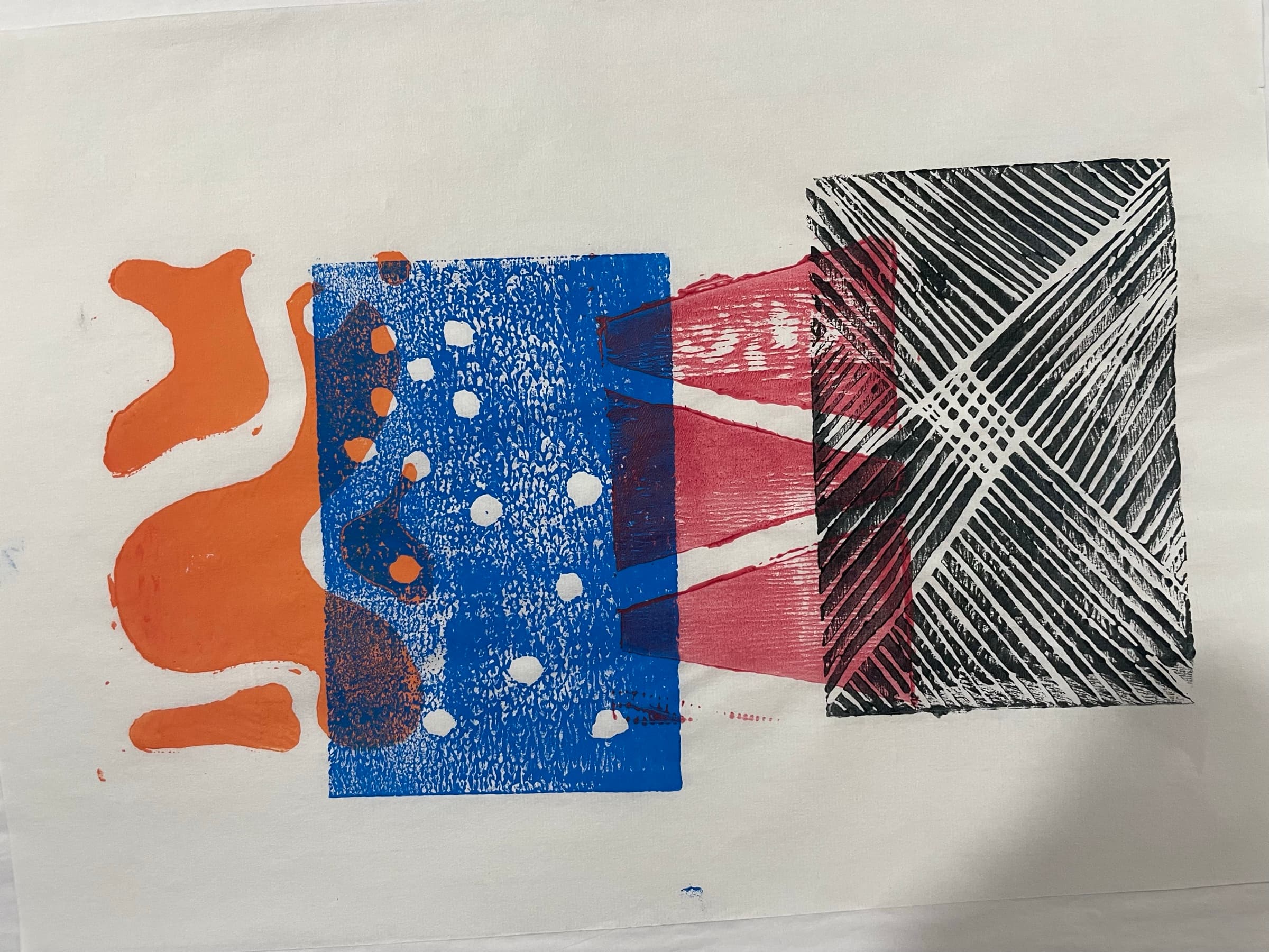
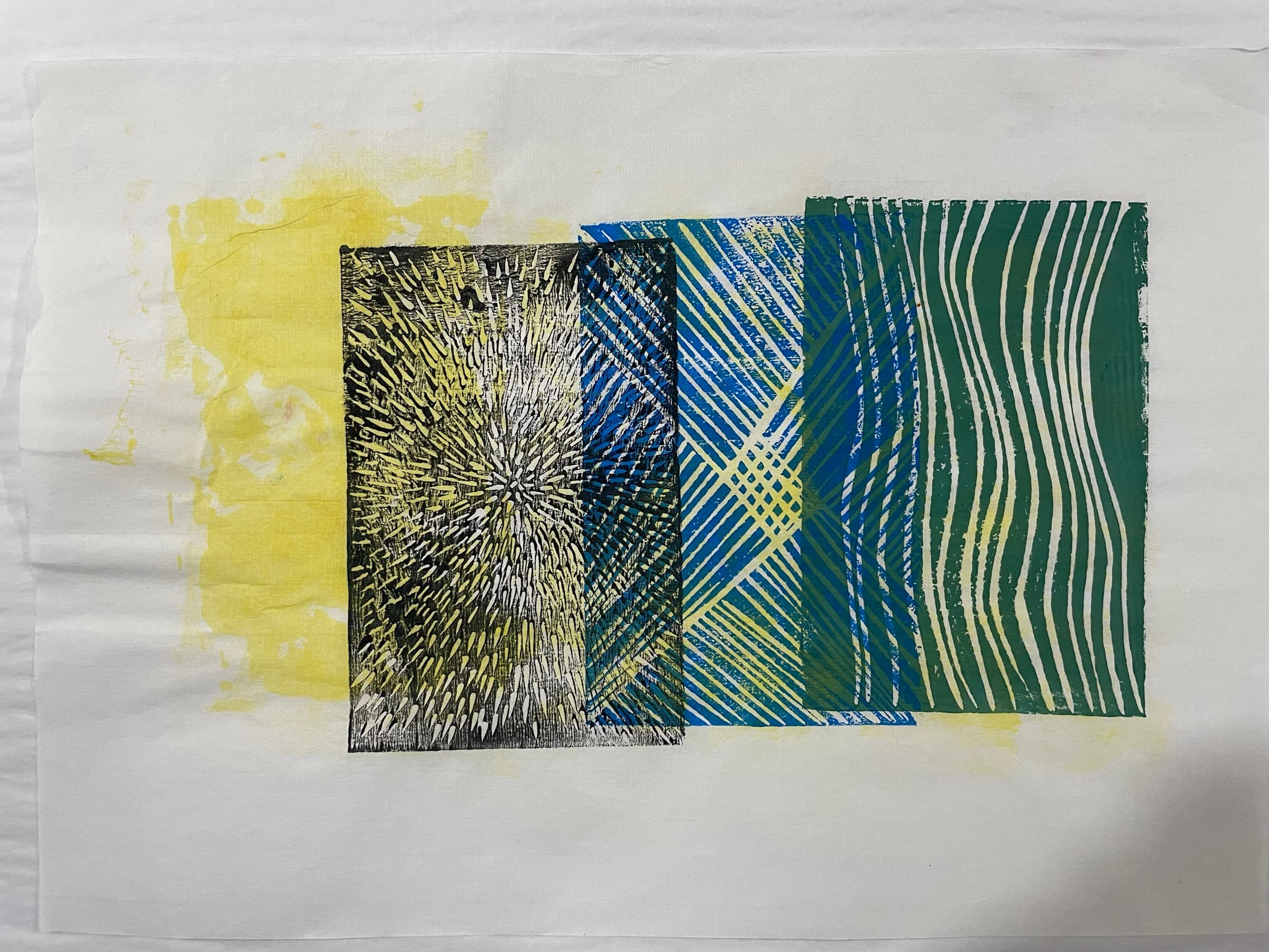
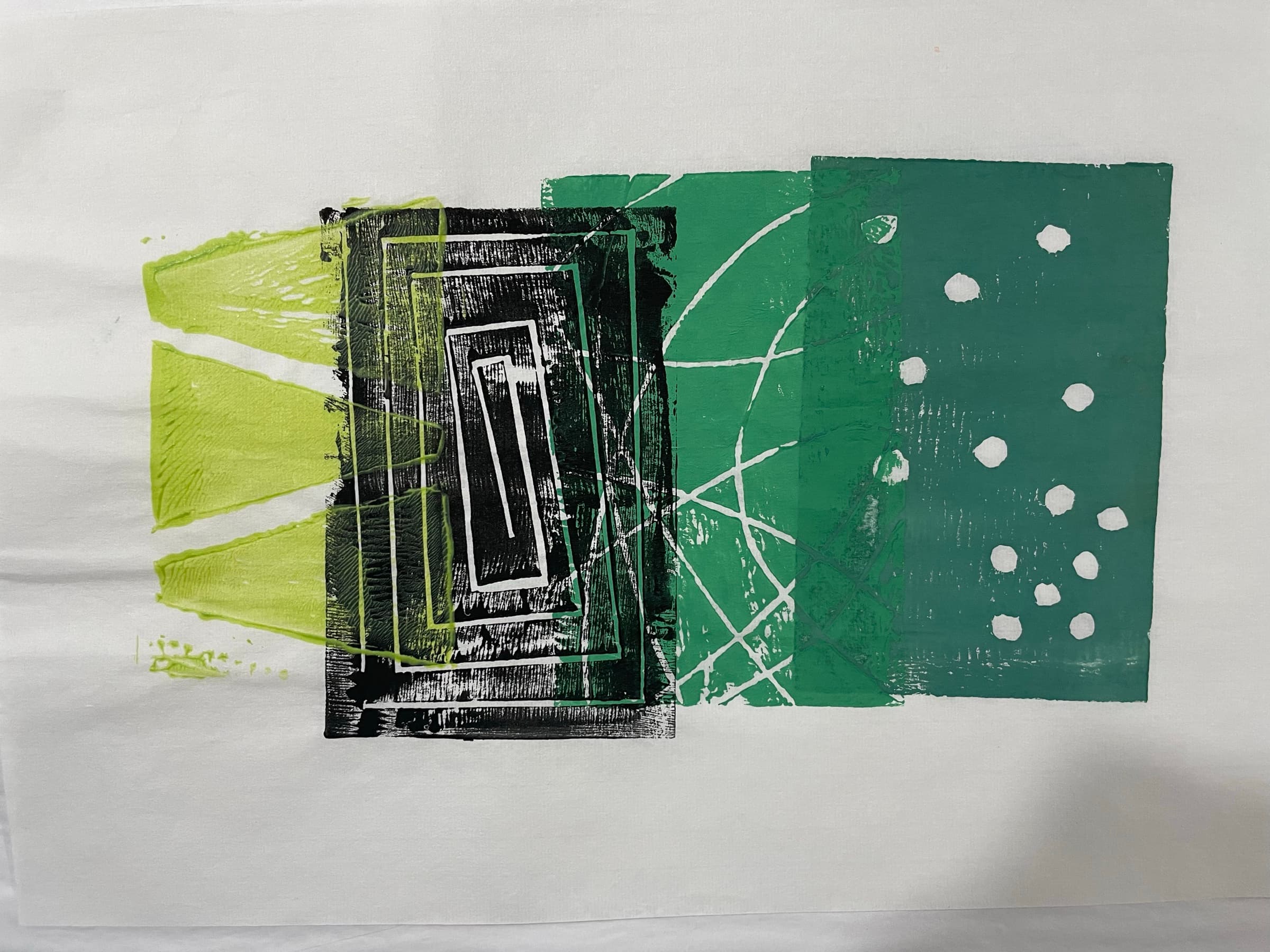
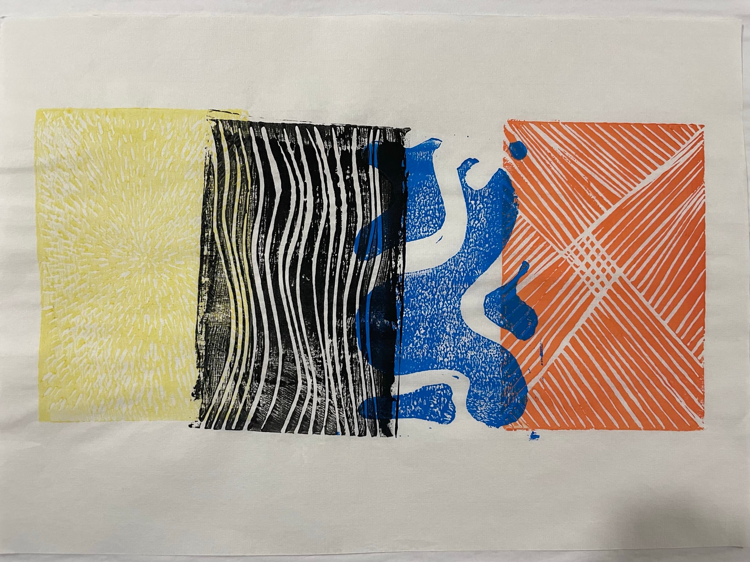
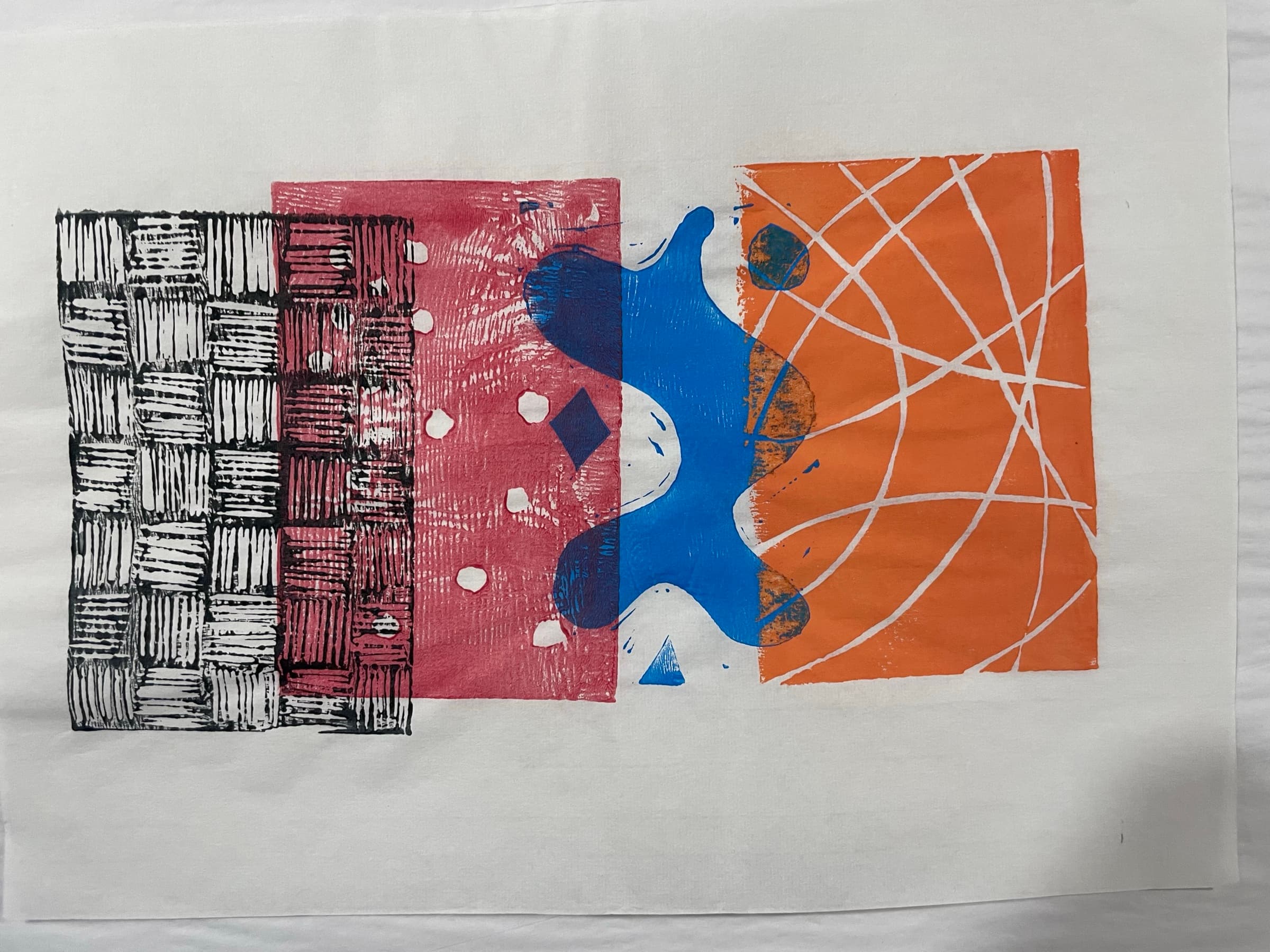
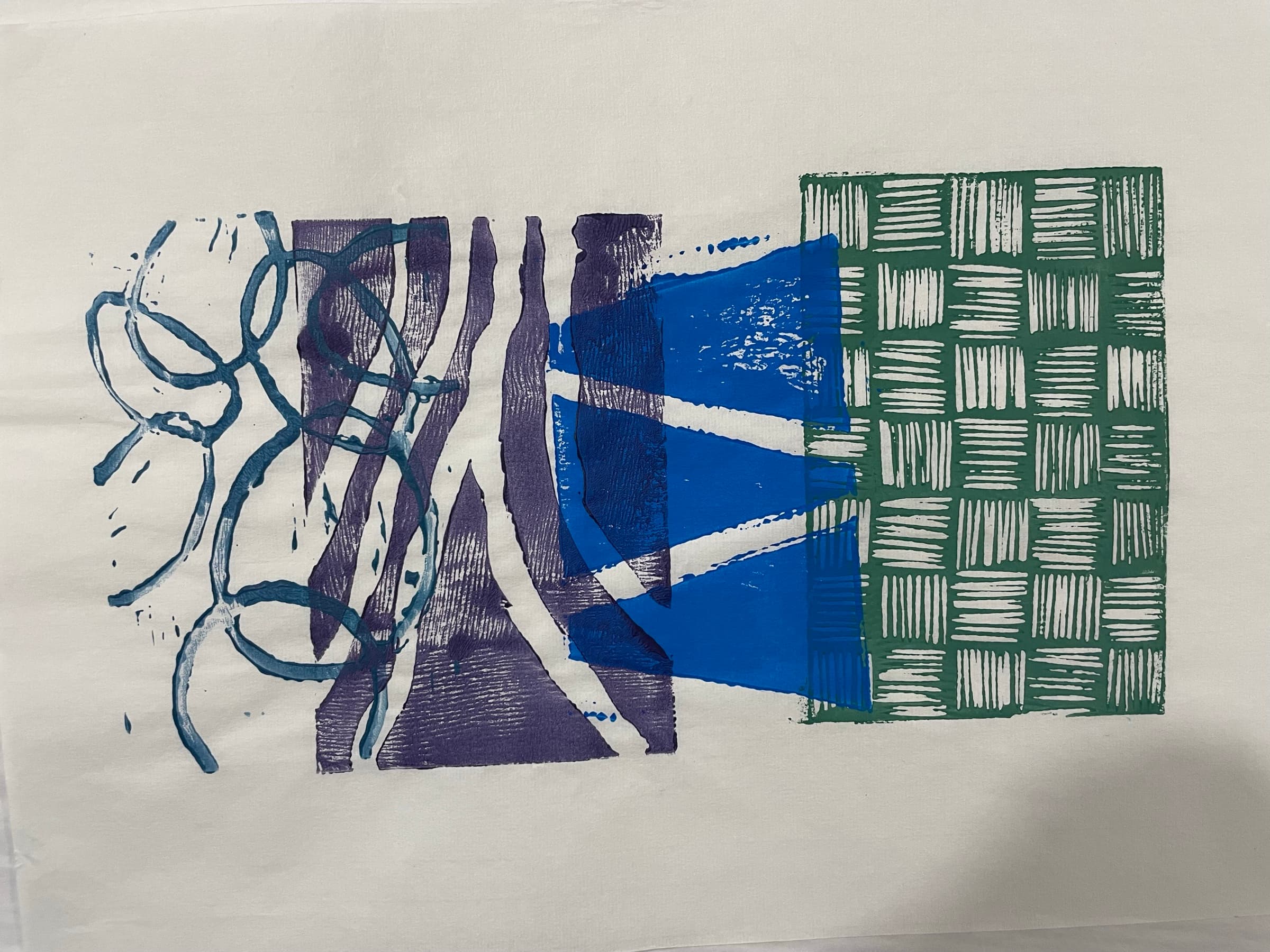
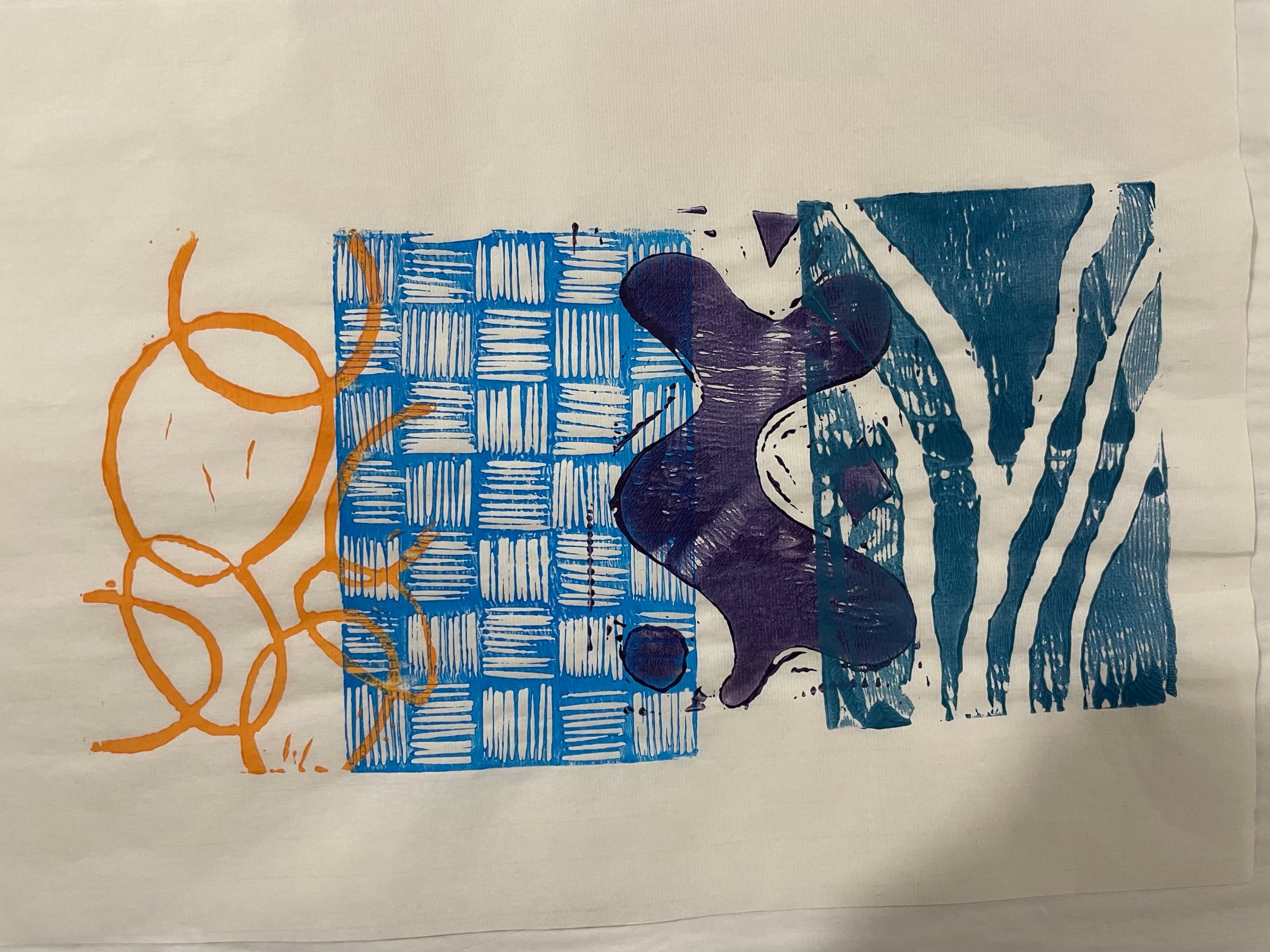
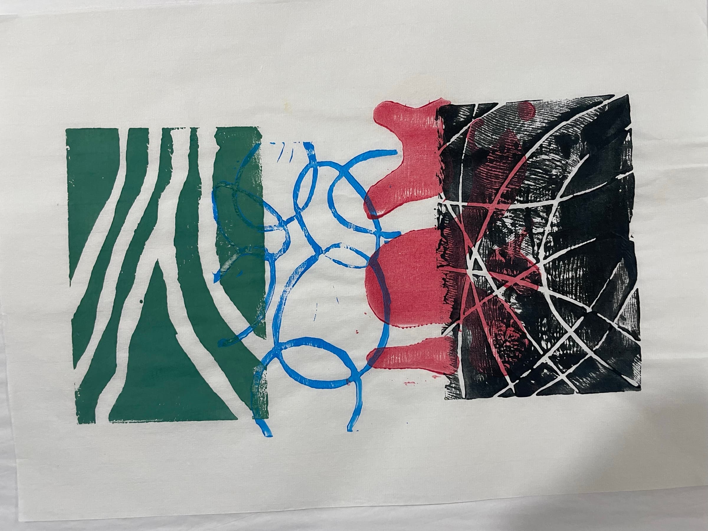
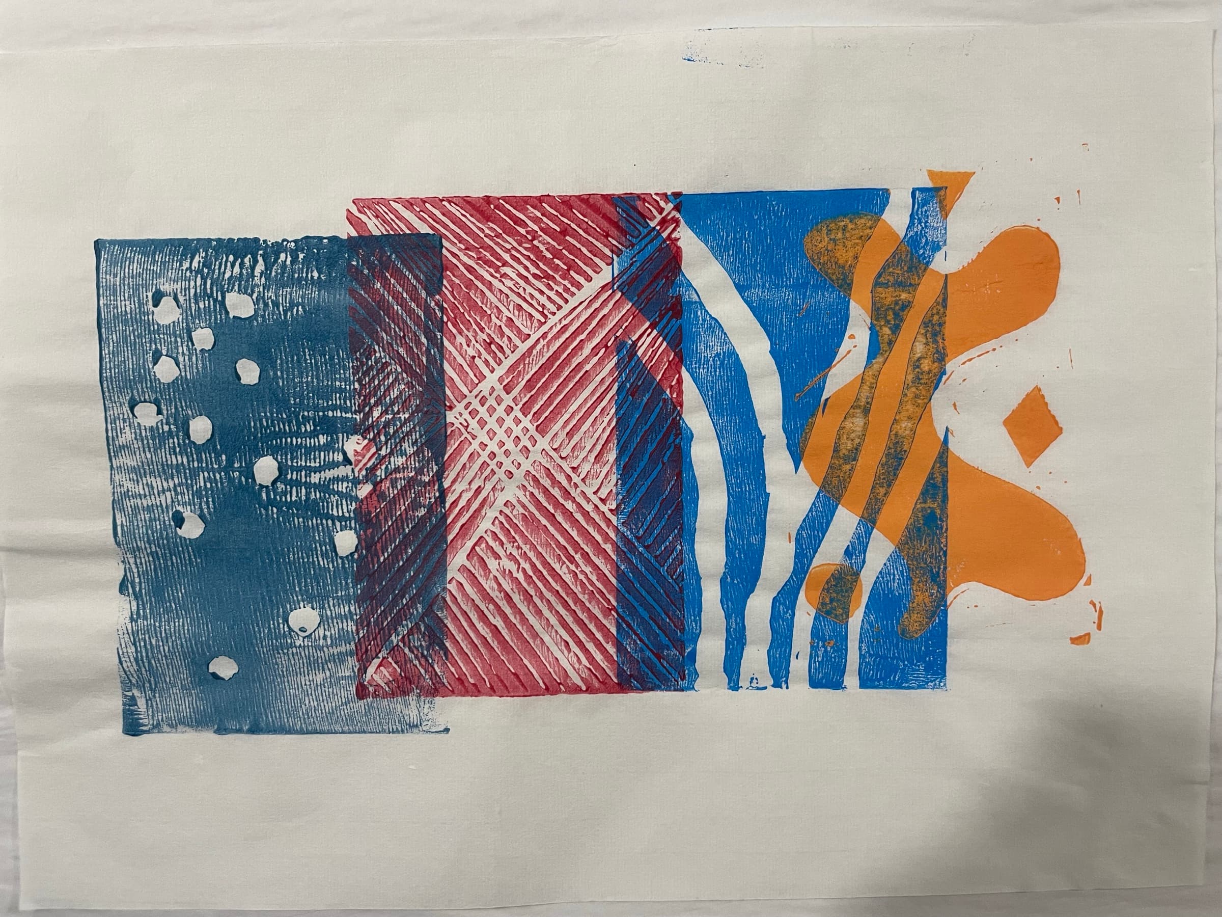
The misregistration is the point. The hand-pressed edge is the point. A perfectly aligned print is a screen-printed poster. The looseness is what makes it look like a person made it.
Closing