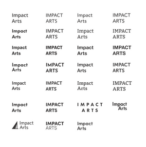
Impact Arts
Establishing brand architecture for a newly launched arts organization
Ginger Morris had been running Texas Arts Project and Summer Stock Austin for years before Impact Arts existed as a name. The organizations were strong. The story tying them together was newer, and it didn't have a brand yet.
She came to us with a question. What do we tell people about ourselves now that we are something larger than the parts.
We did the slow version of the work. Whiteboard sessions. Word maps. Two boards we could put in front of her board of directors that felt like opposite ends of one room: both honest, both Impact Arts, neither safe.
She picked one. The rest of the system fell out from there.
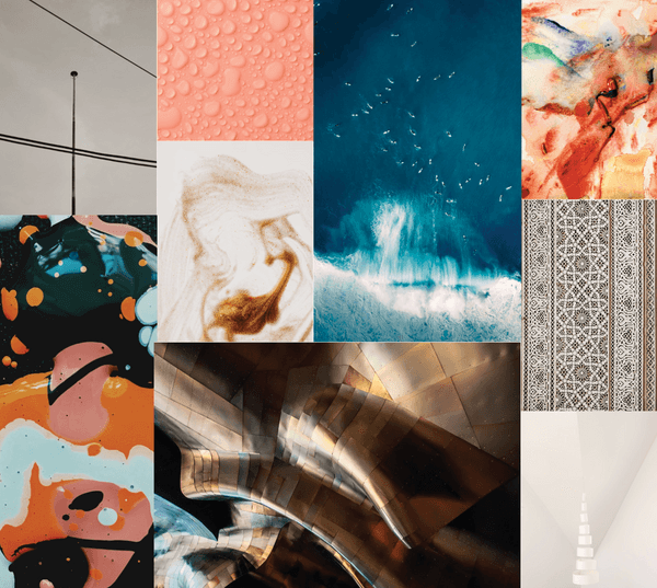
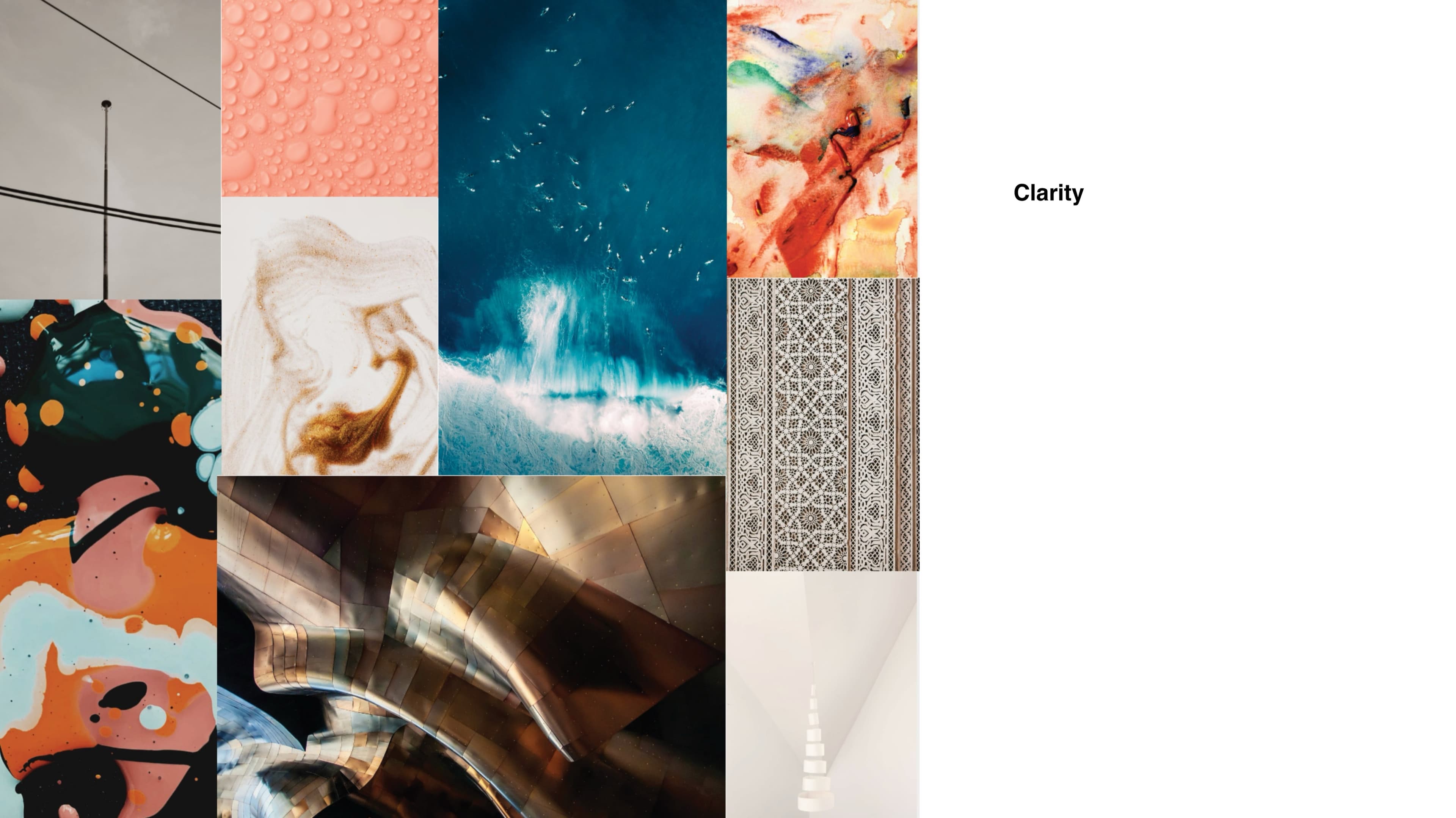
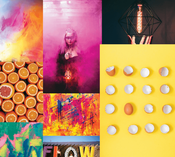
Concept 1
Clarity
"I want to help you find the way. I'm worldly, confident, and content. I see all and know all. I'm a mentor, a guide, a teacher. I speak softly and about grand things. Sometimes chaotic and sometimes methodical, I'll always provide a complete picture."
Play with contrast. Light to dark.
Small patterns. Natural lines.
Natural colors. Gradients.
Layers. Subtle texture.
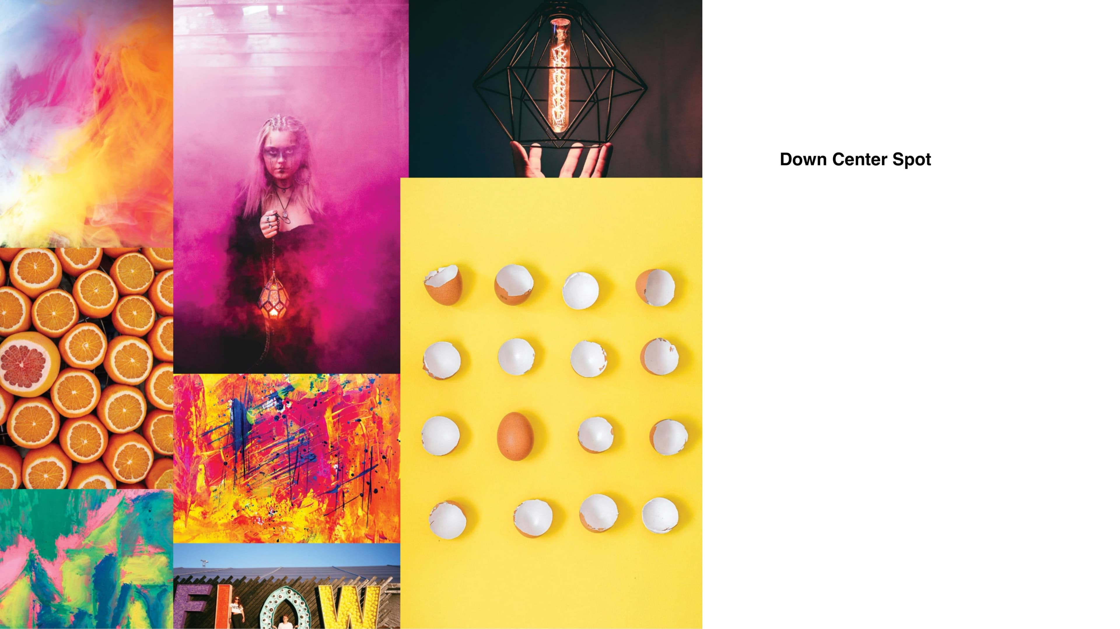
Concept 2
Down Center Spot
"I'm awake. I'm alive. I'm shining with brightness. I'm the impact in your daily coffee. I'm here to make change and be bold. If you need something done, come to me. We are going to make a difference. Promise."
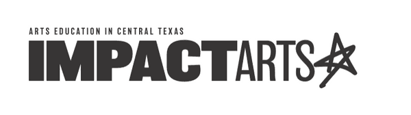
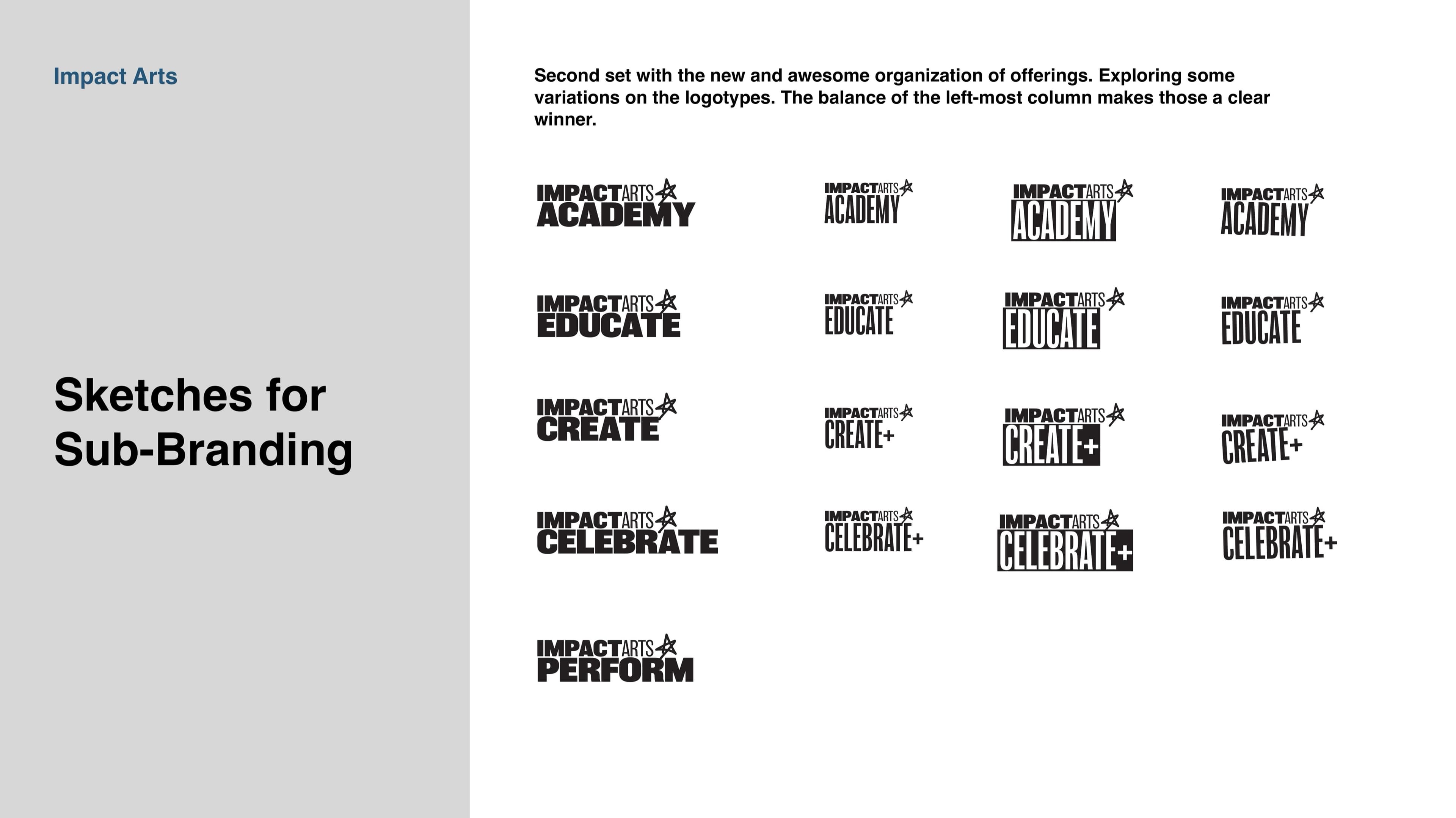
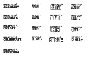
Logo
Sketches to Final
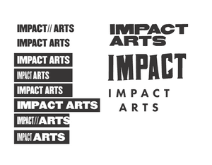
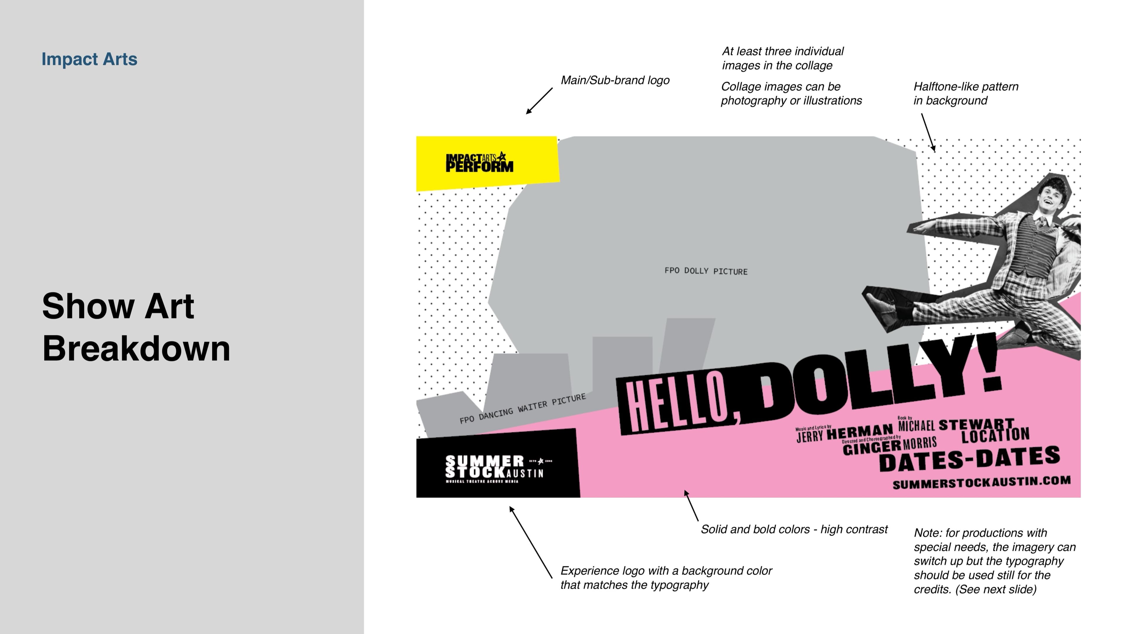
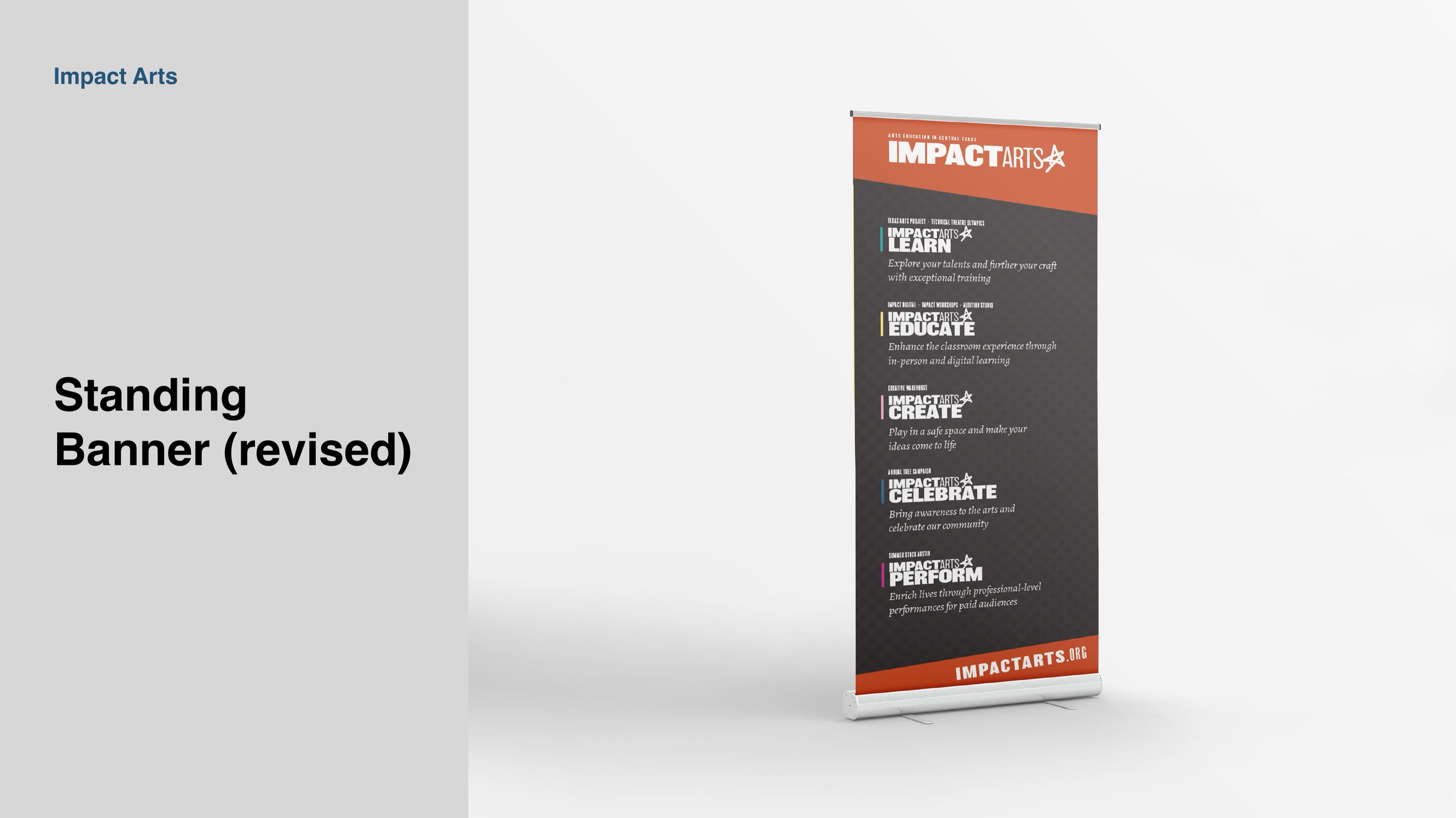
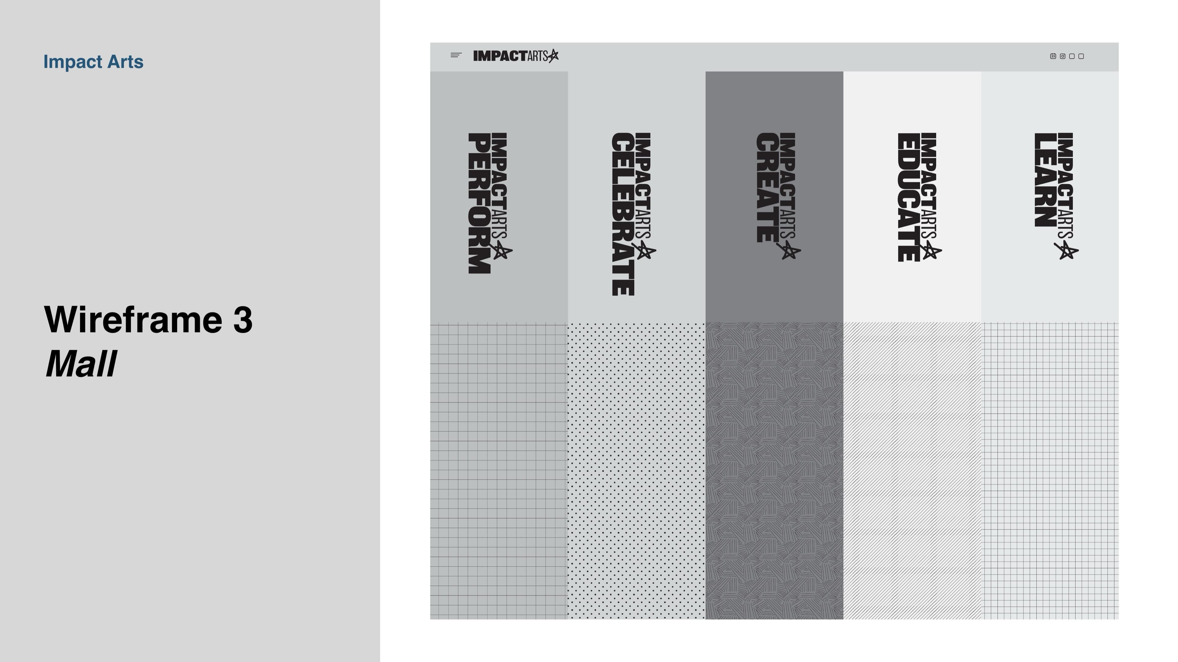
The two existing programs each got their own mark. Texas Arts Project and Summer Stock Austin had their own audiences, donors, and personalities. The new system gave each program a logo that was unmistakably its own, with structural DNA that made the parent brand obvious at a glance.
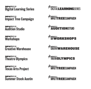
Type
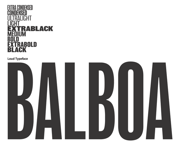
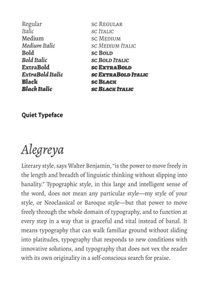
Loud, then Quiet
The typographic system has two registers. Loud, when the work needs to grab a passing student's attention from the back of an auditorium. Quiet, when the same brand has to write a thank-you letter to a donor. The rules are about knowing which one to use, and not mixing them within a single piece of communication.
Plenty of clear space. Do not abhor a vacuum.
Follow proper grammar and punctuation.
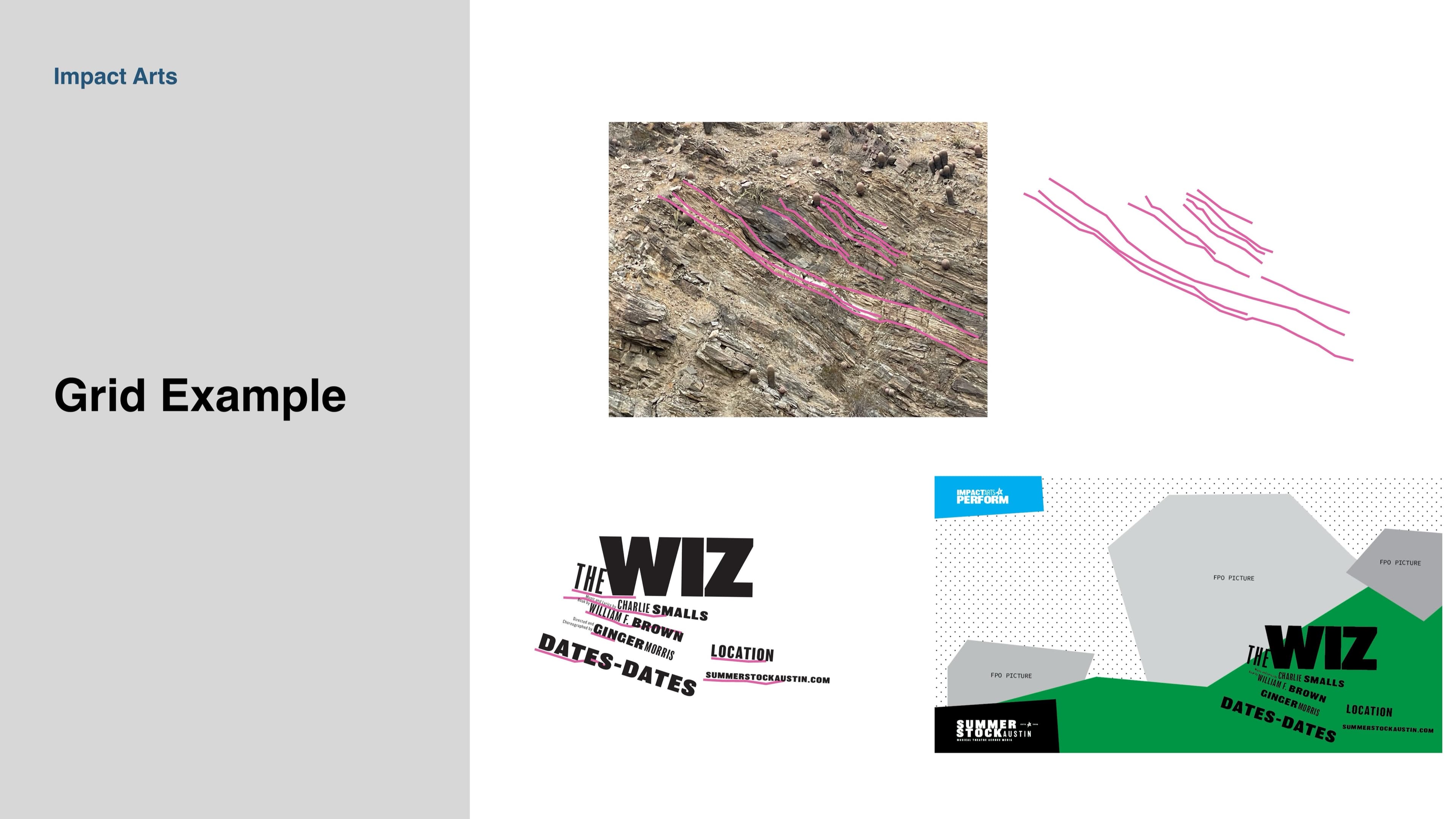
Everything has an underlying grid.
Everything is legible. Hierarchy is key.
The grid came from the landscape. The American Southwest pushes upward in shelves and strata, layer over layer, in colors that get more saturated when the sun is low. The visual language of Impact Arts borrows that. The arts can have a seismic impact on young people. The brand speaks with confidence and urgency.
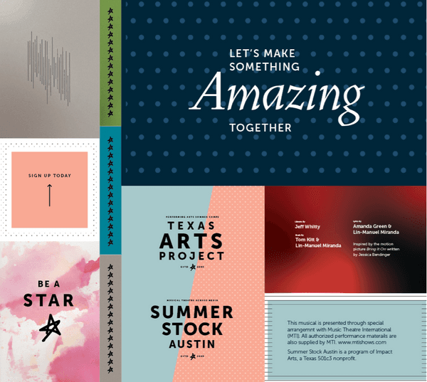
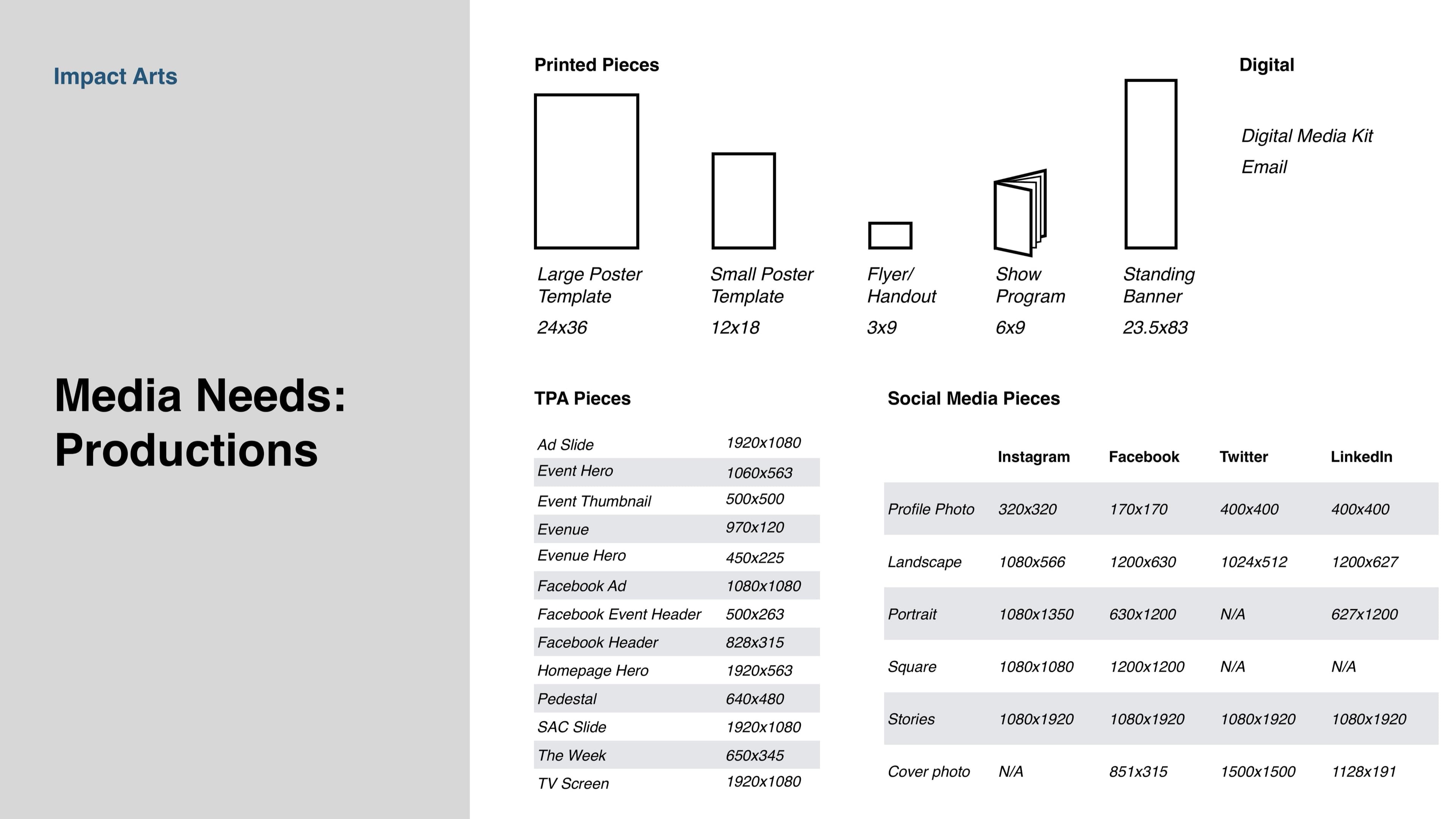
The workbook
Forty-six pages of the system.
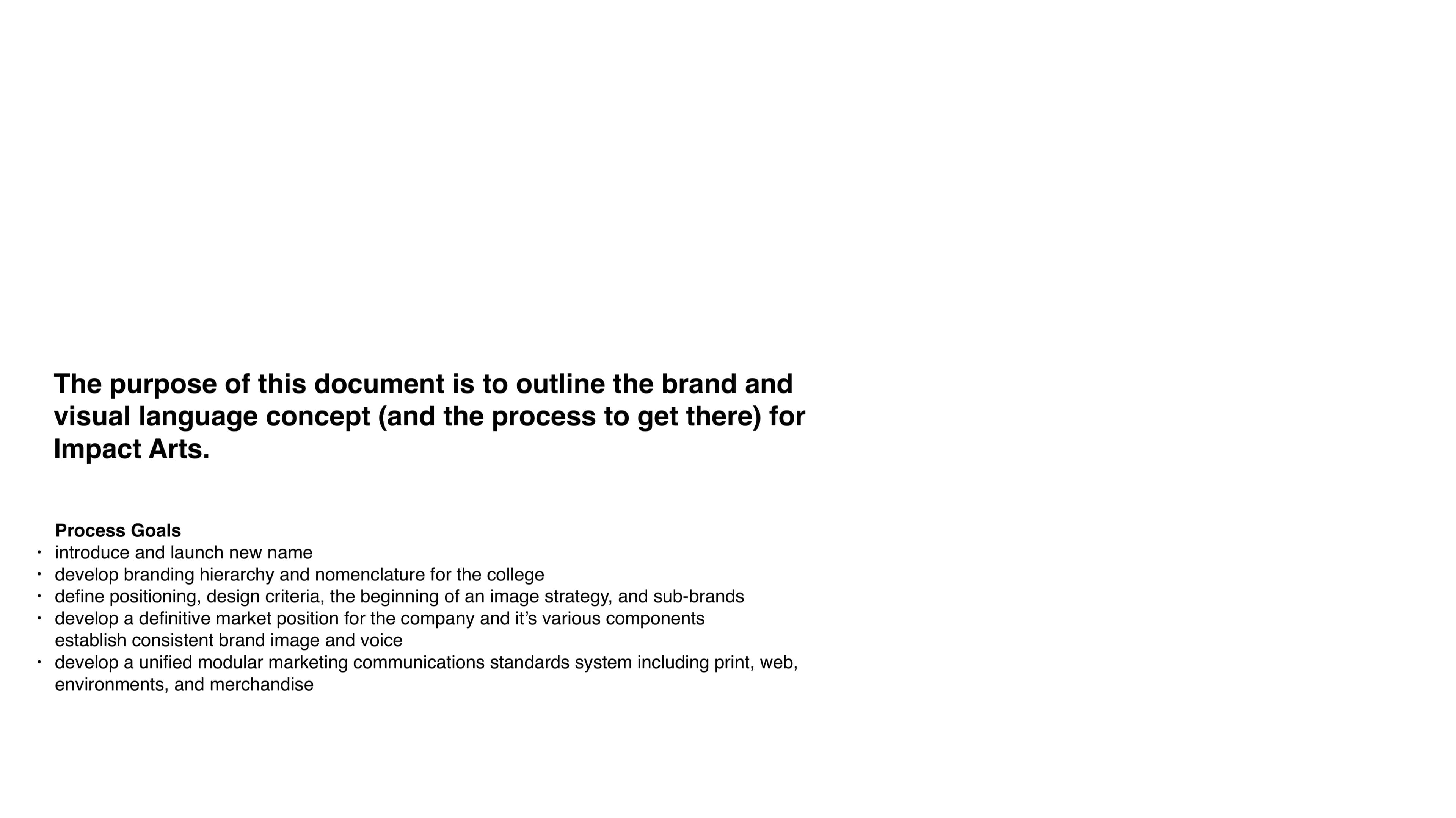
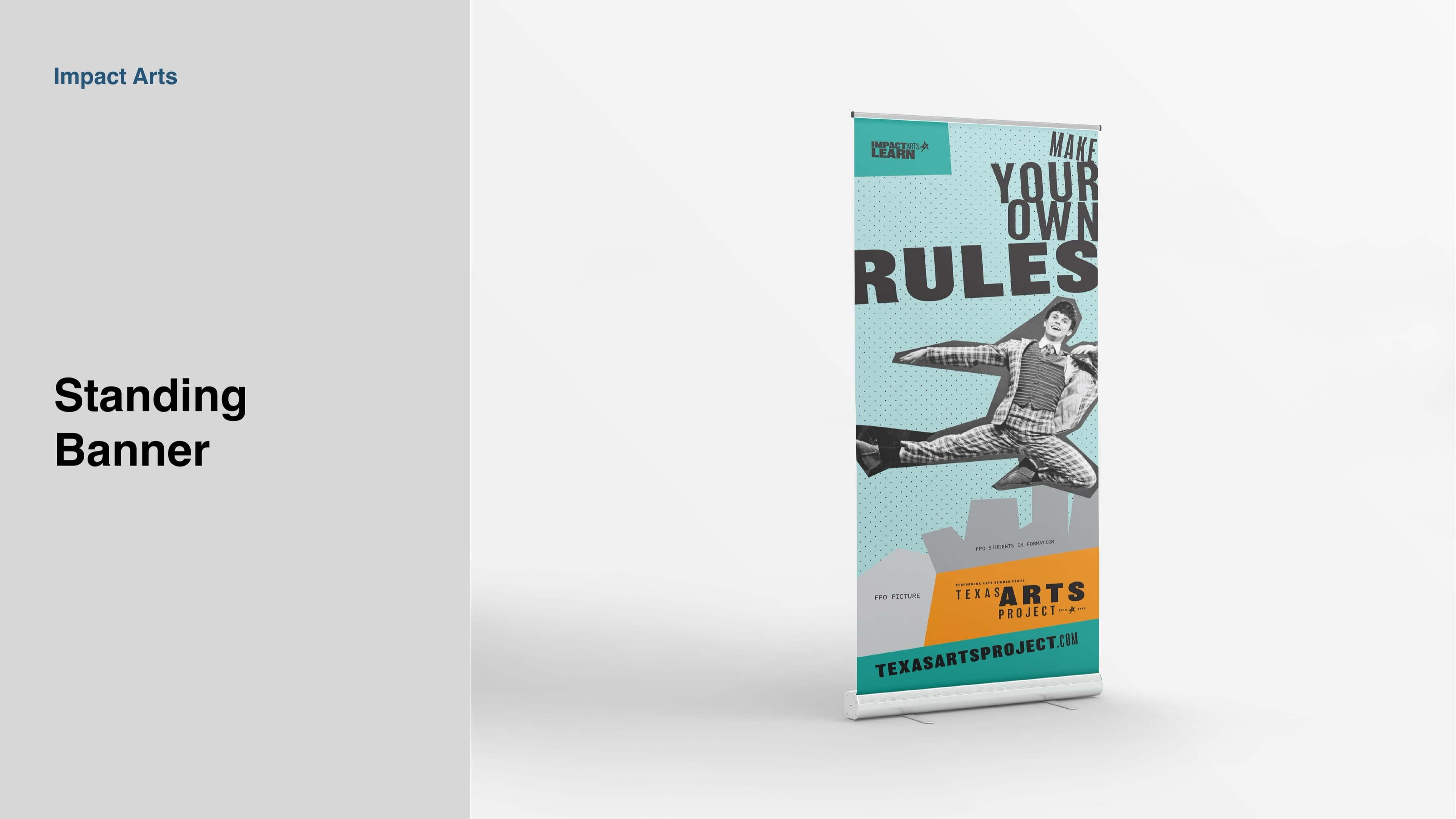
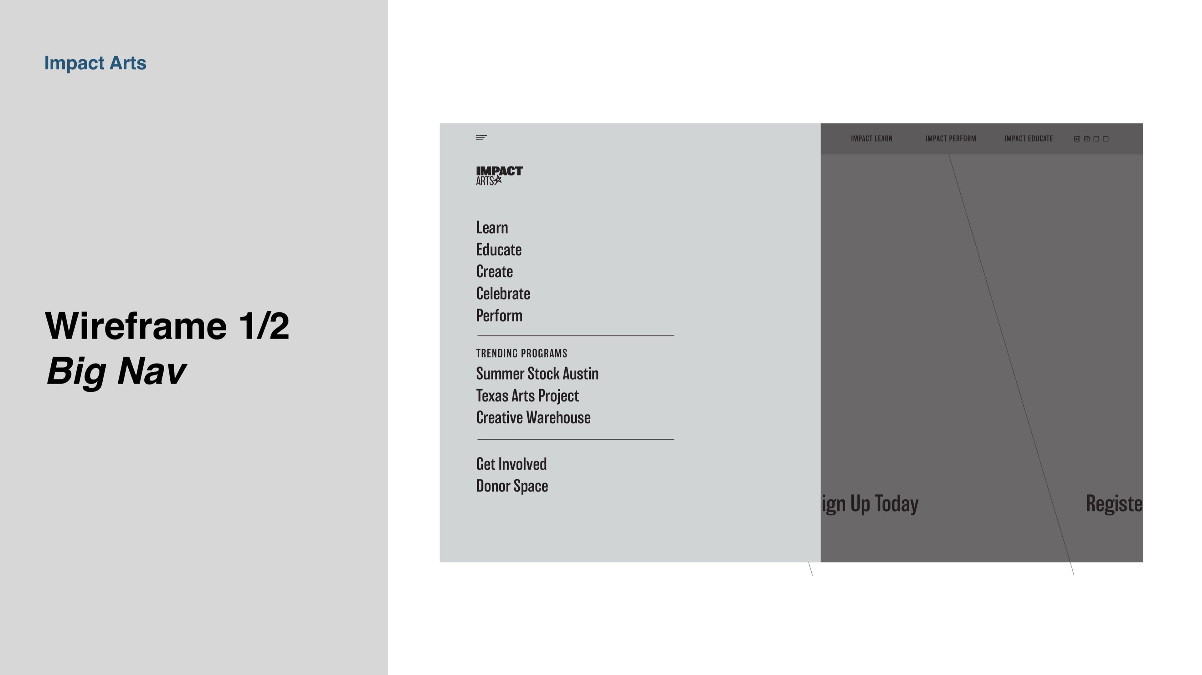
The deliverable that outlasted the launch was the Brand and Visual Language Workbook. Forty-six pages, every artifact in the system, every typographic rule, every sub-brand lockup, every standard production size, every wireframe for the website. Half rule book, half production schedule. Selected spreads below.
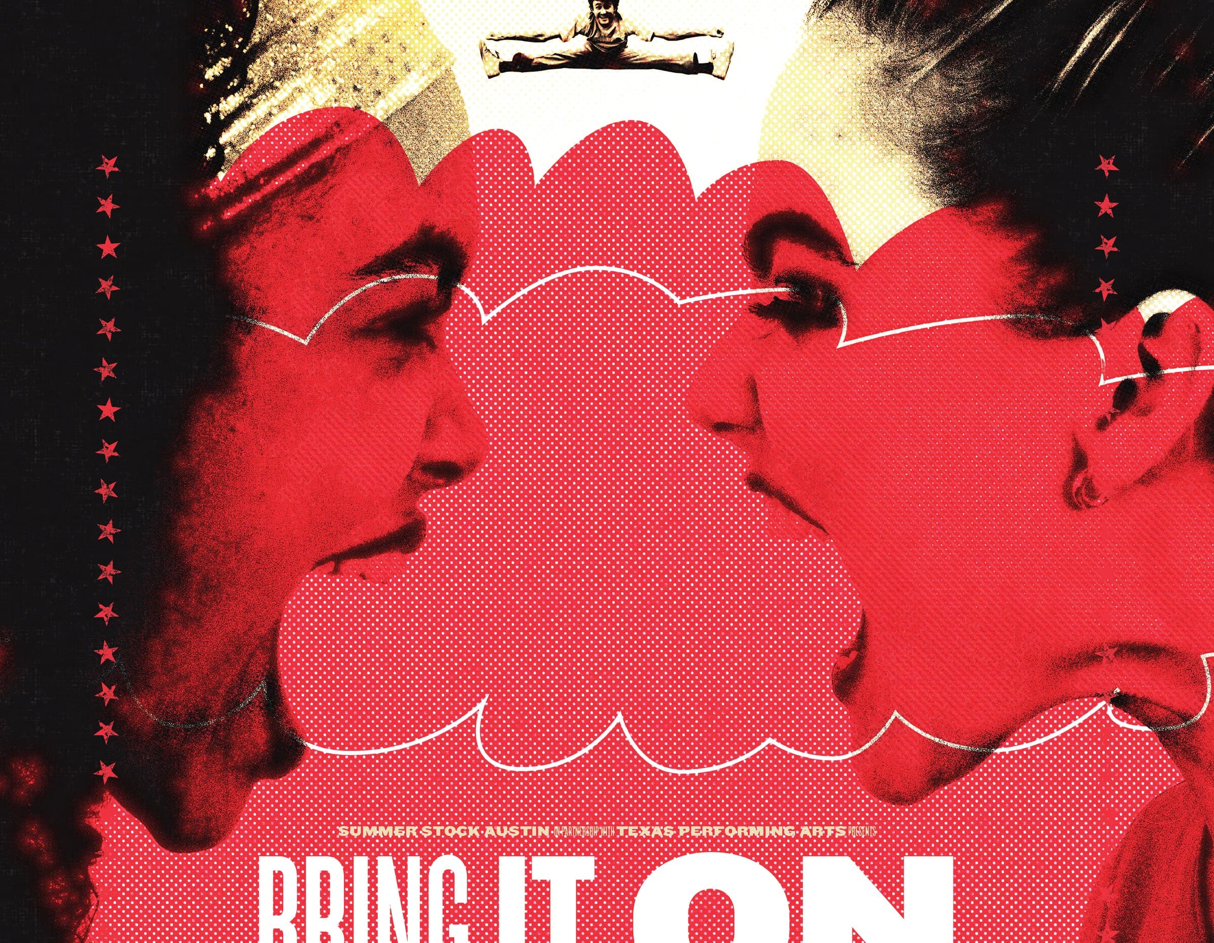
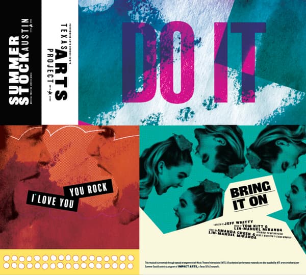
Application
Pre-Release Materials
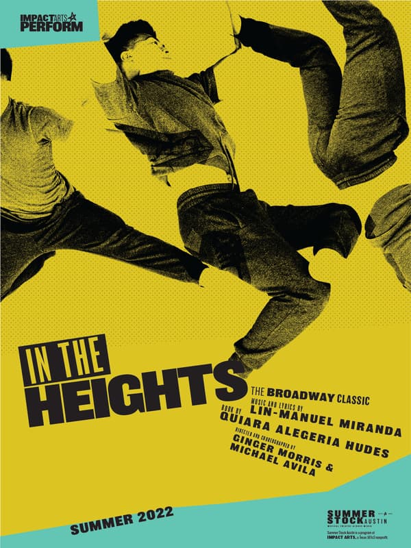
First application of the new system. Pre-release materials for Summer Stock Austin, the program that has trained Central Texas high-school performers for almost two decades. Posters, social posts, the audition packet, the season announcement.
"I've worked with John and The Collective for two decades. From the Texas Arts Project to Summer Stock Austin to ImpactArts, we've created educational brands that have transformed the lives of young performers across Central Texas. The Collective always starts from research and leads to unique experiences. Constantly surprised by their out-of-the-box points-of-view and insight-driven approaches that always lead to powerful outcomes. And everything looks amazing!"
Ginger Morris, Founder · Impact Arts
- Impact Arts
- Arts and Non-Profits
- Education
- Brand Strategy
- Creative Direction
- Design Direction
- Brand Identity
- Typography
- Visual Vocabulary
- Ginger Morris (Founder, Impact Arts)
- Made By the Collective