Palm Springs Book Fest
A modular poster system for a desert literary weekend
Palm Springs Book Fest is a three-day weekend, March 27–29, 2026, at Festival Theaters in the desert. Thirty-plus authors. Friday and Saturday on tickets, Sunday open to the community. Bestsellers, book club picks, Pulitzer winners, in conversation with moderators ranging from journalists to literary agents.
The festival is produced by OUTspoken, a nonprofit, with Jason Blitman as Project Director. Jason also hosts Gays Reading, the podcast that turned a niche of literary conversation into a national one, and that DNA runs through the brief: warm, irreverent, plural, audibly literary. A festival for readers, by readers who think their queerness, their politics, and their summer beach reads belong in the same conversation.
The brief was a whole identity, not just a poster. A wordmark, a voice, an out-of-home campaign, and a system the festival could keep using as the lineup grew. The work is built on one idea: every great book has a double meaning, and so should the campaign. The audience reads each headline once and gets one joke. They read it again and the joke gets sharper.
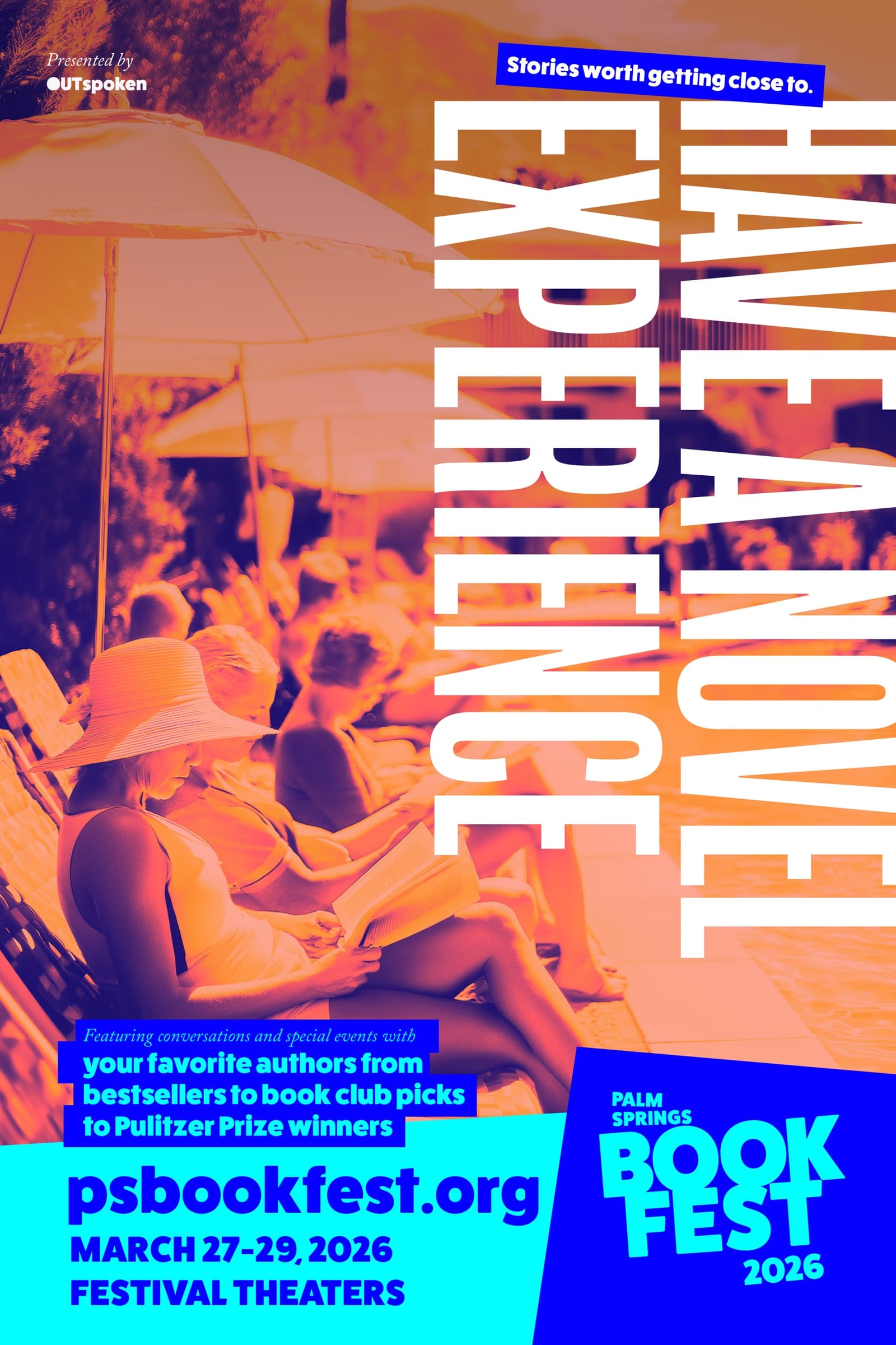
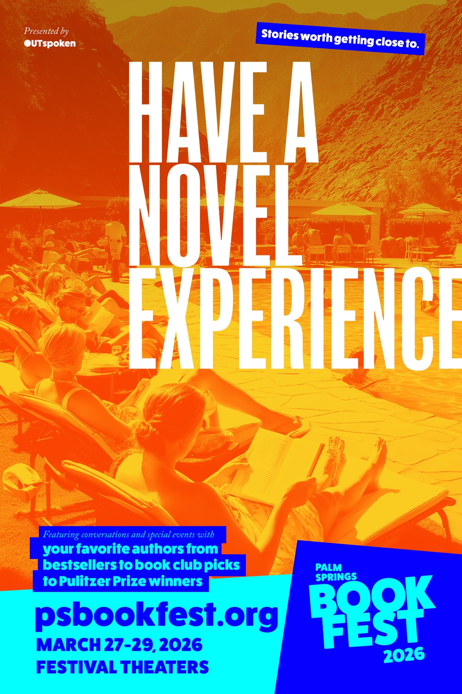
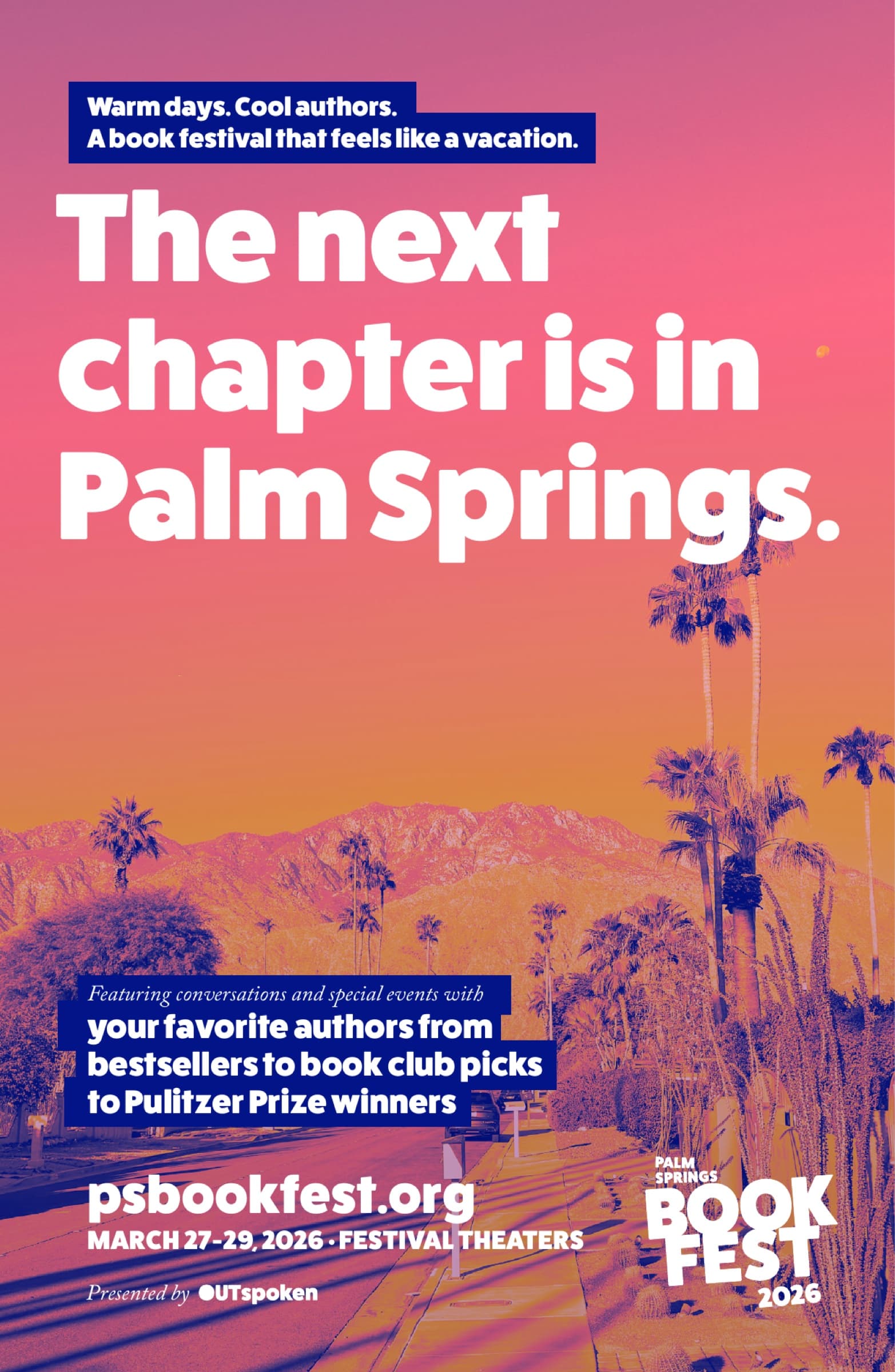
What separates this from a one-off campaign is the system underneath. Every poster is built from two halves, a typographic top and a photographic bottom, that the festival can recombine on demand without ever opening a new file.
The mark
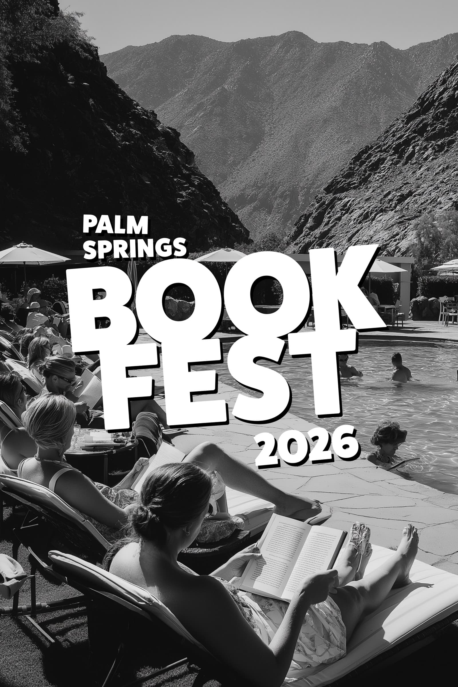
Palm Springs Book Fest.
The wordmark is one extra-bold geometric sans set in three rows. PALM SPRINGS reads as a small label across the top. BOOK FEST claims the rest of the lockup at twice the height. The shape is heavy on purpose. It holds at billboard scale and at avatar scale, and the round counters on the B and the O give it the soft, sun-warmed feel a desert festival earns.
The voice
Headlines that read twice.
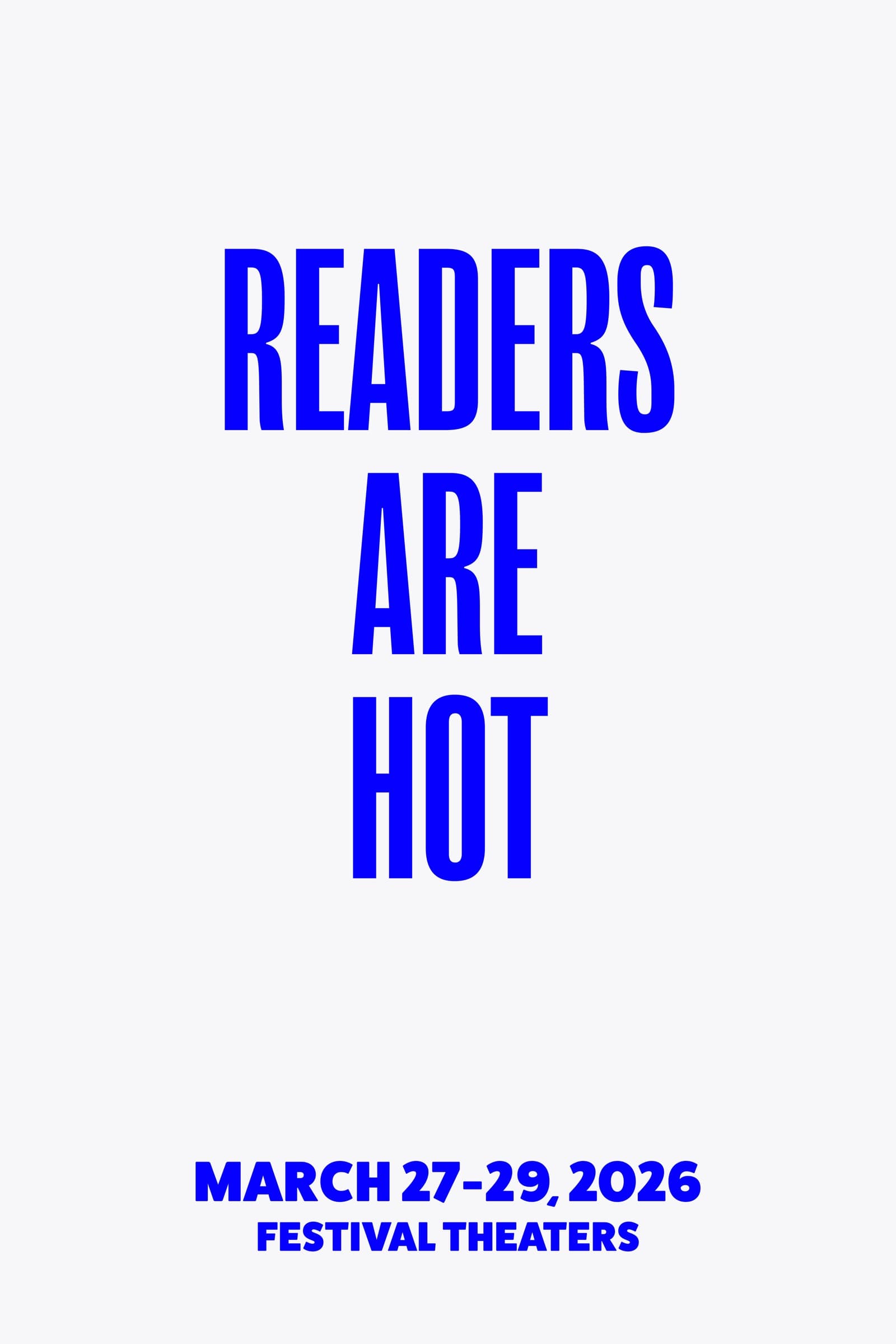
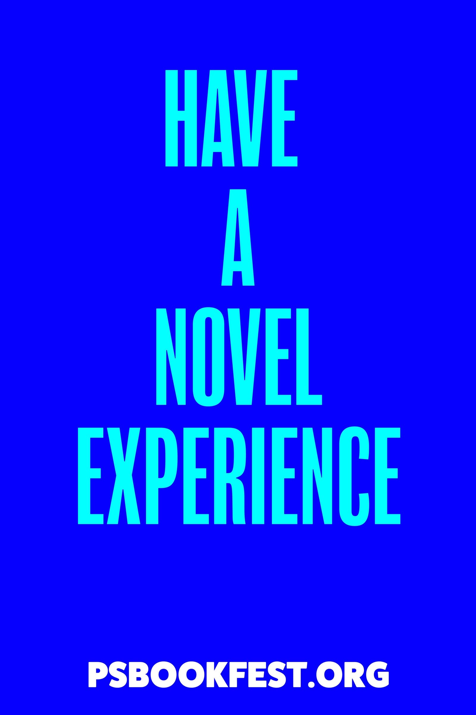
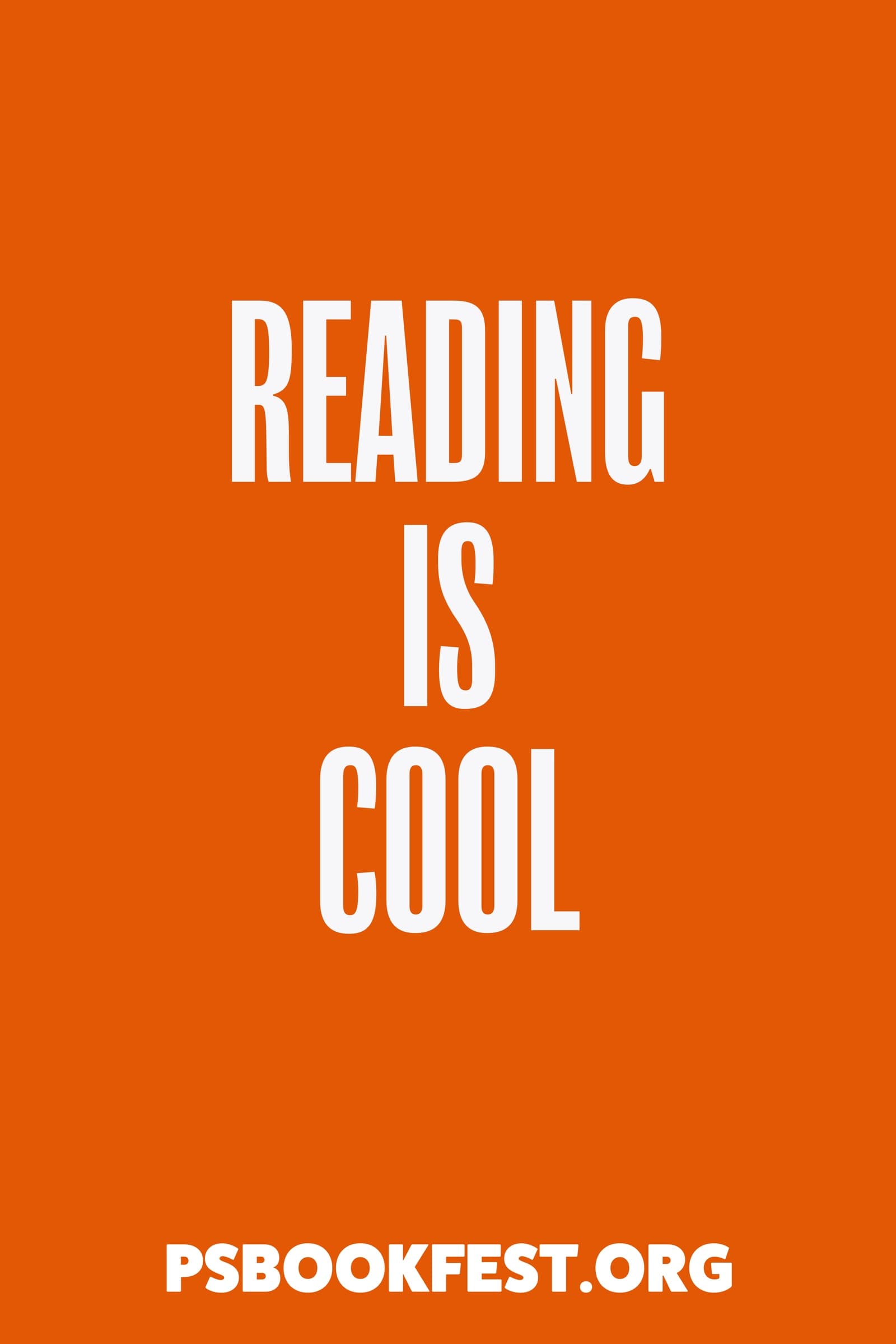
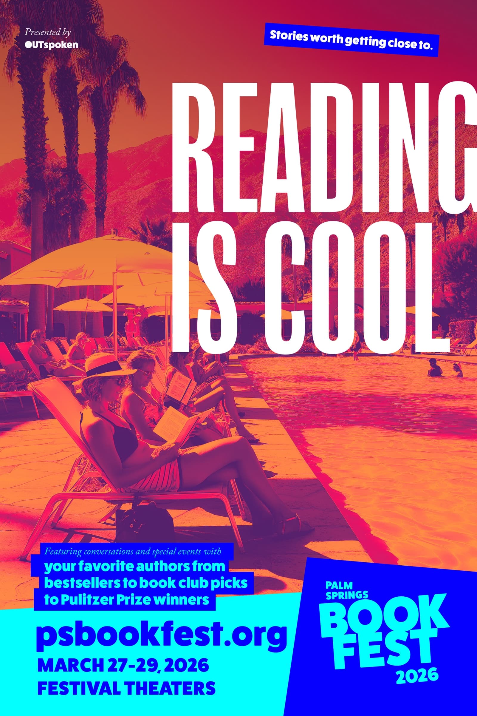
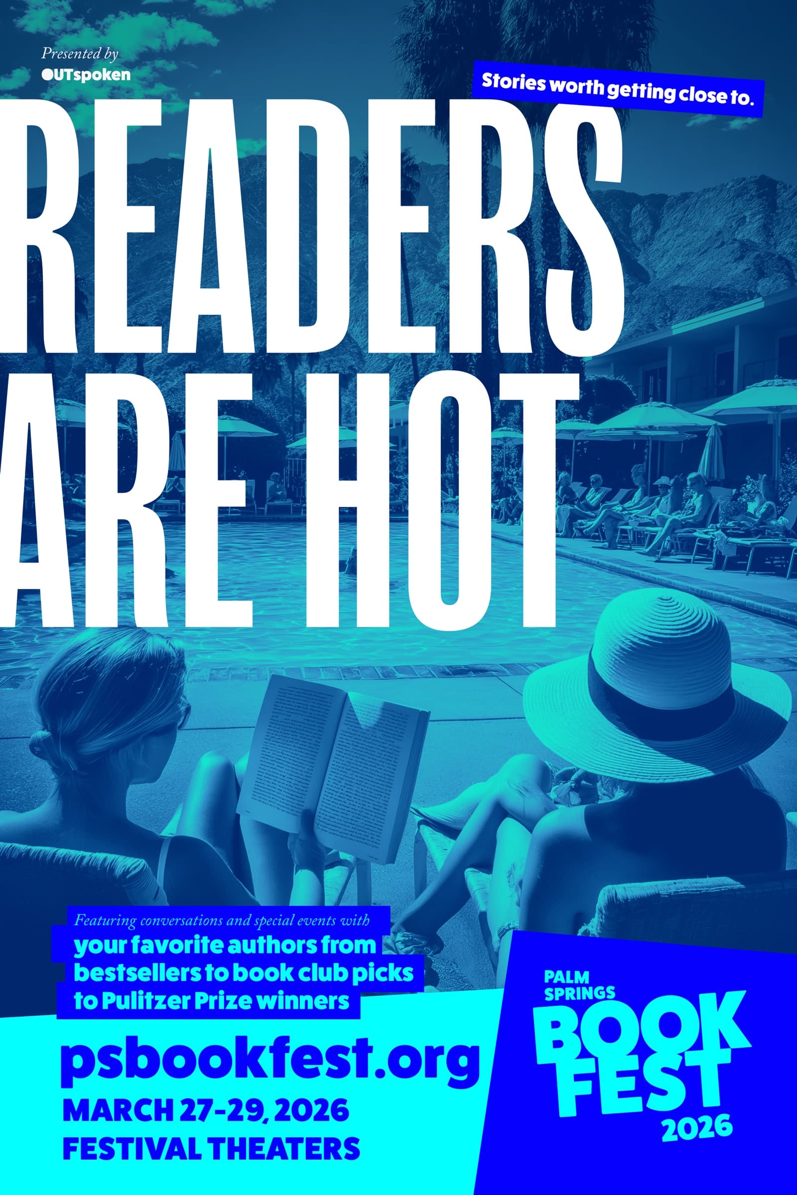
The campaign is a stack of double-meanings. The festival catches you reading the line, then catches you smiling about reading the line. Every headline does the same trick. One noun, two senses, and the design lets both land.
The system
Two halves, one poster.
Every poster is built from two halves the festival owns separately. The top half is one of the wordplay headlines on a flat color field. The bottom half is a black-and-white photograph of someone reading by a Palm Springs pool with the BOOK FEST mark dropped onto the image. The two halves stack to make the full poster. They can also be deployed alone: the typography for moments where the photo would be too much, the photo for moments where the joke would be too much.
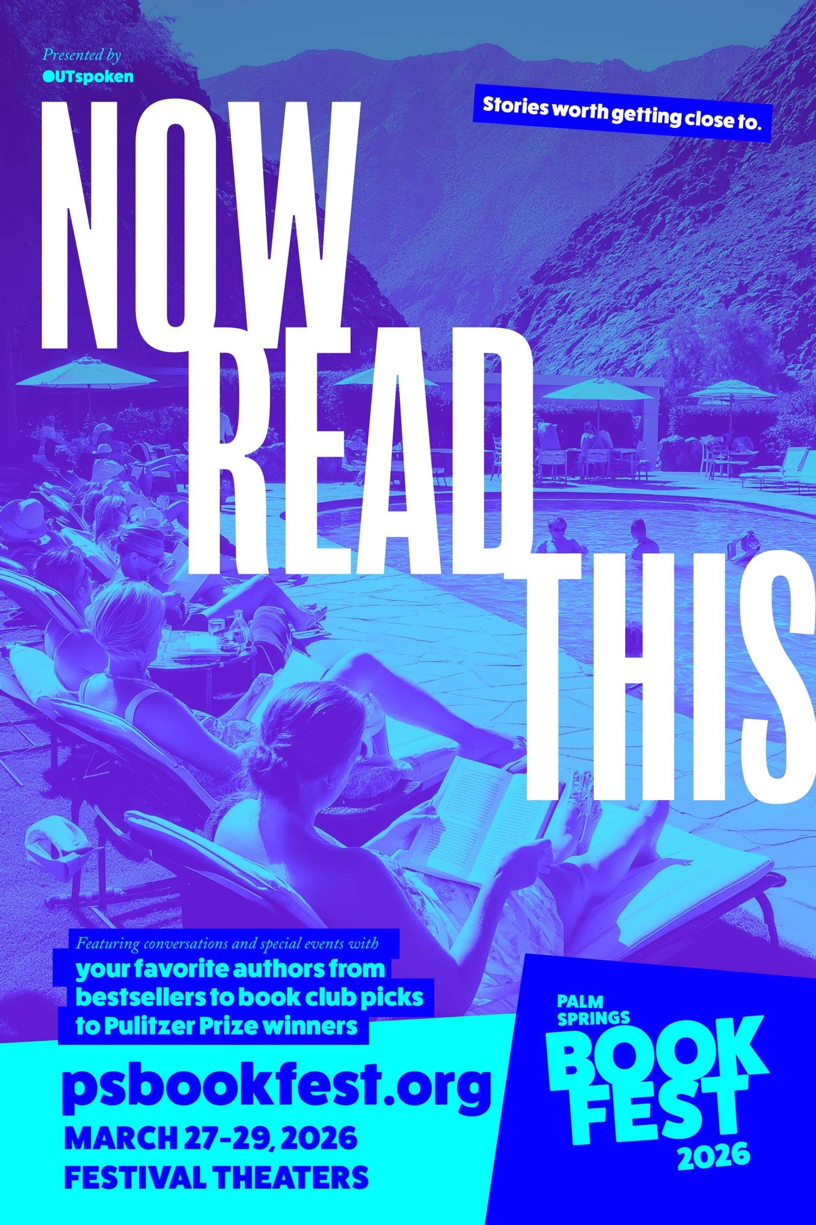
Same wordmark, same headlines, same photography. The variation comes from the duotone. Each pairing is pulled from the brand palette, which is itself drawn from the desert across the day: first light, midday glare, late afternoon, dusk, the deep blue after the sun is gone. No rule about which palette goes where; whichever one made the poster sing was the one we used.
A single working file produces poster, half-page ad, social square, and lockscreen wallpaper without anyone redrawing anything.
The print pieces ship in CMYK with named spot replacements; the digital pieces ship in sRGB; the OOH pieces ship at the printer's preferred resolution. The whole thing fits in one folder.
The festival's marketing lead can build a new poster in five minutes by swapping a top, a bottom, and a palette.
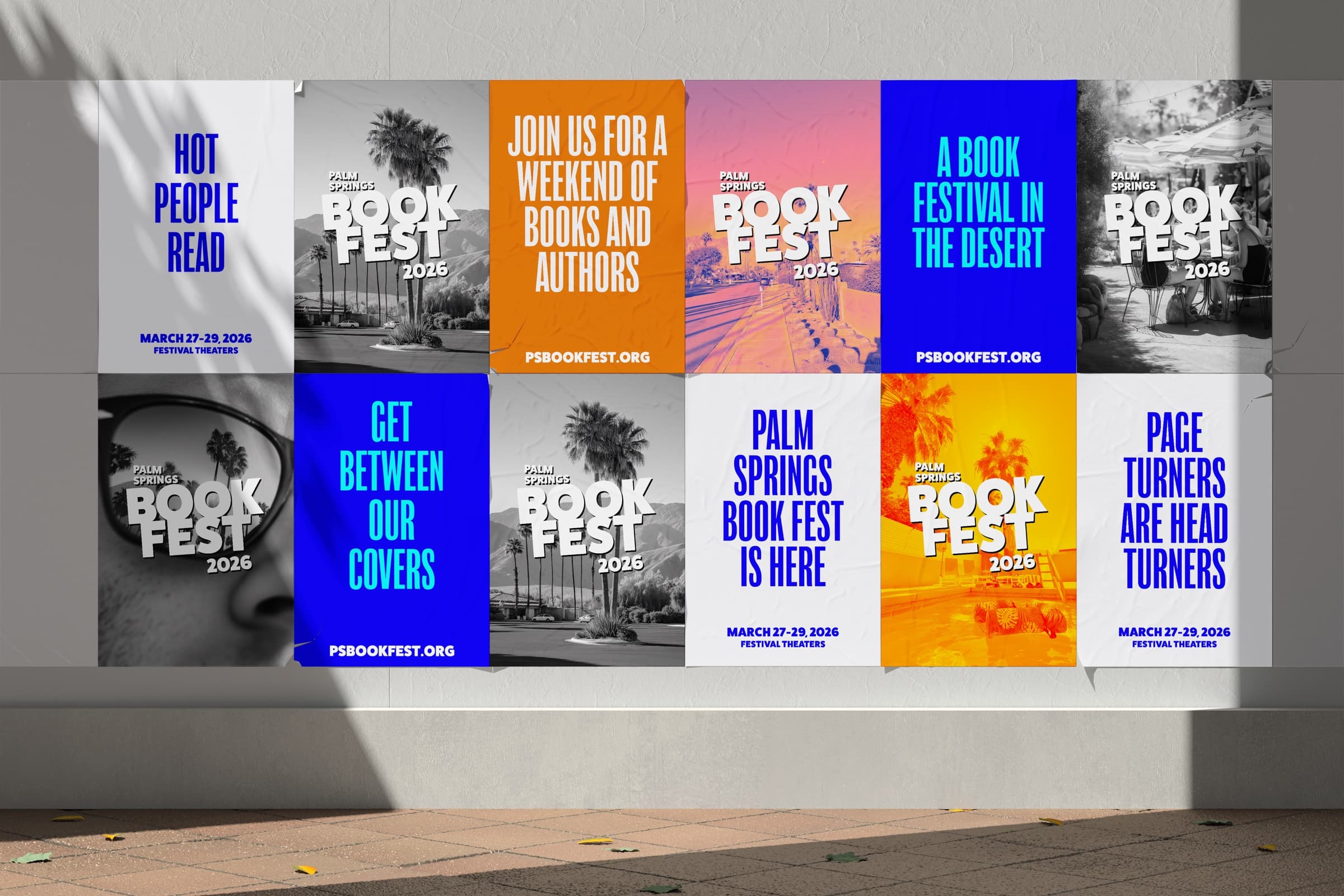
The series
Six posters. One weekend.
Out of home
The next chapter is in the desert.
The festival placed a full page in the Aspen Film Festival program. Same audience, different season. The kind of person who books a winter vacation around a film program is the same kind who'd book a March weekend around a book program; the ad just had to put Palm Springs in front of them while they were already paying attention to a printed schedule. Same system, vertical aspect, photography turned to dusk.
In the wild
On the wall, in the weekend.
Collaboration
With Jason Blitman, Project Director at OUTspoken and host of the Gays Reading podcast.
Jason brought the festival the audience and the voice. Gays Reading runs on tight, warm, smart conversations between Jason and authors he admires, and Palm Springs Book Fest is the IRL version of that same generosity: a weekend of recommendations from the friend who reads more than anyone you know. The brand had to match.
A festival brand is a conversation. The headline is the icebreaker, the photo is the room, the system is the way you keep walking up to people for three days without repeating yourself. Build it once, build it well, hand it back, and the festival keeps using it long after the weekend is over.
Takeaways
- Palm Springs Book Fest
- Arts and Culture
- Events
- Literature
- Creative Direction
- Brand Identity
- Art Direction
- Print Production
- Brand Identity
- Editorial Design
- Out of Home
- Type System
- Jason Blitman, Project Director · OUTspoken
- Jason Blitman, Host · Gays Reading podcast
- OUTspoken
- Festival Theaters
- Hey Books!
Up next