The Collective
Launching the studio I built: the brand, the manifesto, the materials
The Collective is a studio of doers and makers from divergent backgrounds, solving problems through curious execution. Founders, in-house design teams, arts non-profits, Fortune 500 product groups. We needed a brand that could open the door to all of them at once.
This is the launch system. The wordmark, the avatar, the manifesto, the buttons, the deck templates, the print, the voice. The package we used to introduce the studio to the world.
The visual idea was a contrast: lightness and joy on one side, stern typography on the other. Hand-lettering pinned to a strict grid. Mustard warmth pinned to deep ink black. The two halves hold each other up. Take either out and the work goes flat.
We pulled the influences from a long list and edited them down to three. Bauhaus, for the discipline of the grid and the conviction that color and form can carry an idea by themselves. Neo-modernism, for the way it lets warmth and craft into a system without softening the system. The wayfinding at Schiphol airport in Amsterdam, for the specific calm of large type setting direction in a busy room: the moment a sign tells you exactly where you are.
Where it came from
Three reference points.
We pulled from a long list and edited it down to three. Each one contributed a specific thing to the system. Bauhaus gave us permission to let color and form do the work. Neo-modernism kept warmth in the grid. The wayfinding tradition at Schiphol airport in Amsterdam showed us how a single line of big type can set the tone for a whole room. None of these are quoted directly. All of them are present.

Exploration
Three names. One answer.
The studio went by three names before it was The Collective. Each name carried its own visual direction, its own room temperature, its own way of answering the door. Looking at them in order is the clearest way to explain why we landed where we did.
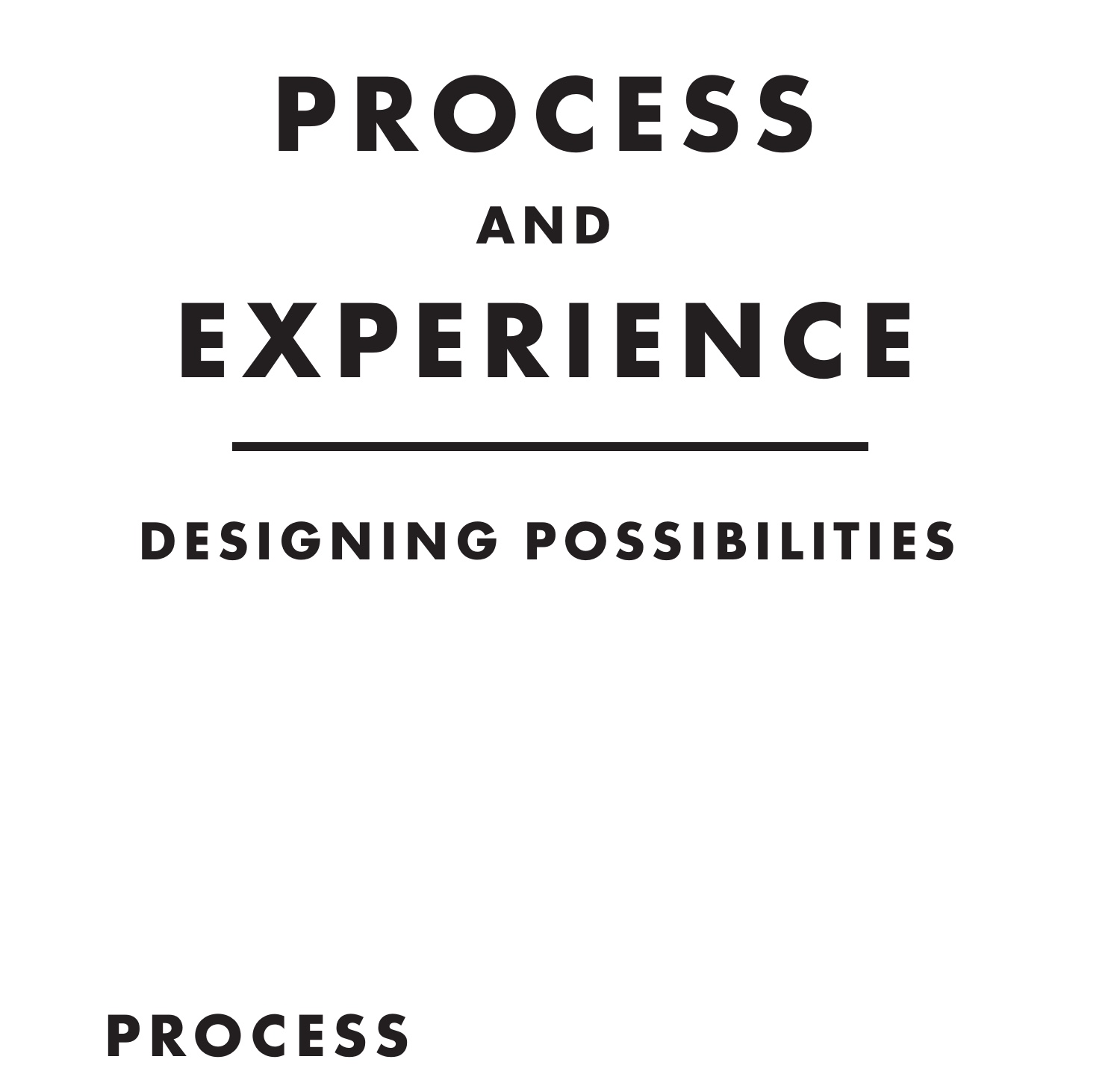
Name 01 · Process and Experience
Read as a course catalogue. Right energy for a conference, wrong energy for a studio.
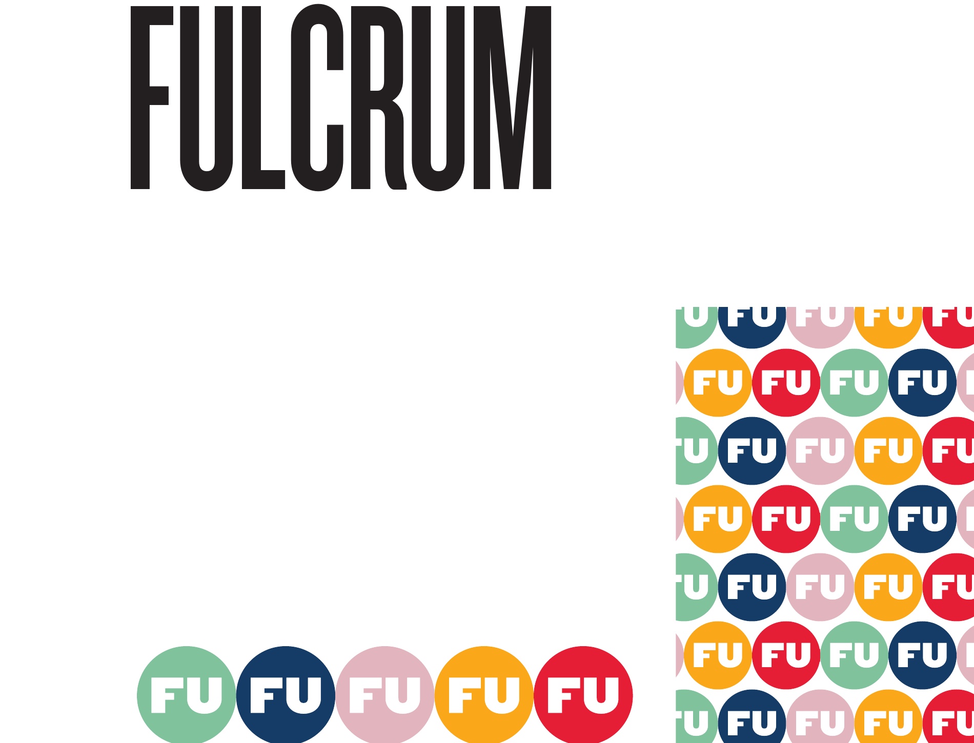
Name 02 · Fulcrum
Five colors of FU buttons before anyone read the second syllable. The mark out-talked the work.
Name 03 · The Collective · Shipped
A small "THE" over a bigger "COLLECTIVE." One phrase. Holds at a contract scale and at a button scale. Same room temperature for a Fortune 500 procurement desk and an arts non-profit on a shoestring.
Why this one
- Plural in the noun. The studio is not a person.
- Owns one word. Easier to say, write, and remember.
- Reads as inclusive: clients, collaborators, work.
- Survives the avatar test. THE / CO holds at 64px.
The mark
The Collective.
The wordmark sets a small "THE" above a bigger "COLLECTIVE." Same weight in both lines, so the lockup reads as one phrase. Letters sit tight, with the counters opened just enough to breathe at print scale. The mustard square avatar ("TH / CO") is what the wordmark becomes when it has to live inside a 64-pixel circle.

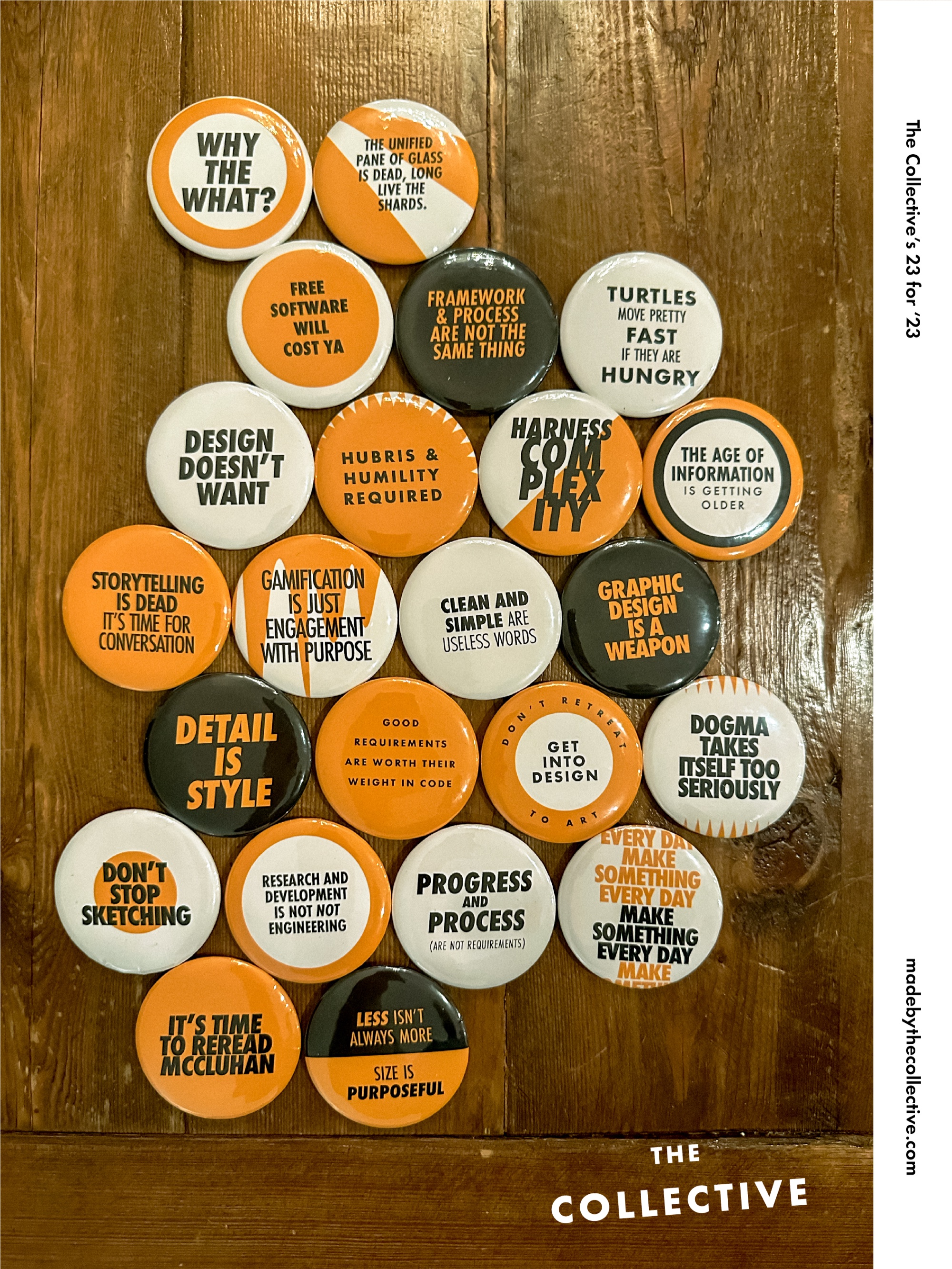
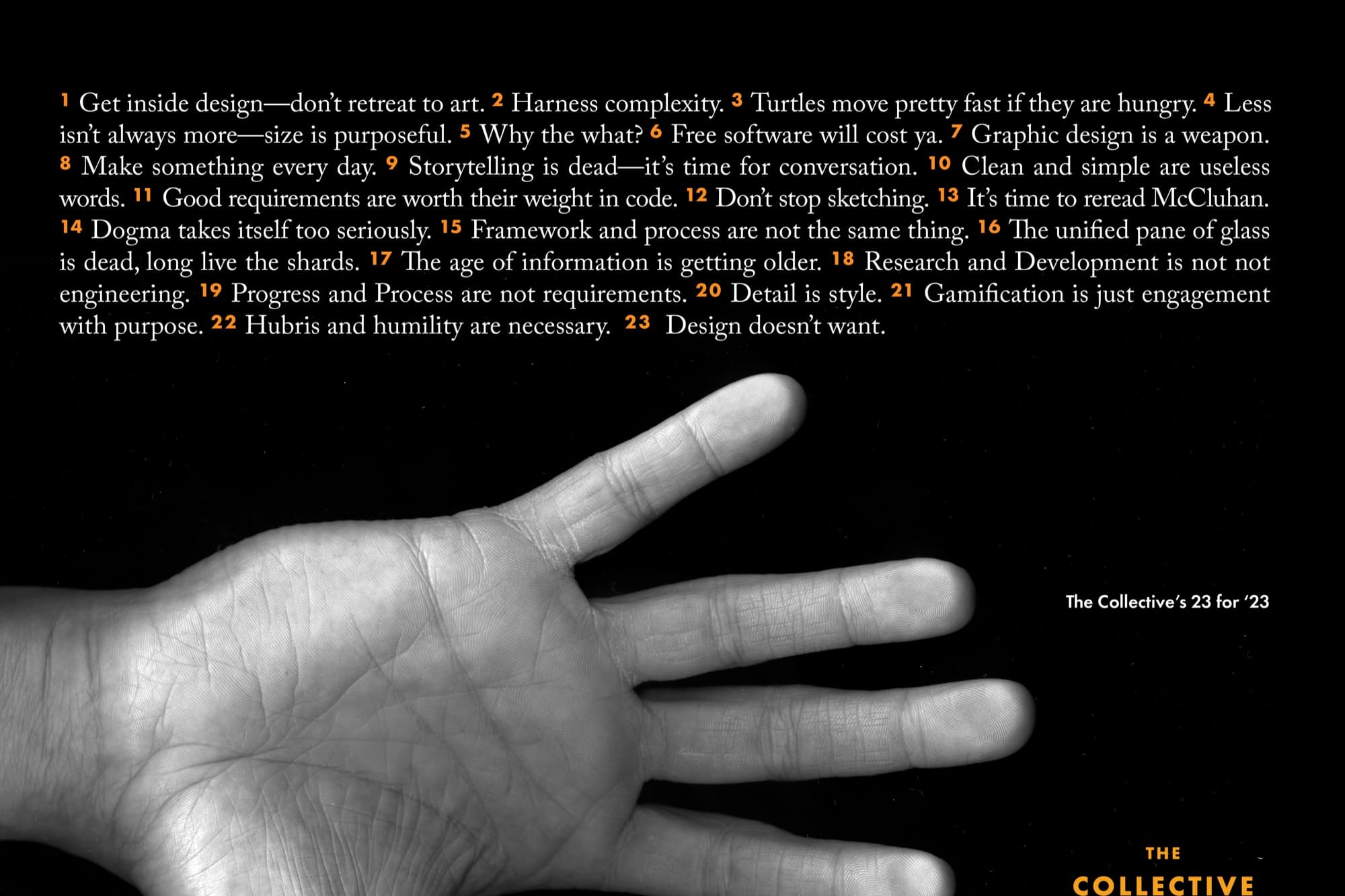
The Collective's 23
Twenty-three rules. Hand-lettered. For the year ahead.
Every January the studio writes a manifesto. Twenty-three short statements about how we work, hand-lettered onto a single page. Get inside design; don't retreat to art. Detail is style. Less isn't always more; size is purposeful. Storytelling is dead. It's time for conversation. The page becomes a poster, a mailer, a sticker sheet, and twenty-three pinback buttons we hand out at conferences.
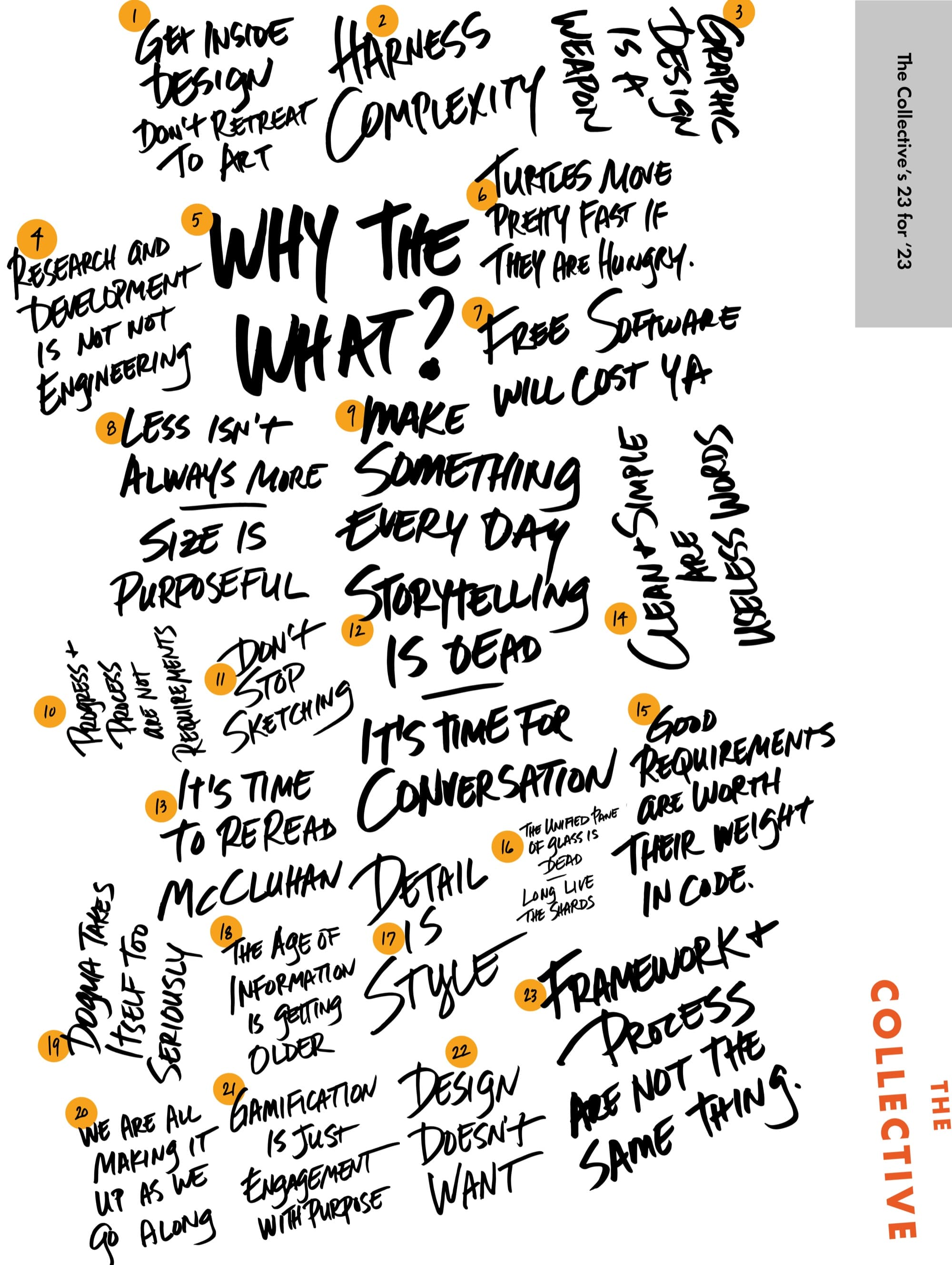

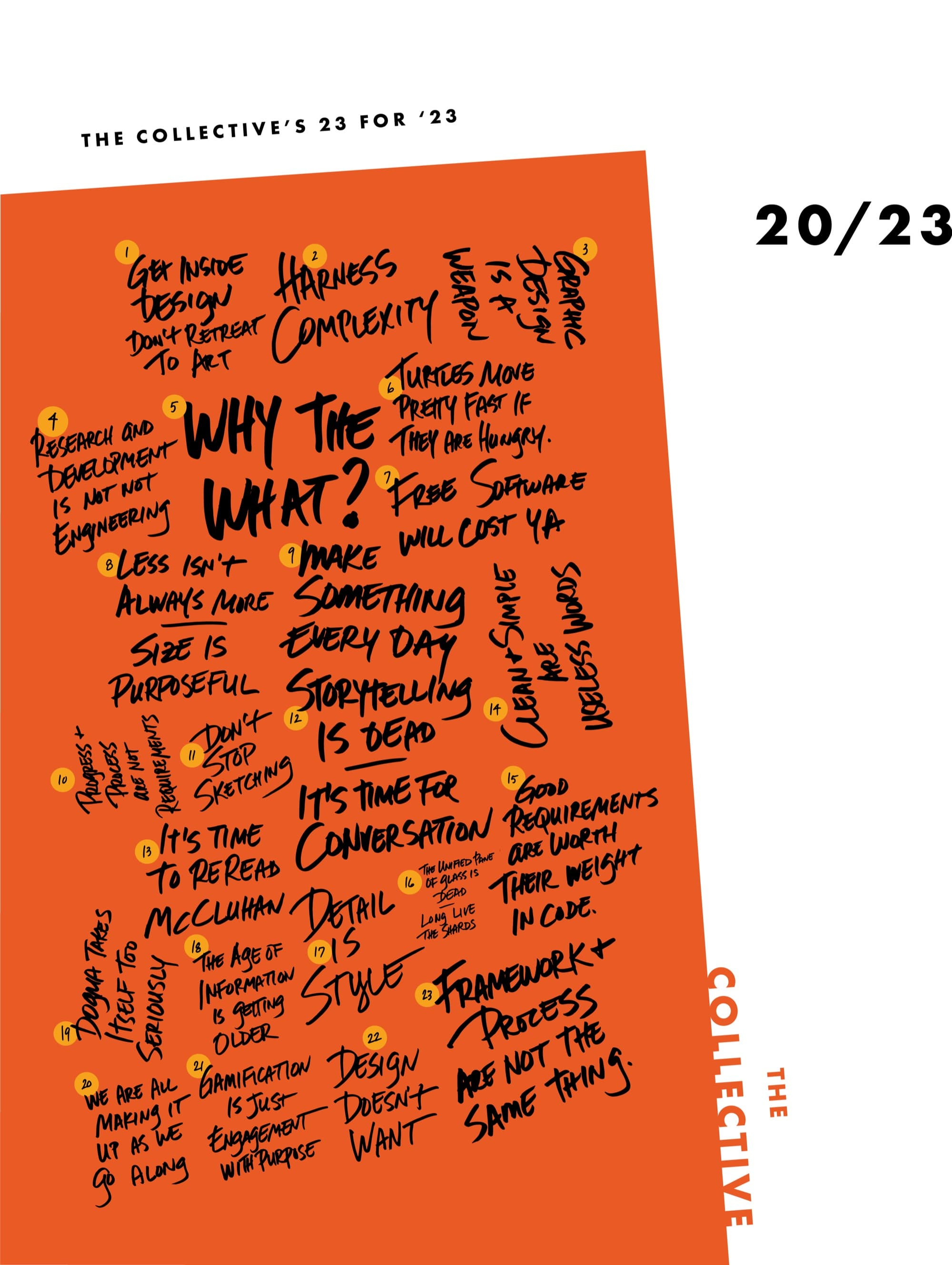
Hand-lettered the entire poster ourselves. No display fonts. No vectorized handwriting. Real ink on real paper, scanned and cleaned.
Numbered every statement so the page reads as a list and a poster at the same time. Mustard circles for the numerals, ink for the letters, the grid holding the whole thing in place.
Translated the same set into a typeset version for the small-format applications: business cards, email footers, deck cover lines, the website.
Stamped twenty-three pinback buttons in the brand's three colors. Tossed them into conference bags. Watched people pin "Detail Is Style" to a lapel and own it for a year.
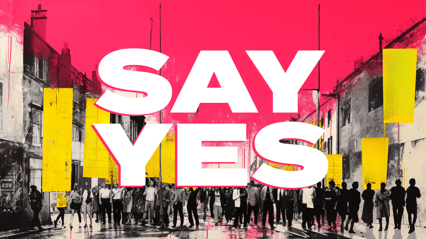
The Yes Manifesto
We say yes to audacious ideas.
The Yes Manifesto is the public-facing version. It runs with a poster of city storefronts behind a giant SAY YES, and a printed card we leave on the table at first meetings. Same brand, louder voice. The hot pink shows up exactly when we want the room to relax and start naming the audacious thing first.
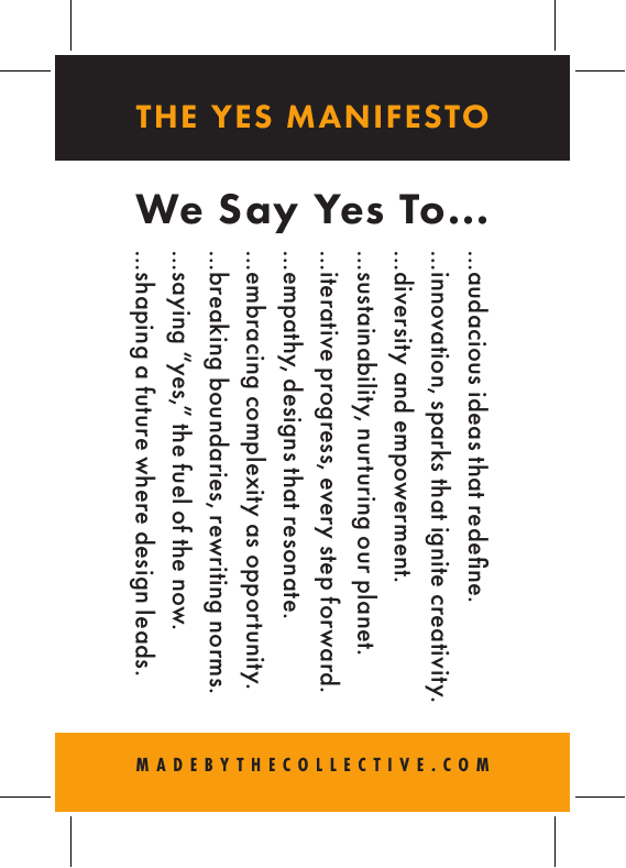
We say yes to
- audacious ideas, sparks that ignite creativity.
- innovation, diversity and empowerment.
- sustainability, nurturing our planet.
- iterative progress, every step forward.
- empathy, designs that resonate.
- embracing complexity as opportunity.
- breaking boundaries, rewriting norms.
- saying "yes," the fuel of the now.
- shaping a future where design leads.
Applied
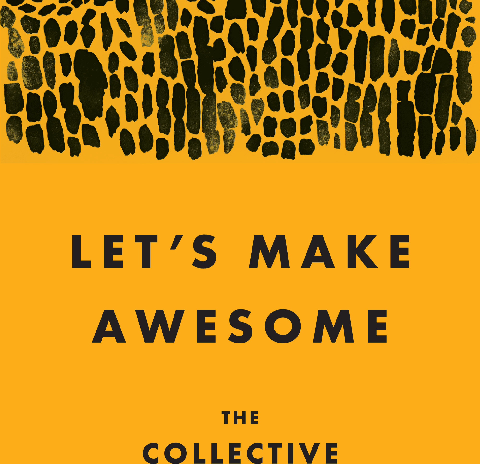
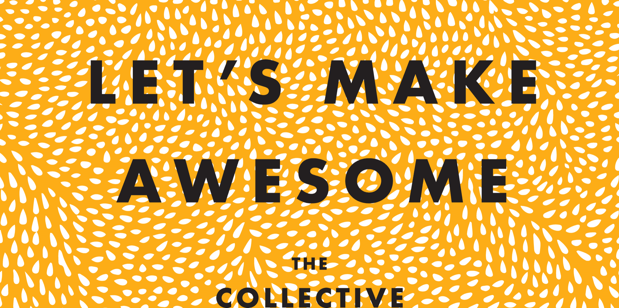
Let’s Make Awesome.
The brand assembles into one of three modes. Mustard for the invitation. Black for the body. Cream for the writing. A hand-drawn dotted leaf-and-seed pattern shows up where we want texture without losing the grid. The wordmark shows up at every scale, including the smallest one.
Pinback buttons, stickers, manifesto cards, conference giveaways. Twenty-three colorways. One pattern.
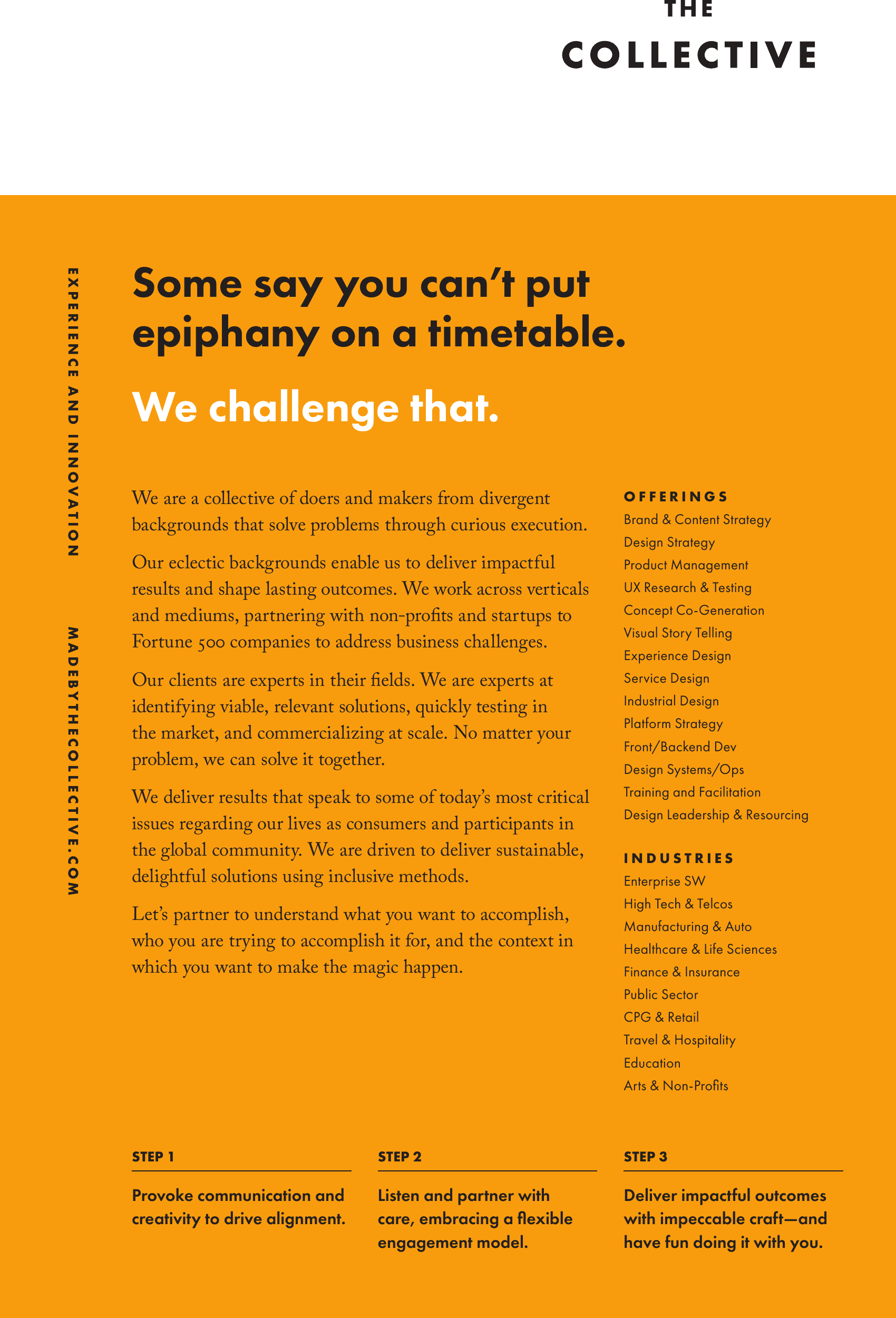
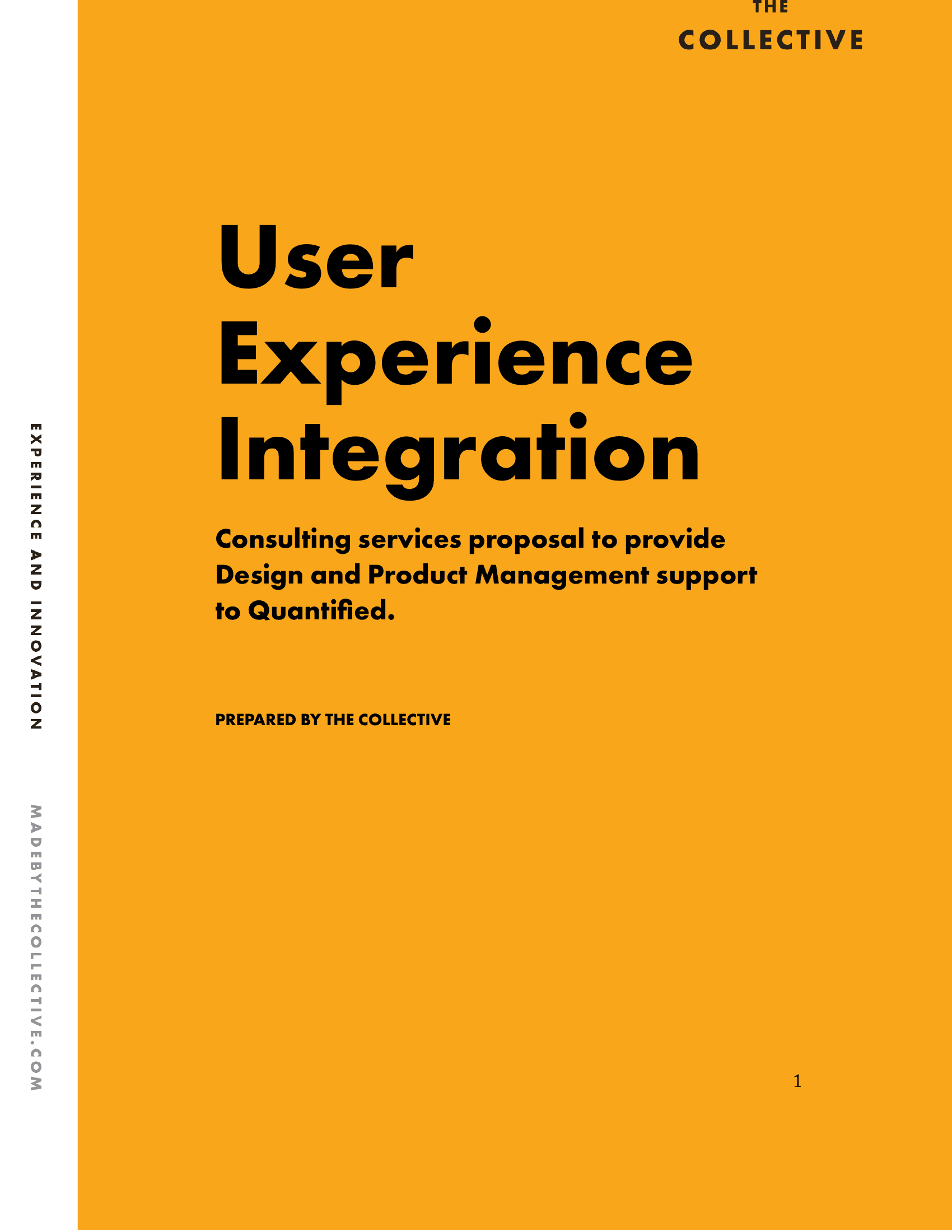
Proposal covers and capability decks: mustard ground, big black headline, minimal sub-line. The brand carries the formality so the writing can stay loose.
Letterhead and "Send After" follow-up cards keep the conversation warm without diluting the wordmark. The leaf pattern earns its keep on the print pieces; it's the thing people remember about a postcard pulled out of an envelope a month later.
The launch system shipped as a single brand book the team uses every time a new piece needs to ship. Drop a headline in. Drop the pattern down the side. Done.
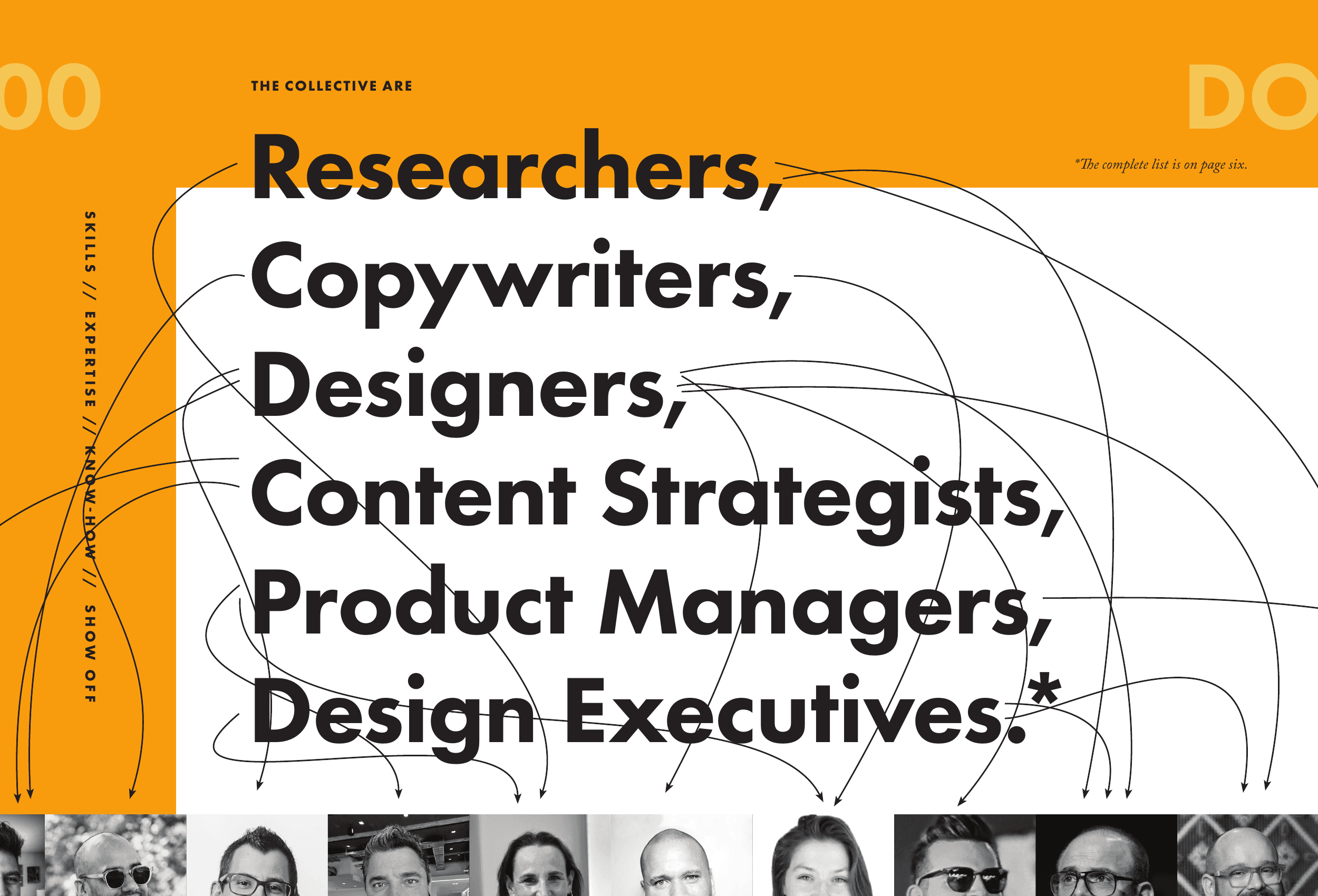
The Collective are
Researchers, Copywriters, Designers.
The clearest single page in the launch deck. Six job titles set big and tight, mustard panel framing the count, hairline curves pulling each title down to a portrait of the person behind it. The page is the introduction. Names follow.
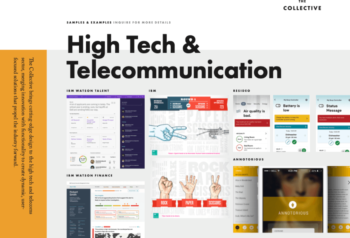
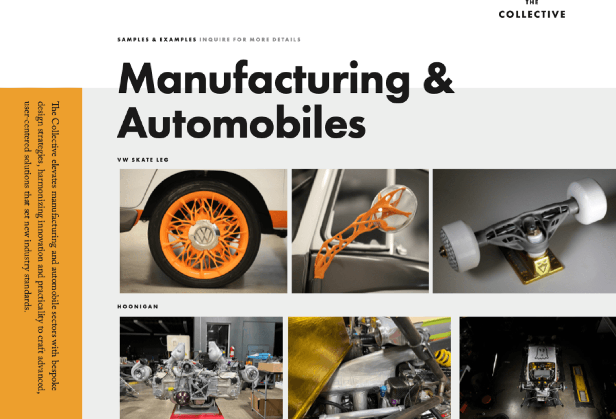
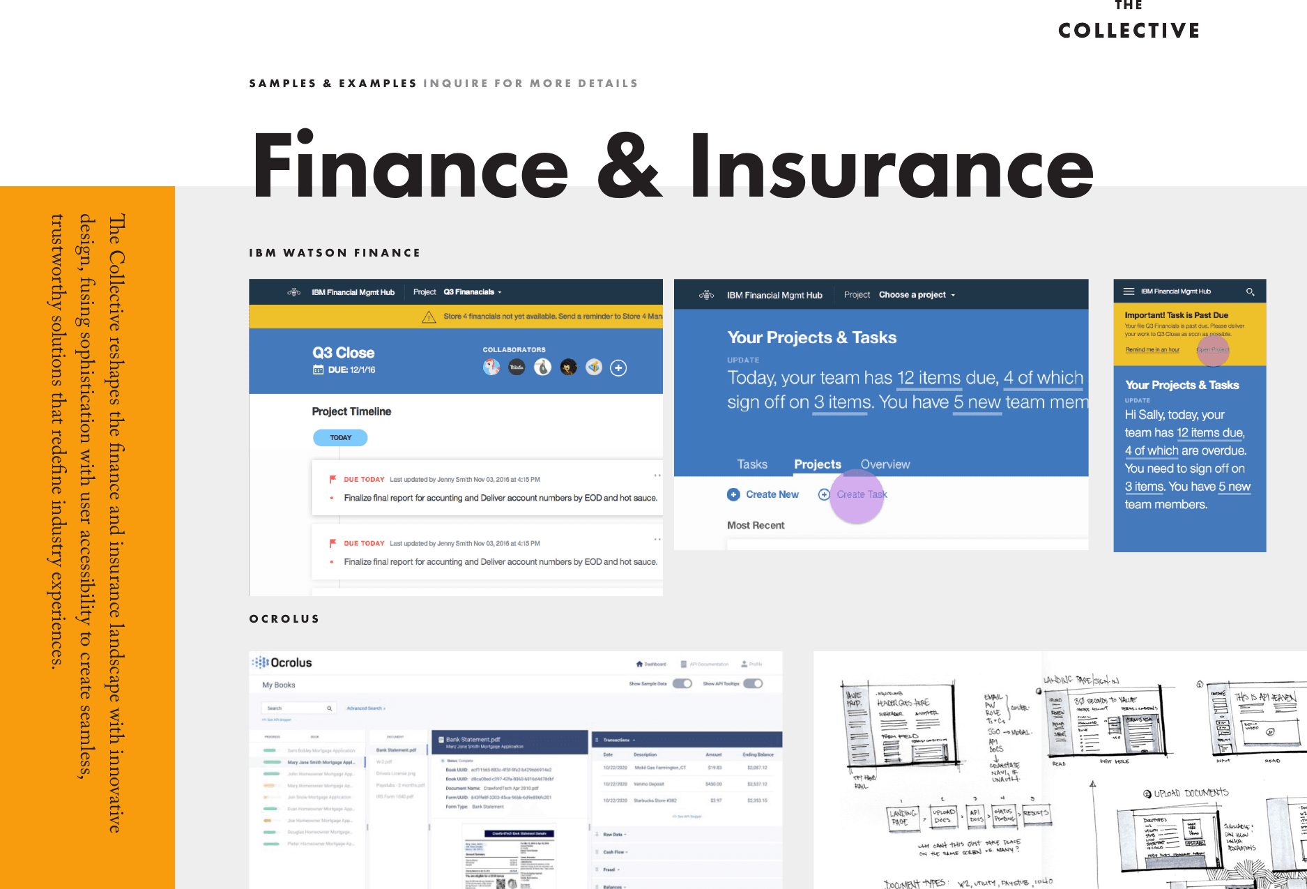
Decks by industry
One brand, six portfolios.
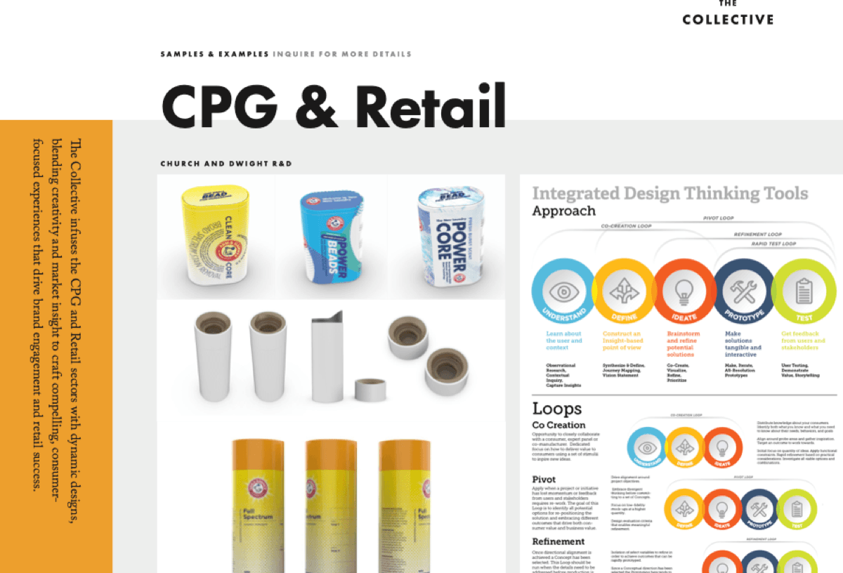
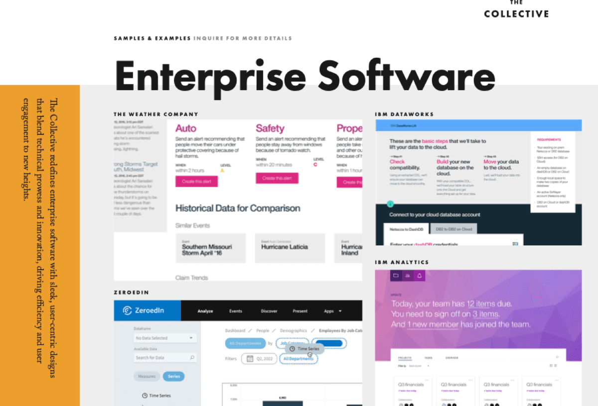
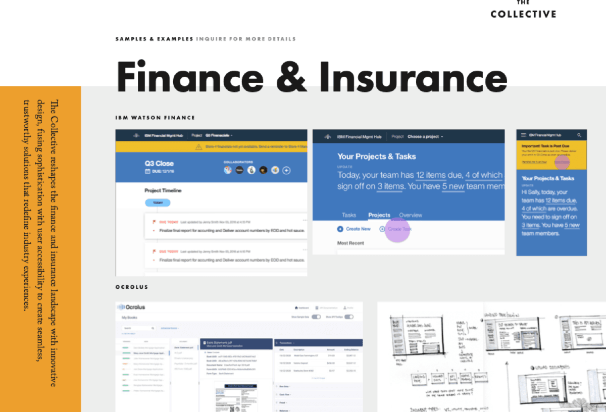
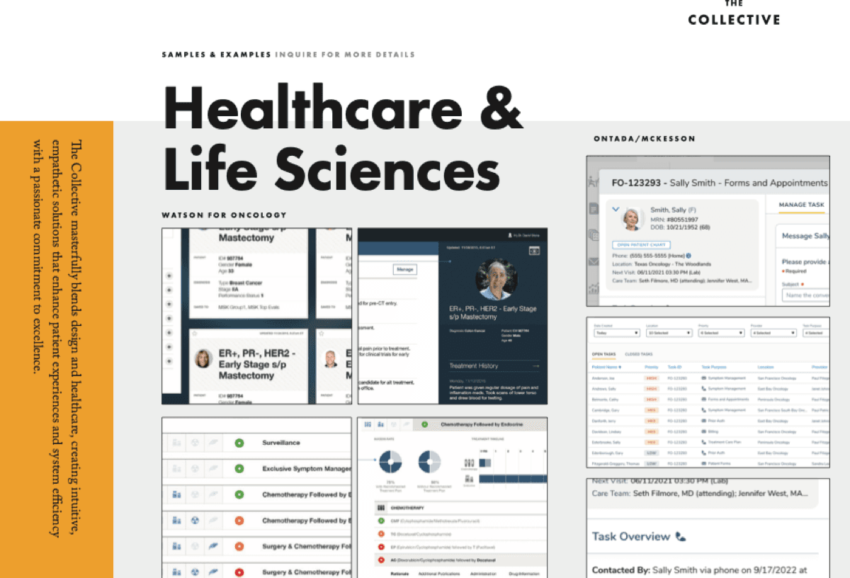
The studio works across CPG, enterprise software, finance, healthcare, high-tech, and manufacturing. Each industry has its own portfolio deck: same template, same brand, the right work surfaced for the right room. The deck system is what makes a small studio look prepared without looking the same twice.
"I've worked with John and the Collective for two decades. From the Texas Arts Project to Summer Stock Austin to Impact Arts, we've created educational brands that have transformed the lives of young performers across Central Texas. Constantly surprised by their out-of-the-box points-of-view and insight-driven approaches. And everything looks amazing."
Ginger Morris, Founder · Impact Arts
The hardest brand to design is your own. The launch system is the one that survived the four drafts before it. The pieces that didn't make it taught us what mattered. The ones that did still hold up. Every time a new client opens a deck and a small "THE" sits above a bigger "COLLECTIVE," the studio shows up before any of us do.
Takeaways
- Made By the Collective
- Brand Identity
- Design Studio
- Founder
- Creative Direction
- Design
- Brand Strategy
- Visual Identity
- Voice
- Editorial Design
- Wes Wright (Partner)
Up next