Essay · 11 min read
Simplicity Is a Deliberate Act
What it actually takes to make something feel obvious
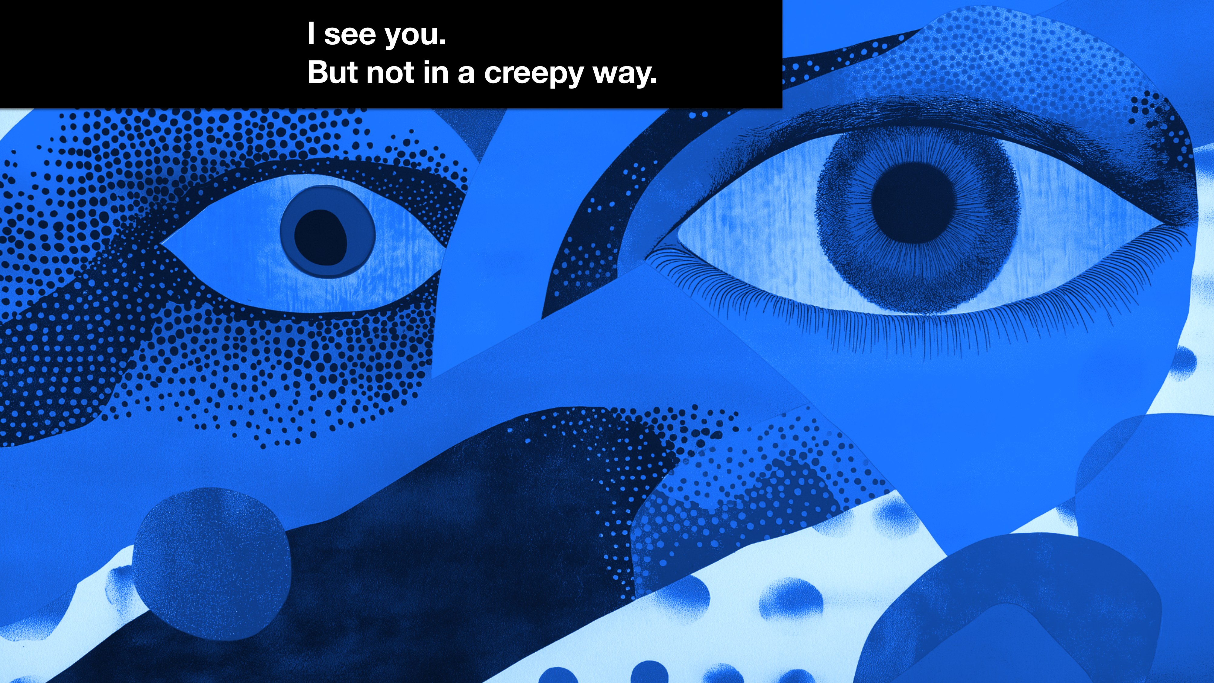
Every product has a person on the other side of the screen, and design is mostly about actually seeing them. I don't mean the surveillance kind of seeing. I mean the kind a good editor uses on a writer, or the kind a good doctor uses on a patient who's nervous about the appointment. Attention. Care. A little patience.
I keep coming back to that idea because it's where simplicity actually starts. Most teams reach first for fewer features or shorter flows when they want a product to feel simpler. I think that's looking at the wrong end of the telescope. Simplicity comes from how clearly you can see the person you're designing for, and how stubborn you are about translating what you see into the work.
The frame I open every team conversation about simplicity with. Seeing the user is the first job. Everything else is downstream of that.
I want to lay out two things here. The first is how to actually see your users in a way that affects the work, not just the research deck. The second is what to do with what you see, especially when the truth is that the thing you're designing is genuinely complicated and pretending otherwise is going to make it worse.
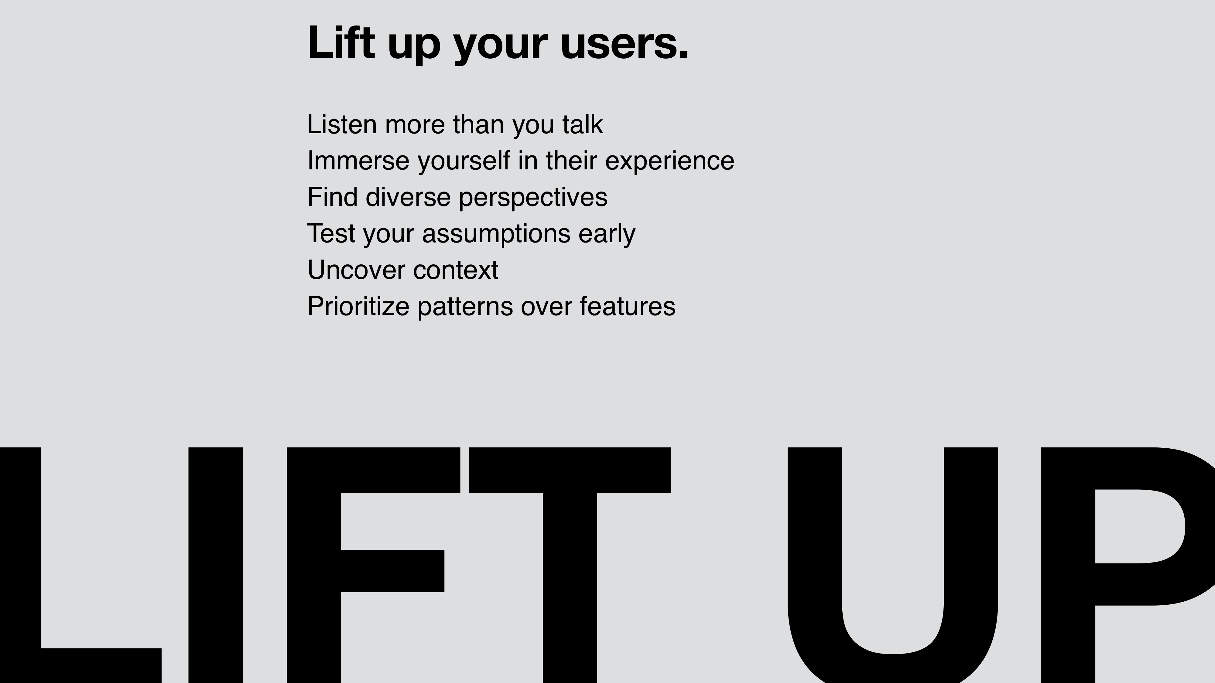
Lift up your users
Listening to users is the easiest thing to claim and the hardest thing to actually do. Reading three Slack messages and calling it qualitative insight is not the same thing. Reading a quarterly NPS report is not the same thing. Doing the real version takes time, attention, and some humility about what you don't yet know. Here are the six things I keep returning to.
Listen more than you talk. Insights don't come from data alone. Stories reveal truths that numbers can't, and the only way to surface those stories is to ask open questions and then shut up. Ask users to share their frustrations, their successes, and the workarounds they've built. Workarounds are the most honest signal a product gets. They're the user telling you, in their own hand, exactly where you've failed them. If you only listen for what confirms what you already think, you'll keep building for the user you imagine instead of the one you actually have.
Immerse yourself in their experience. Don't just observe. Step in. Use their tools. Navigate their workflows. Feel their pain points firsthand. Empathy grows when you live the problem, not when you watch a screen recording of it. At one point during the DigitalOcean work I made myself spin up a fresh account and try to set up a managed database from scratch with no prior knowledge of the product. It took me eleven minutes longer than I expected, and I designed the whole thing. That moment of friction told me more than any usability study could have.
Find diverse perspectives. Look beyond the usual suspects. Beginners, experts, and people from unexpected industries bring fresh insights, and they will catch the assumptions your team has stopped noticing. Diversity in feedback is what protects you from designing a product that only works for the room you've been sitting in. Some of the best feature changes I've ever shipped came from a user whose use case I didn't know existed when I started the project.
Test assumptions early. Don't wait. Validate ideas before they're set in stone, because anything you don't test on purpose will be tested by your users at the worst possible moment. Even a rough prototype can reveal gaps in your understanding. The cost of a wrong idea drops by an order of magnitude every time you catch it earlier in the process. That math is why I keep my teams sketching for longer than feels comfortable.
Uncover context. Users don't exist in a vacuum. They have an environment, a set of pressures, and constraints that shape what's possible for them. The same person making the same decision at 2pm with a coffee is a different person than they are at 6pm with a deadline and a Slack thread on fire. Designing without that context is designing blind, and you can usually tell when a feature was made by a team that hadn't thought about it.
Prioritize patterns over features. Patterns matter more than one-off requests. They reveal the recurring questions users are asking, and they guide you toward solutions that serve more than the loudest voice on last week's customer call. When five users ask for the same thing in five different ways, that's not five feature requests. It's one pattern in a costume, and a pattern deserves a real answer.
The six-rule summary I use to anchor team kickoffs. I worded each one as an action on purpose. Principles let you off the hook. Actions don't.
The road to simplicity is paved with “yes, and”
Once you can see your users clearly, the harder problem is what to do with what you see. Most teams treat complexity as the enemy. I think that's the wrong way to look at it. Complexity is what users are actually trying to accomplish. Cloud infrastructure is genuinely complicated. So is enterprise hiring, or buying a wedding cake, or planning a six-week summer stock season. Pretending the complexity isn't there only makes things worse for everyone. The work is managing it well enough that users don't feel it pressing down on them.
When my teams hit a hard problem and someone says “no, this is too complicated,” I push back. The answer I'm looking for is “yes, and…” Yes, this is complicated, and here's how we'll handle it. There are three handles I reach for most often.
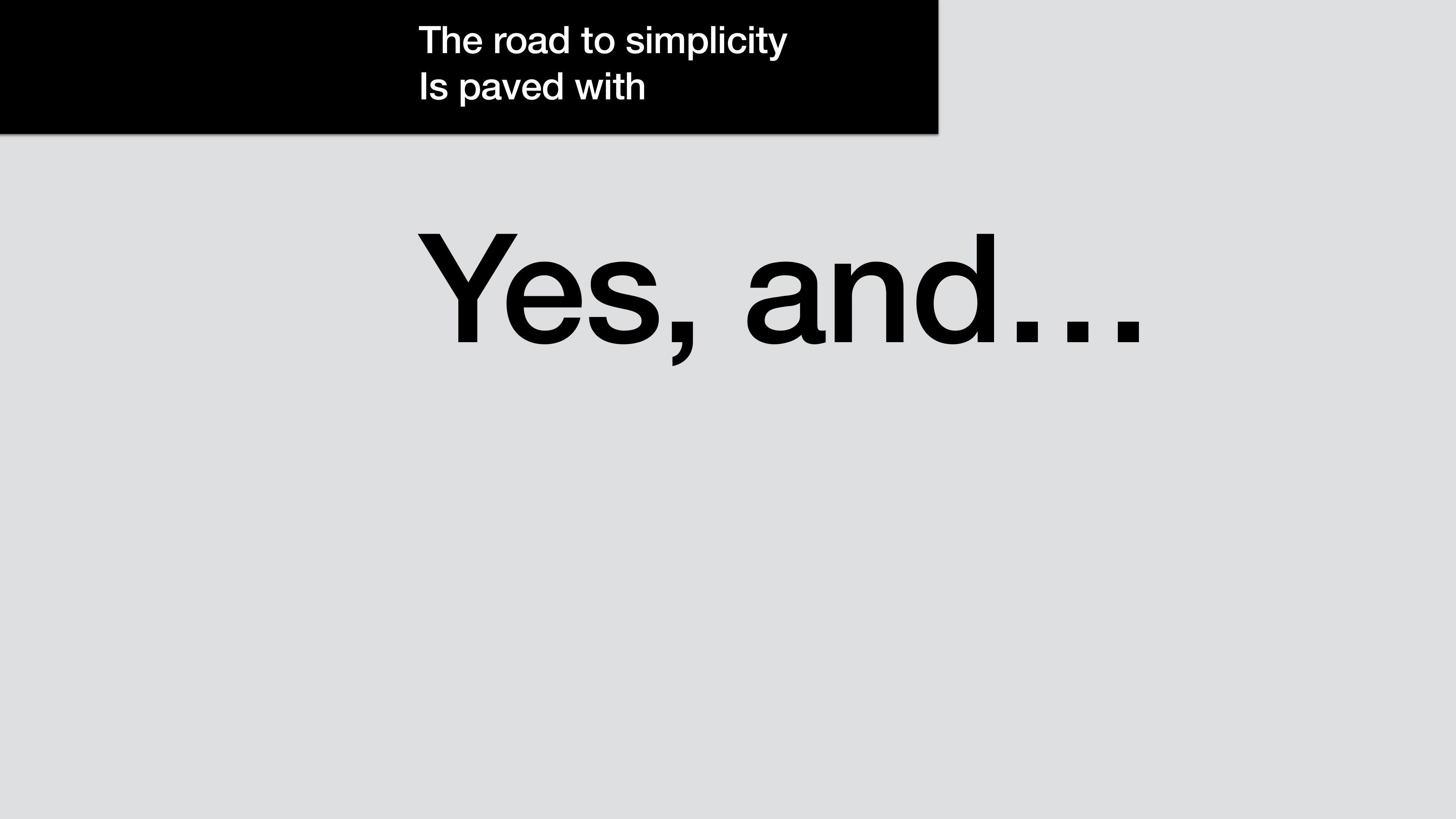
Borrowed from improv. It's a discipline of refusing the “no” reflex when something gets hard, and reaching for the next move instead.
Yes, and we can layer it.
Think of an iceberg. The tip is visible and manageable. As users progress, the depth becomes available, but only when they need it. Progressive disclosure gives beginners a clean, focused experience, and lets experts dive deeper when they're ready.
Most product surfaces I've worked on get this wrong by either showing everything at once or hiding everything behind a series of clicks. Both of those fail. The goal is to match the moment. A new user setting up their first project doesn't need to see VPC routing rules. A senior engineer running a production migration absolutely does. The same surface can serve both, if you're willing to do the work of layering.
Yes, and we can guide it.
Imagine setting up a Droplet. For most users, pre-configured defaults are all they need. CPU, RAM, region, none of it requires a decision the first time through. For an advanced user, those same fields need to be tweakable. The work is structuring options to match the user's journey. Smart defaults sit in the obvious place. The power-user controls sit one click away from where they're working.
Smart defaults are an act of generosity. They say: we have done the hard thinking so you don't have to, and we'll be honest about what we chose so you can change it if we got it wrong. The Database Create Copilot work I led at DigitalOcean is the cleanest example of this I've shipped. The user types “I need a Postgres database for staging,” and the system fills in the engine, the size, the backup policy, the region. Every choice is editable. Every choice is explainable. The complexity is still there, full strength. The user just doesn't have to wade through it to start.
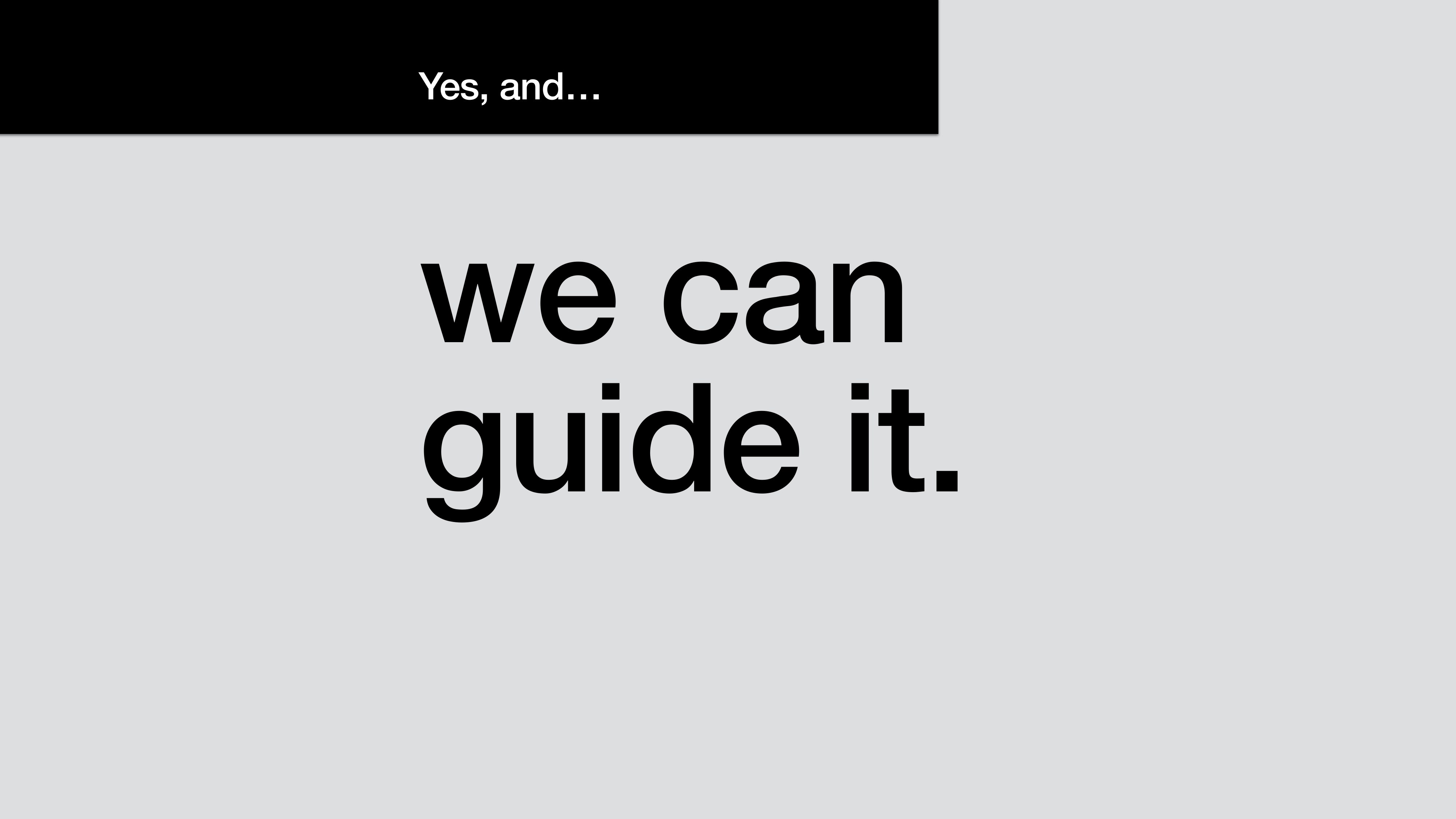
Guidance is a design surface. Defaults, recommended options, and inline explanations all do the same job: they shorten the distance between user intent and a working result.
Yes, and we can test for clarity.
At DigitalOcean, every design goes through rounds of user testing. We ask both “do they understand it” and “how does this feel.” The first question tells us about cognition. The second tells us about confidence. We test for both, because a screen can be technically clear and still feel like a trap.
Clarity is a measurable outcome. You can watch someone's shoulders drop when a screen finally makes sense to them. You can hear the difference between “okay, what next” and “wait, I think I'm doing this wrong.” That signal is what we test for, and that signal is what tells us a complex system has been simplified well.
Working with complexity instead of against it produces tools that feel powerful in the user's hand. Complexity managed well stays out of the way. Simplicity, when it shows up, is the result of all of those choices made well; you can't add it at the end like a finishing pass.
Simplicity is a deliberate act
We need to acknowledge that simplicity is deliberate. It is the result of disciplined decisions that turn complexity into clarity. If simplicity is the heart of great design, these are the practices that keep it alive.
The line I close every team conversation with. Simple shows up as the residue of choices made well, all the way through. It's never a property you can add at the end.
The rules I work by are below. They're not ranked. Each of them is something I've learned the hard way, often by doing the opposite first.
Start with the user's story. Before the feature list, before the roadmap, the story. Who is this person, what are they trying to do, what's in their way. If a designer on my team can't tell me that story in three sentences, we're not ready to design anything yet.
Speak their language, not yours. The most common simplicity failure is using internal vocabulary in user-facing copy. Engineers say “instance.” Users say “server” or “machine” or just “the thing I'm building.” Translating that gap is one of the most undervalued acts of design.
Make every decision feel like the obvious choice. When the user looks at a screen, the next move should feel inevitable. Layout, hierarchy, copy, and color work together to put the right answer where the eye lands. The user doesn't have fewer options; the surface has been arranged to honor what they came to do. That takes craft.
Cut for simplicity. Every feature, every label, every tooltip is a candidate for removal. The question to ask is “is this earning its place?” “Could this be useful” is the trap. If you wouldn't add an element to the screen today, take it off the screen tomorrow.
Meet users where they are. Don't make people change their mental model to use your product. Build the product to fit the model they already have. The Database Create Copilot lives inside the existing create flow, where users already go when they want to make a database. We meet them in the moment of creation. A separate chatbot would have asked them to learn a new surface first.
Test your assumptions relentlessly. Every assumption is a future bug. Test the ones you're most sure about even more than the ones you're not, because the ones you're sure about are the ones nobody else will catch.
Keep users informed. The opposite of confidence is mystery. Show progress. Explain what's happening. Tell users when they need to wait, and tell them when they don't. Communication is design work, not engineering noise.
Guide with clarity. Hints, defaults, recommendations, and warnings are all part of the surface. Use them to shorten the distance between intent and outcome. Don't be coy. Don't make users guess.
Consistency breeds comfort. Patterns that repeat well let users carry knowledge from one part of the product to another. Consistency is a gift you give your users so they can spend their attention on the thing they actually came here to do.
Collaborate for coherence. Simplicity is a team sport. The product manager, the engineer, the writer, the designer, the support lead, the data scientist all hold pieces of the user's experience. If any of them are out of sync, the user feels it. Get everyone in the same room often enough that the seams disappear.
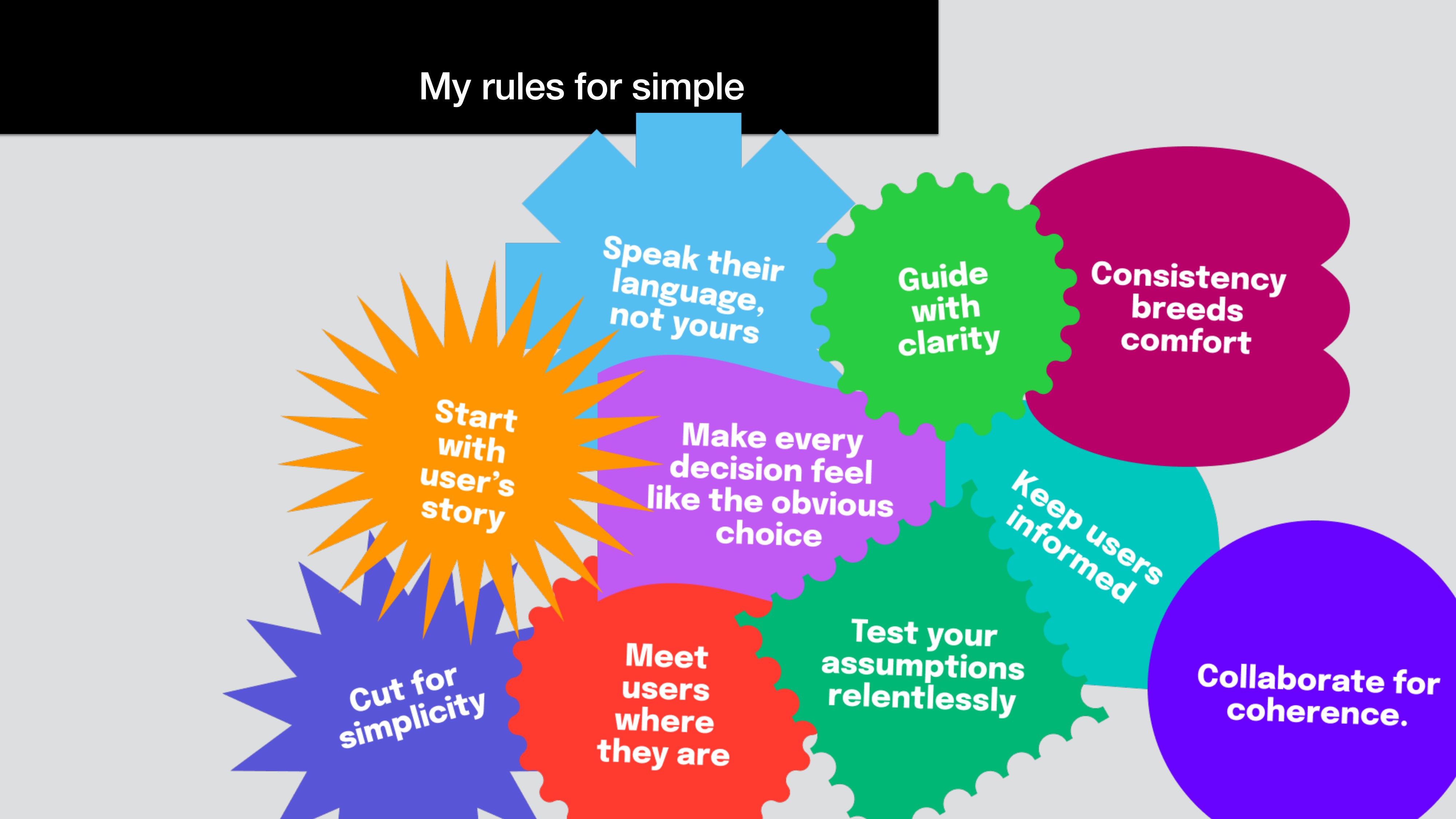
The full set, the way I draw it on a whiteboard when a team needs a shared vocabulary fast. The shapes overlap because the rules do too.
None of this is a checklist you can mark complete. It's a way of working. When simplicity is earned, it's invisible to the people it serves and obvious to the people who made it. That asymmetry is most of why it's worth chasing.
What I tell my teams, and what I have to remind myself of often, is that the user shouldn't be able to feel the complexity we worked through to get here. They should just feel like the product met them where they were. If they finish what they came to do without thinking about us, we did it.